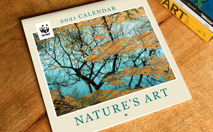
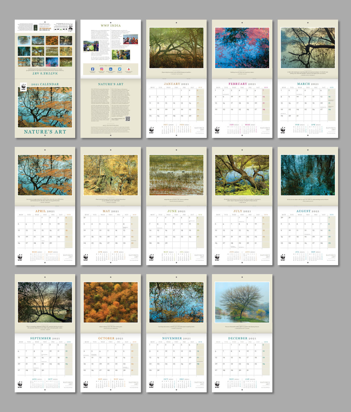
Clean and consistent design of a wall calendar featuring thought-provoking fine art photographs of nature, helped to shape it into an elegant and useful product.
Background and Purpose
WWF (World Wide Fund for Nature) India is one of the foremost organisations working for the conservation of India’s wildlife and natural habitats. Every year, WWF-India brings out a range of calendars on nature / wildlife related themes. Proceeds from their sale help to support its conservation mission.
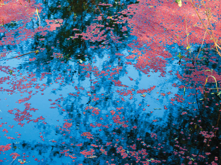
The theme of art suits calendars very well as they are often used in living and office spaces for long periods, like paintings or works of art. In 2020, WWF-India commissioned the design of a unique wall calendar featuring fine art photographs of nature (by Mayank). The images were an amalgamation of shapes, forms, lines, textures, colours, patterns, reflections, light and shade — akin to paintings made by mother nature. Some of the photographs had an abstract quality. The calendar was simply named Nature’s Art, to appeal to an audience as wide as possible.
Design Rationale
Calendars with art themes — featuring beautiful artworks or paintings and photographs by the great masters — are popular the world over. Several such calendars were studied. The client and the designer agreed that the calendar’s overall look and feel should be faithful to the genre of art calendars. WWF brand guidelines, importantly, had to be considered and implemented in the layout as well.
Clean and Formal Layout
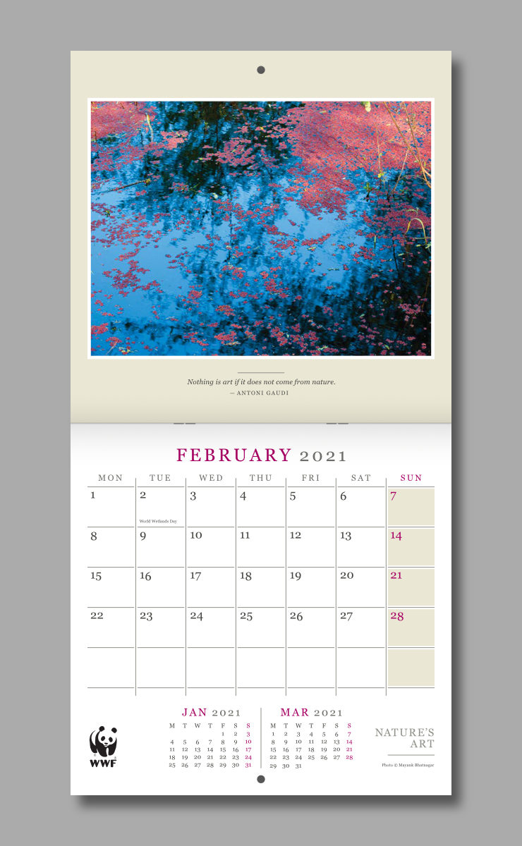
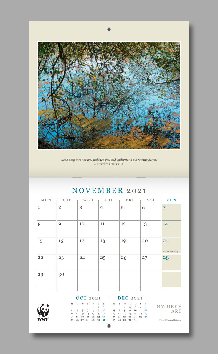
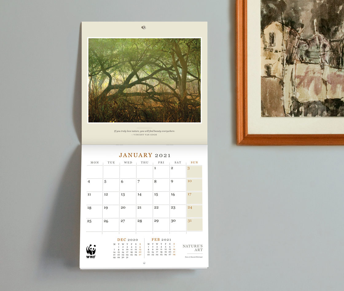
Of the two design options developed and presented to the client, the one approved had a clean, classic look within a squarish page proportion that art based calendars often have. The photographs dominated calendar page layouts, accompanied by typography with a formal feel.
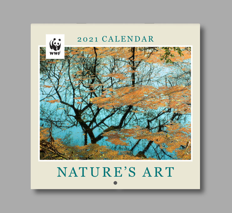
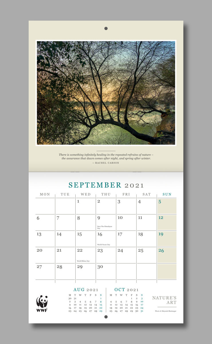
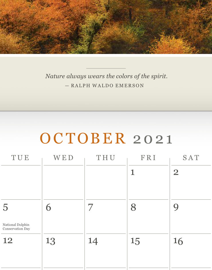
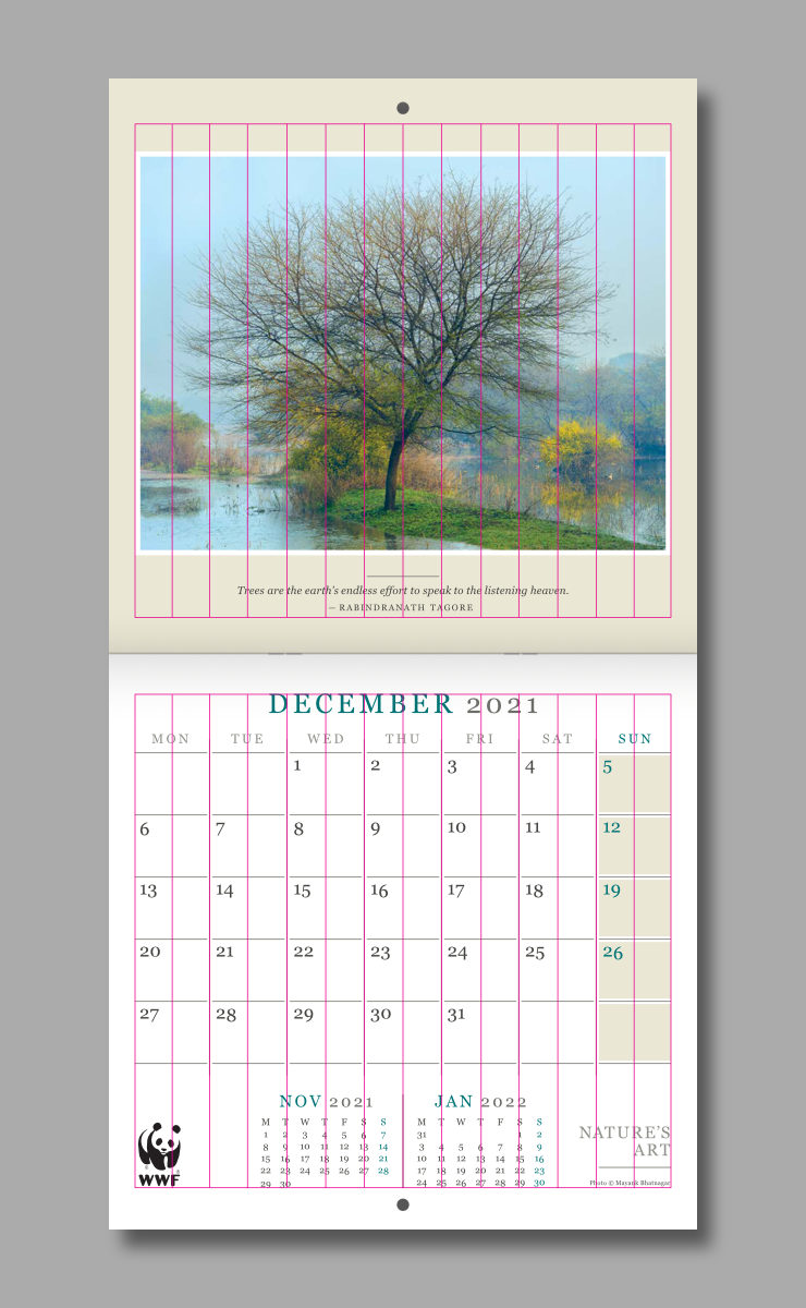
In each calendar spread (consisting of top and bottom pages or portions) the image of nature was placed in the top portion, with a subtle white frame, over a light background colour. It appeared to have been framed with a matte around it (similar to how fine art photographs are often framed). It was accompanied by a thought-provoking quote about nature.
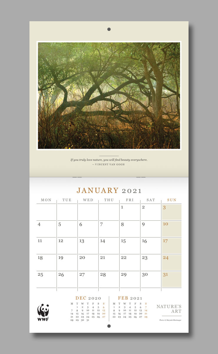
The bottom portion consisted of a large, usable planner, followed by previous and next months, WWF logo and the calendar name. The spread had an overall formal, disciplined and dignified feel.
One Typeface, Uniform Typography
Only one typeface — Georgia, recommended by WWF brand guidelines — was used to dress all calendar text. This brought in a sense of uniformity to the layout. Beautiful curves of this serif face also lent to the calendar an elegant touch. Text was treated delicately, all headers were set in all caps, with loose letter or character spacing.
Georgia has good readability and legibility, which were helpful in deciphering the dates from the distance of a few feet, as well as other information provided in the calendar.
A limited number of font sizes and styles were used in the layout. Typographic hierarchy — uniform sizes and styes for headers, dates, quotes and paragraph text — was maintained throughout the calendar.
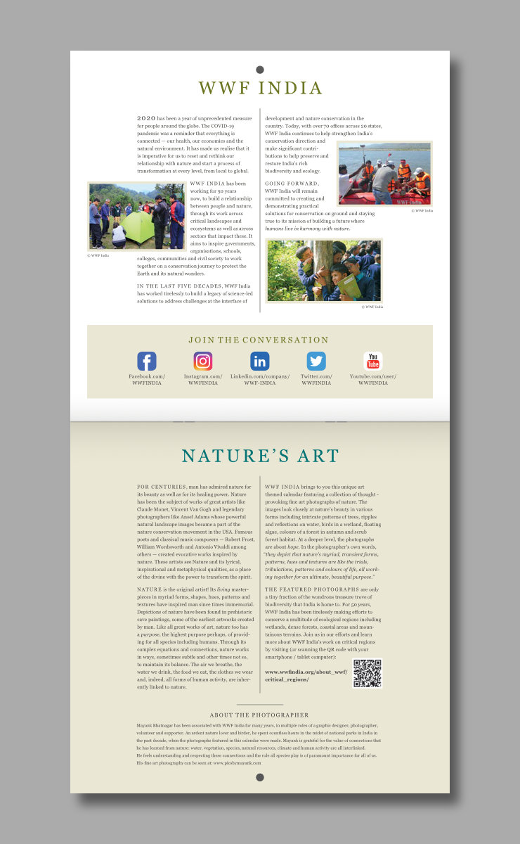
The first page of the calendar (inside cover) featured information about WWF-India, its work and aims. The second page (in the same spread, below) featured a thought-provoking concept note about nature being the original artist, the important role it plays in our lives, and the imperative to conserve it. Layouts of these pages also had a clean and formal feel with consistent typographic styles.
Use of Background Grid
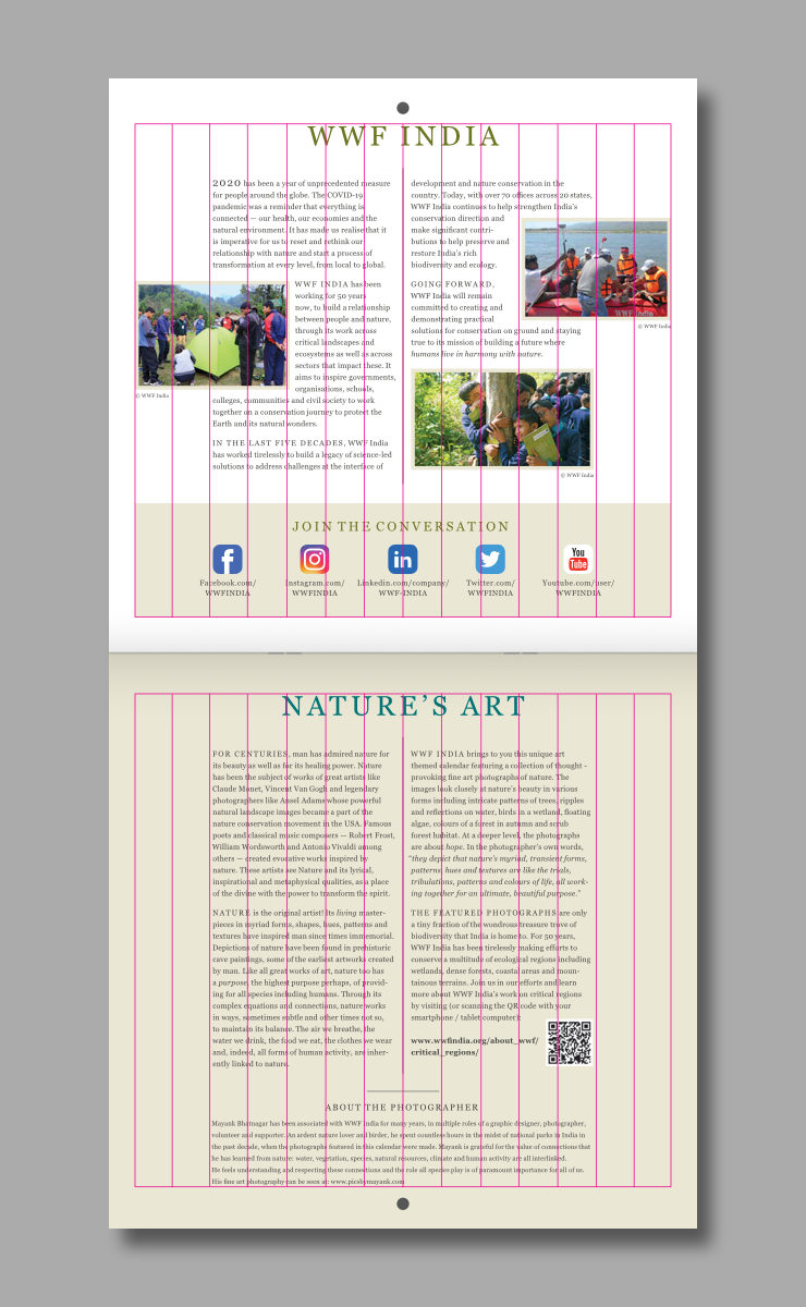
Text and other visual elements were arranged with the aid of a 14 column background grid, within an outer margin, on every page of the calendar. The grid helped to organise every layout with precision and consistency.
Minimal Colour Scheme
Use of colour in the layouts was kept to a minimum, to allow the nature images to dominate. Beige background colour — from WWF brand guidelines — around the photograph provided an earthy and sophisticated tone to the calendar. It was also used as background colour for Sundays in the planner below. Background of the bottom page including the planner was otherwise left white. It subtly contrasted with the top portion (in beige) and allowed for easy writing and reading of small text in the planner.
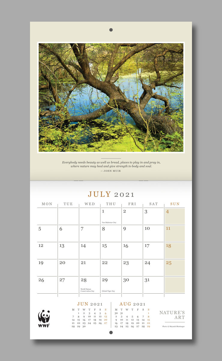
Colours of headers were again taken from WWF brand guidelines. They also acted as accent colours (to highlight important text) and matched some of the key colours in the corresponding photographs showcased in the spread. All other text was dressed in dark grey or grey colour.
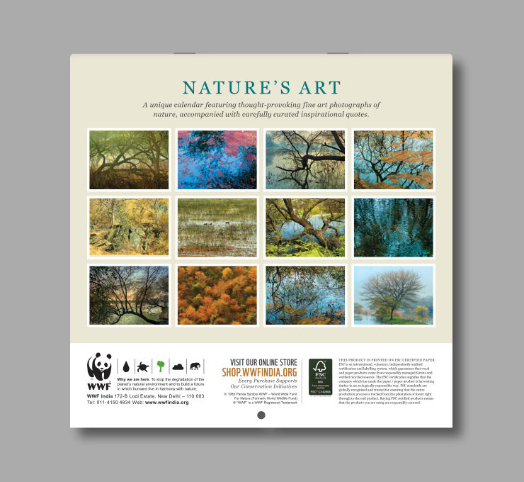
Design of the Back Page
The back page featured a short concept note and all 12 photographs in small size — which is often the norm in art based calendars. Bottom portion of the page layout contained the WWF logo and mandatory / boilerplate information.
Technical Notes
The calendar was printed in four colour offset on FSC (Forest Stewardship Council) Certified paper, and center stapled for binding. It had an open size of 11.25 inches (width) x 22 inches (height) and closed or folded size — important while shipping — of 11.25 inches (width) x 11 inches (height).
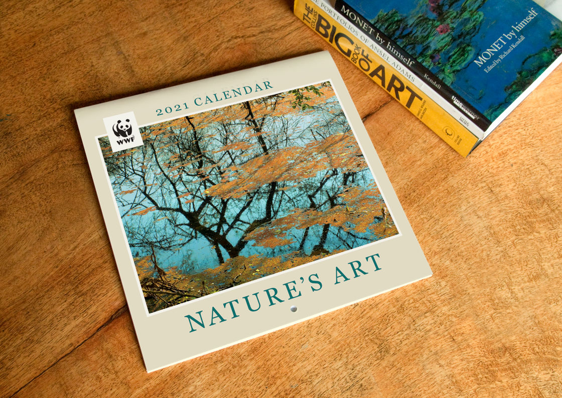
The calendar consisted of 28 pages (14 sides) in all, including cover and back cover and 2 pages with information.
In Essence
Design of WWF-India Nature’s Art wall calendar helped to showcase artistic photographs of nature in a formal and dignified manner. Its uniform and clean structure and typographic style gave it an overall elegant feel, appropriate for an art themed calendar. Its large, easily discernible and usable planner helped users to plan their days with ease. With thought-provoking images and quotes, and a wealth of information about the nature, Nature’s Art was an attractive, informative, purposeful, useful and unique calendar.
WWF-India Nature Products
WWF-India calendars have a decades old legacy. Nature / wildlife enthusiasts, supporters and many others adorn their work and living spaces with them every year. Apart from calendars, a wide range of nature related and Eco-conscious products are available at the WWF-India Online Nature Store. Please visit if you can, your purchases will support the organisation’s conservation initiatives.
Copyright Information
- WWF Panda logo / symbol, all designs and images published in this article are copyrighted and may not be copied or reproduced in any manner.
- WWF® and ©1986 Panda Symbol are owned by WWF. All rights reserved.
- © 1986 Panda Symbol WWF – World Wide Fund For Nature (Formerly World Wildlife Fund). ® “WWF” is a WWF Registered Trademark.
- Photographs of WWF-India teams and work (in the calendar introductory page layouts) © Copyright, WWF-India. All rights reserved.
- Fine art photographs of nature showcased in the calendar layouts © Copyright, Mayank Bhatnagar. All rights reserved.