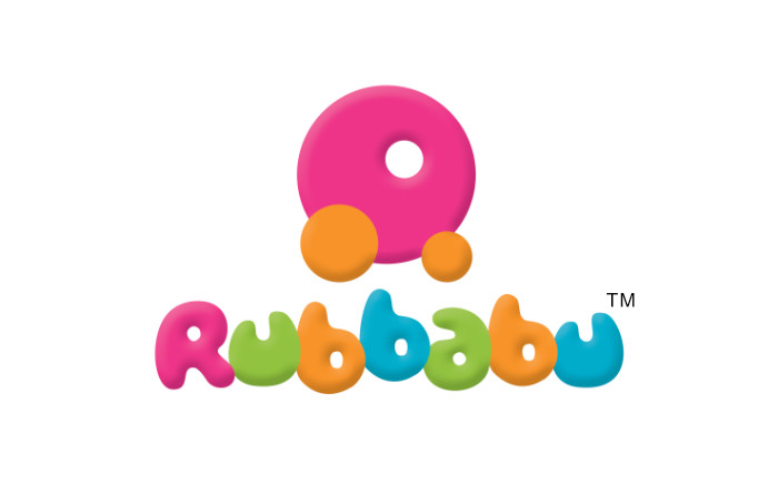
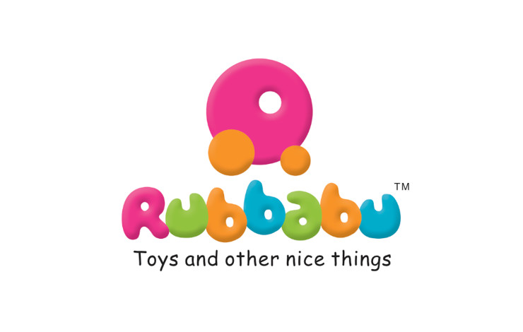
Logo for the international toy brand Rubbabu was designed to represent the company’s creations in a memorable way and to appeal to kids and parents alike.
Background and Creative Brief
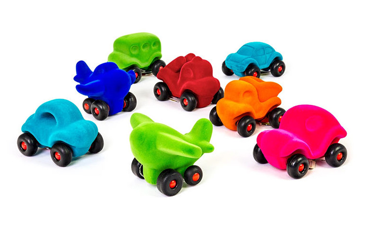
The Rubbabu brand consists of a wide range of safe, intuitive, eco-friendly and pleasantly different toys for kids. The toys are made from natural rubber foam and characterised by their curvy shapes, bright colours and soft, tactile feel. Design of a logo for Rubbabu was commissioned as soon as the brandname was finalised (in 2004) by the company Iseo Chemdis Pvt Ltd, based in Gurgaon, India. The brief was to create a logo that not only embodied the characteristics of the toys but one that would be unique, memorable and appeal to kids and parents alike!
Design Rationale
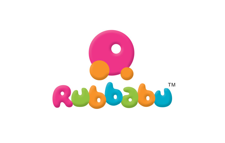
Of the several logo design options presented to the client, the one finalised comprised of a logotype with custom lettering inspired by the curvy shape of the toys, arranged in a playful manner. The lettering was combined with an ‘R’ (for Rubbabu) letterform or lettermark, which took the shape of a car. The car — also acting as a pictorial mark — suggested movement and energy, which playing with a toy involves; cars were also one of the company’s most popular categories of toys. The two together formed the Rubbabu logo unit or a combination logo.
Three Dimensional Appearance
The logo was given a three-dimensional feel as the experience of playing with a toy is inherently a spacial one. The beveled or embossed look also represented and suggested a tangible product and reinforced the softness aspect of the toys.
Vibrant Colour Scheme
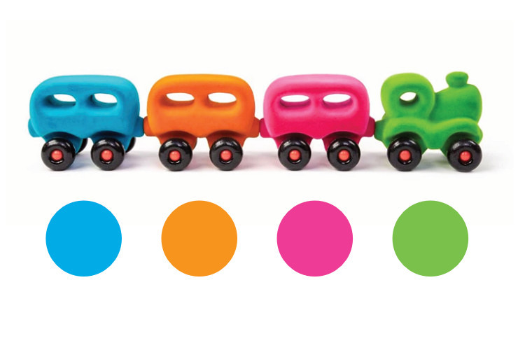
Colour scheme for the logo was inspired by and derived from the bright colours of the toys. The four colours — used in succession — consisted of Deep Pink, Lime Green, Orange and Deep Sky Blue. The hues were carefully chosen to not only reflect and represent the vibrant character of the toys but to also allow the logo to reproduce optimally in print (4 colour offset).
Logo Look and Feel
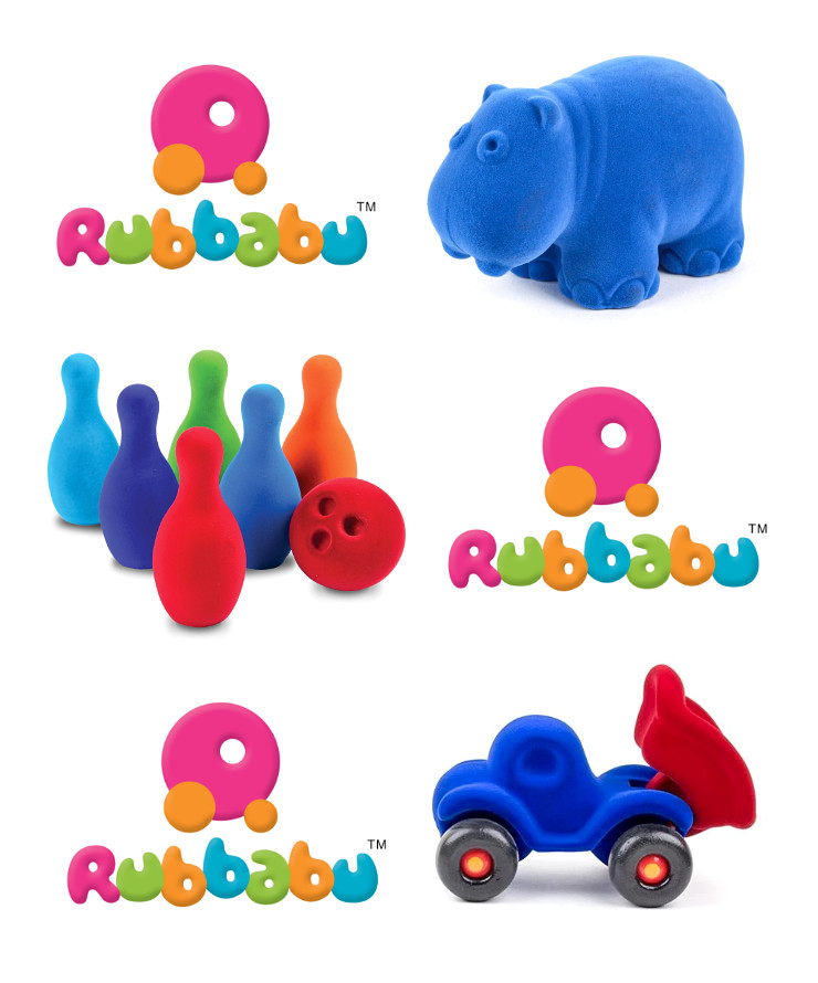
Overall, the logo appeared vibrant or colourful, child-like, playful, friendly, soft and attractive. It also had a tangible feel since it represented a product. These visual characteristics of the logo went hand-in-hand with intrinsic qualities of Rubbabu toys.
Technical Notes
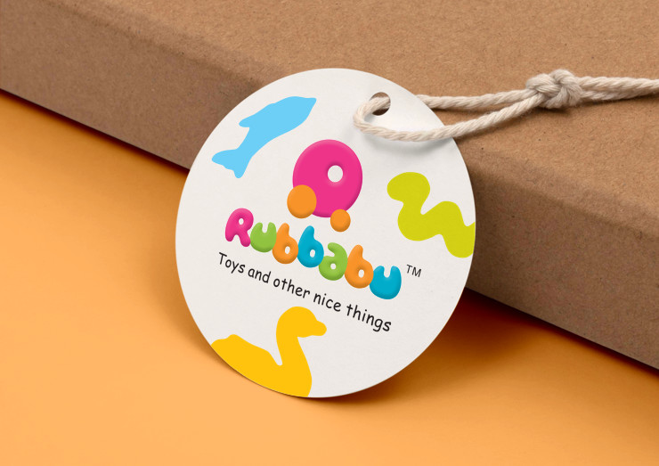
RGB (for the web) and Greyscale (for reproduction in black and white or single colour on shipping boxes, etc.) versions of the logo were also created and submitted to the client along with the final logo artwork. As the brand evolved, the logo was later combined with the tagline Toys and other nice things.
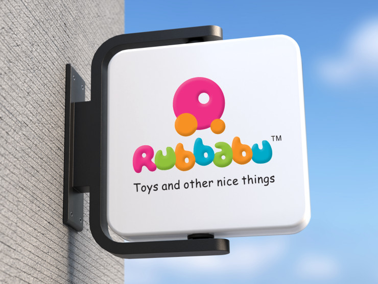
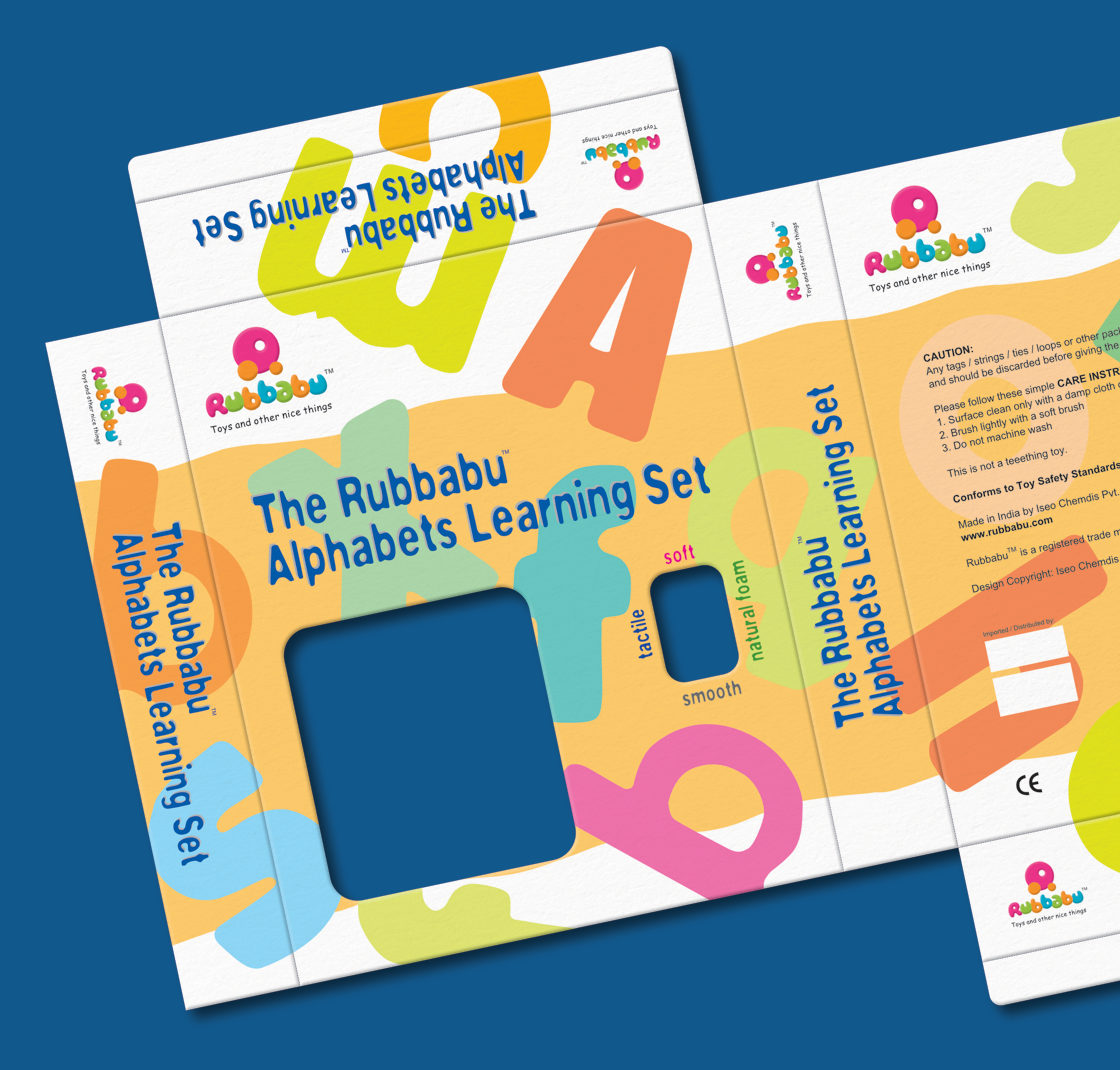
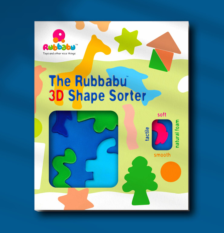
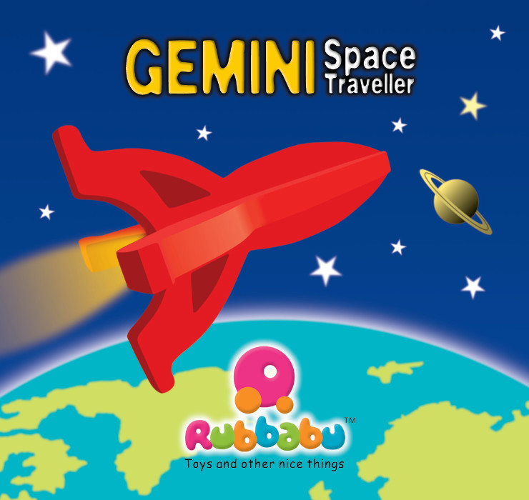
Examples of Logo Usage
Postscript
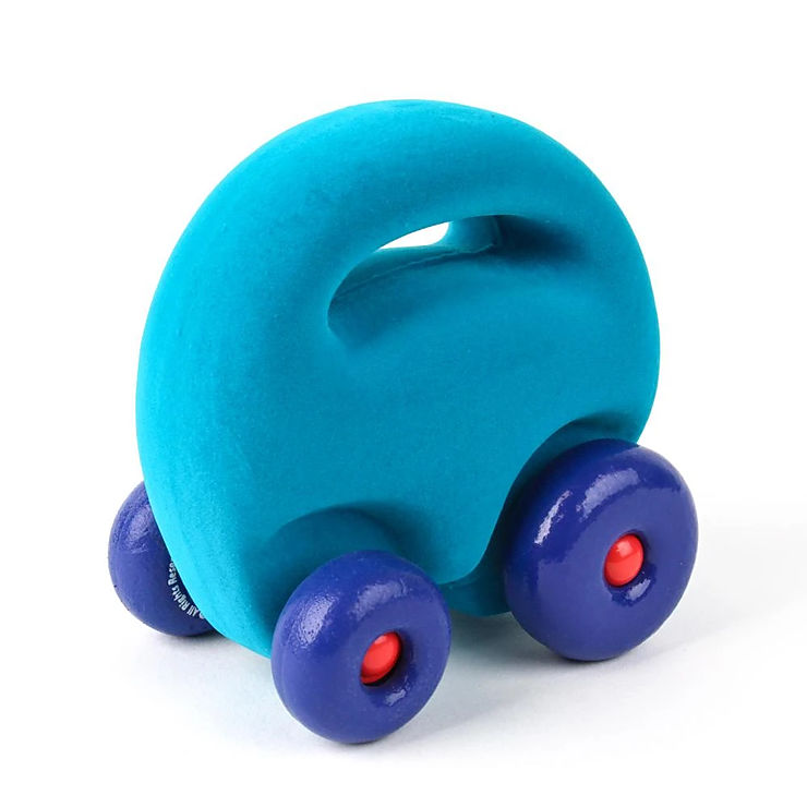
Over the years, Rubbabu logo has been received very well by the target audience. It has competed successfully in international markets with well known and established toy company logos. As the brand grew and the logo gained recognition, designers at the company created a ‘mascot car’ inspired by the logo. Rubbabu is now a popular, globally recognised and respected toy brand.
NOTE: Kindly also see the related article Rubbabu ‘Water World’ Play Mat Design
Copyright Notice
Rubbabu is a registered trade mark of Rahul Butalia and licensed to Iseo Chemdis Pvt Ltd, India. All designs featured in this article are copyrighted and may not be reproduced.
