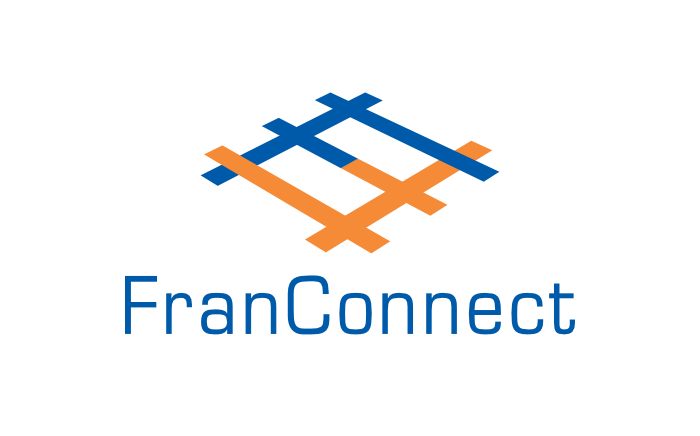
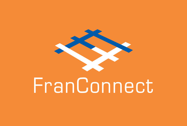
Logo for FranConnect Inc. and software was designed to visually depict the idea or proposition of a harmonious franchisor–franchisee network.
Background and Requirement
FranConnect is one of leading software based franchise management systems in the world. It facilitates harmonious connections between franchisors and their franchisees, enabling them to carry out a wide range of functions including operations, sales and marketing.

Design of a logo for FranConnect was commissioned in 2003, at the inception of the company of the same name. The client wanted the logo to visually depict the franchisor–franchisee relationship or connection which the software helps to forge and nurture. That FranConnect was a technology company also had to be kept in mind while designing the logo.
Design Rationale
The designer worked on and presented several logo options based on the proposition. The one approved by the client comprised of a pictorial mark formed by combining two F (for FranConnect) letterforms.

Logo Symbolism
In the mark, the two F letterforms — representing the franchisor and the franchisee — were simply connected to visually depict FranConnect’s proposition. The graphic, rendered in perspective, looked like a matrix formed by the coming together of franchisor and franchisees. It symbolised a network of endless possibilities, opportunities and growth.
While the logo appeared abstract at first glance, its meaning or symbolism could be quickly deciphered by the eye.

Typography
The pictorial mark was combined with the name of the software / company into a logo unit or combination mark, which the client was urged to use with consistency on all printed and online communication. The name FranConnect was composed in the classic geometric sans-serif typeface Eurostile, owing to its technical, futuristic and functional feel, and excellent legibility.
Colour Scheme
The logo was dressed in two complementary colours — Blue and Dark Orange. While Blue represented technology, Orange represented the energy and vibrancy often associated with commercial / retail franchising. The warm (dark orange) and cool (blue) colour combination also symbolised people to people connections and achievement of their goals through the power of technology.
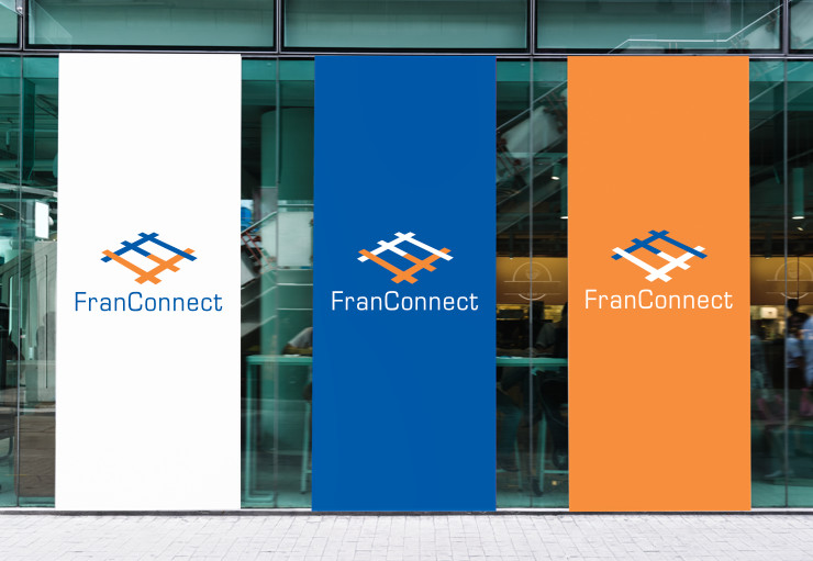
The logo was often used in reverse on blue background, which helped to enhance or reinforce the brand look without using any extra visual elements.


The logo could also be used on an orange background in cases where extra vibrancy was required. For example on posters for trade shows.
Conclusion
FranConnect logo visually depicted the proposition of a franchisor–franchisee network in a clear, intelligible yet distinctive manner. Its overall look and feel was appropriate for a technology company.
—
KINDLY NOTE: Since the logo was designed (in 2003), the ownership and logo of FranConnect have changed. This article, therefore, is about the old or older FranConnect logo.
Photo Credits
- Illustration about franchising courtesy Lukpedclub W on Vecteezy
- Photograph of brands courtesy Jose Francisco Fernandez Saura / Pexels
- Technology background image courtesy Pikisuperstar / Freepik
- Paper texture on photo frames courtesy Augustine Wong / Unsplash
- Office worker using a computer and logo in alternating colours images / mockups courtesy Rawpixel / Freepik
