A four page brochure designed for Diversity and Equal Opportunity Centre advocated the proposition of an inclusive world in a positive, vibrant and dignified manner. Several accessibility features were incorporated in it.
Background and Requirement
Diversity and Equal Opportunity Centre (DEOC), is one of the pioneers of integrated end-to-end services in the domain of disability inclusion in India. It was founded on the fundamental belief that persons with disabilities have equal rights and responsibilities, as all other citizens. The organisation strives to promote equal opportunity and inclusion in all spheres of life.
DEOC works in areas of education, employment, accessibility and technology. It provides consultancy, advocacy, research and training services to corporates, nonprofits, institutions and international agencies.

In 2019, DEOC commissioned the design of a 4 page brochure featuring its profile, to inform prospective clients about the organisation’s offerings / services and accessibility regulations. In the brief, they mentioned that instead of images relating to disability, neutral and positive visuals / illustrations should be used.
Design Rationale
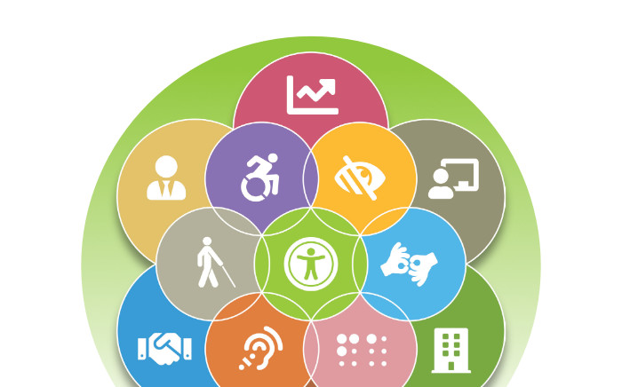
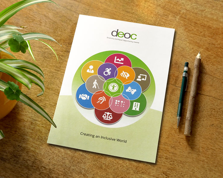
Upon receiving the first draft of the content from the client, the designer researched possible visuals that could support it and depict the proposition. Image of a wheelchair icon led the designer to a repertoire of icons about accessibility on the Font Awesome website. Neutral, pleasant and unambiguous, they seemed appropriate for use in the brochure.
Seed of Life Illustration and Symbolism
The icons — encased in brightly coloured circles — were arranged in the classic Seed of Life pattern, which symbolises interconnectedness in life. The illustration, in this context, suggested an acceptance of the differently abled in all aspects of life.

In the illustration, the Universal Access icon was kept in the middle and icons about different aspects of accessibility were placed around it. A third, outer layer was added to the illustration. It consisted of icons relating to business, productivity and regulations. This layer portrayed DEOC’s core principle of helping the differently abled talent integrate into mainstream business and society. Overall, the illustration looked vibrant and positive.
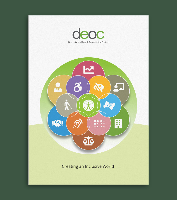
Cover Design
The illustration was encased in a circle representing the planet, which visually depicted DEOC’s tagline Creating an Inclusive World.
Design of Brochure Pages
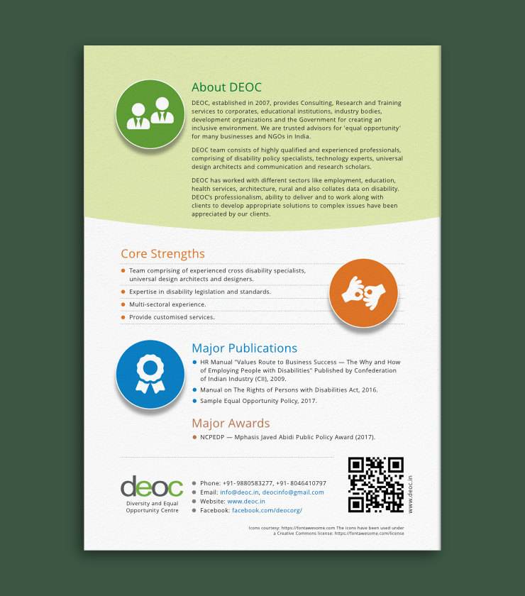
Icons inside brightly coloured circles — introduced on the cover as a conceptual assemblage — were also placed in the following pages. They supported relevant brochure content and acted as anchors or focal points to guide the eye around the layout. Consistent use of round shapes / circles throughout the brochure layout was inspired by the Inclusive World tagline.
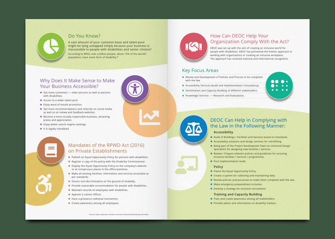
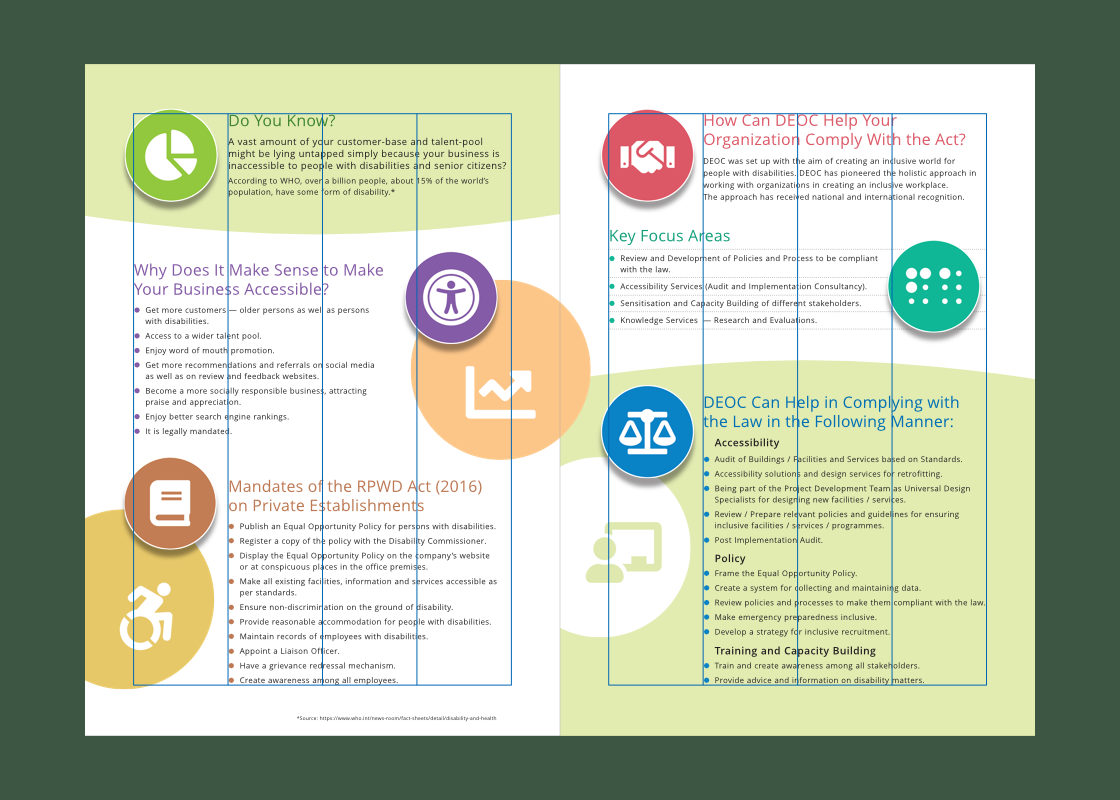
Content was laid out in a disciplined but non-static manner. A four column grid was used to arrange the elements. Type sizes of headers and paragraph / body text were consistent across different sections of the brochure.
Colour Scheme
Vibrant colours in the seed of life illustration on the cover were also used for icons on the following pages. Colour of each header matched / related to the colour of each icon. Light green colour — a hue of the green in DEOC logo — was used in the background of key sections to get additional focus into the layout and to subtly reinforce the brand colour.
Brochure Accessibility Features
The brochure design took into consideration key accessibility features, as follows:
- In the layout, key visual elements (including text) had a healthy contrast ratio. All content was laid out with clarity. There were liberal gaps or negative spaces between different sections of content, allowing them to be easily identified by users with weak eyesight.
- The typeface Open Sans — which has good legibility — was used to compose all text. It was given extra tracking and leading and font sizes were carefully selected, again to help readers with weak eyesight.
- An electronic (PDF) version of the brochure was also created. It was tested for correct reading order and Alt text was provided for relevant images / icons. These additional features were meant to assist blind users using text-to-speech or screen reading softwares to comprehend all the content including visual depictions.
Technical Notes
The A4 (closed) and A3 (open) size, four page brochure was printed front and back on a single sheet of paper, in four colour digital offset, in the exact quantity required by DEOC.
In Essence
Overall, the brochure had a modern, professional and confident feel. It presented the content with clarity and consistency. The visual treatment helped to support the text and depict DEOC’s proposition of An Inclusive World in a vibrant yet dignified manner, with due consideration for the organisation’s sensitive area of work.
Related article: Logo Design for DEOC
Graphics and Photo Credits
- Font Awesome icons were used in the brochure under a Creative Commons Attribution 4.0 International license
- Photograph of wheelchair sign courtesy Markus Spiske / Unsplash
- Paper texture on brochure layout courtesy Augustine Wong / Unsplash