Case study about the design of a distinctive, modern and elegant logo for a restaurant in Jaipur, and how it went on to define the brand’s visual language.
Background and Creative Brief
Indian Spice is one of the leading vegetarian restaurants in the heritage city of Jaipur (Rajasthan), India. It is known for its quality North Indian cuisine prepared using authentic recipes and ingredients sourced with care, served in an elegant, modern and formal ambience.
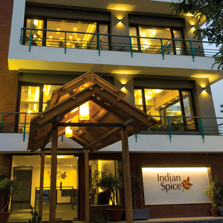
Design of a logo was commissioned prior to the launch of the restaurant, in 2006. Highlight of the brief received from the client was that the logo should look clean, be elegant and simple or uncomplicated.
Design Methodology
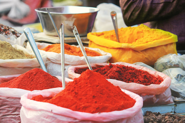
Proceeding from the brief, design research for the logo considered different aspects related to the restaurant like menu items, interior design, target audience and of course spices, of which India is the heartland. Logos of established restaurants in the city and of some others falling in the same category were analysed as well. The client also very generously invited graphic and interior designers to try several scrumptious dishes before the restaurant’s launch.
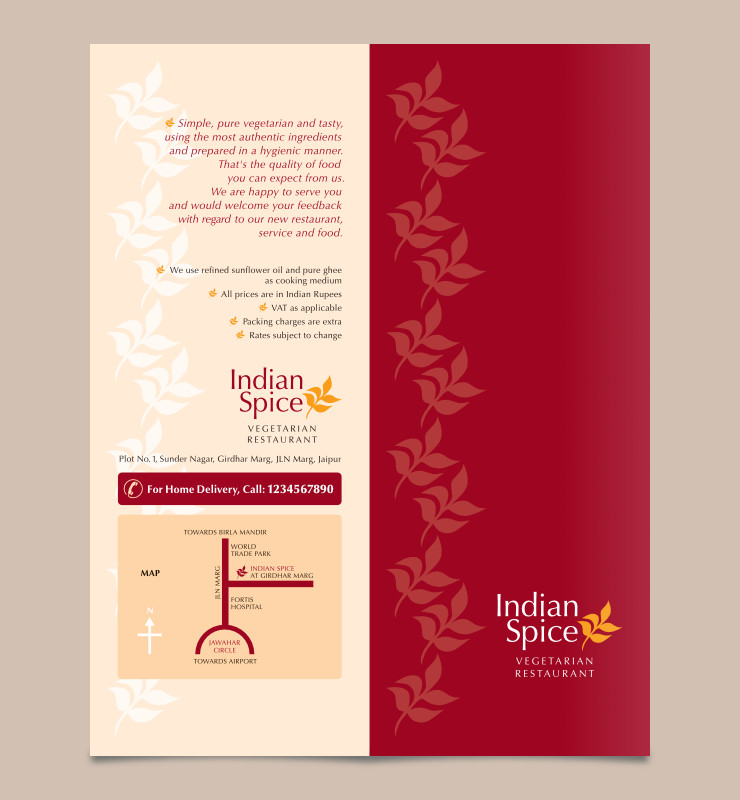
From the several logo design options presented to the client including a few with illustrations of spices, the one they liked most was a combination of the restaurant name set in an elegant typeface and a leaf graphic shape.
Logo Typography
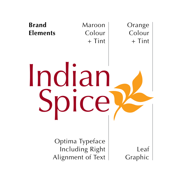
The letters were composed in the clean and elegant humanist sans-serif typeface Optima, the visual feel of which seemed to go very well with the characteristics of the restaurant. Set in Optima, the name looked clean (an important aspect for a restaurant), delicate like food (and not hard), authentic, inviting and had a formal touch with good legibility. The modern and sophisticated feel that Optima lent to the logo helped set it apart from logos of some of the established or traditional restaurants in the city.
Leaf Symbol
The typography was clubbed with a leaf graphic to constitute a logo unit or a combination mark. The leaf — traced from one of the reference images of spices collected during the research phase — symbolised or suggested vegetarian and represented vegetables and spices. Connotation of the leaf with healthy eating was a bonus!

Logo Colour Scheme
Maroon and Orange colours were used to dress the logo. Both have auspicious connotations in India. Maroon is often used or worn (particularly by ladies) on formal occasions and is associated with richness and hospitality. Orange is believed to symbolise purity in India and is also the colour of several ground spices. The colour scheme was also inspired by images of North Indian spices and curries.
As both Maroon and Orange hues fall on the same side of the colour wheel, their analogous combination added strength to the otherwise minimalistic logo and helped in the creation of a strong visual identity for Indian Spice.
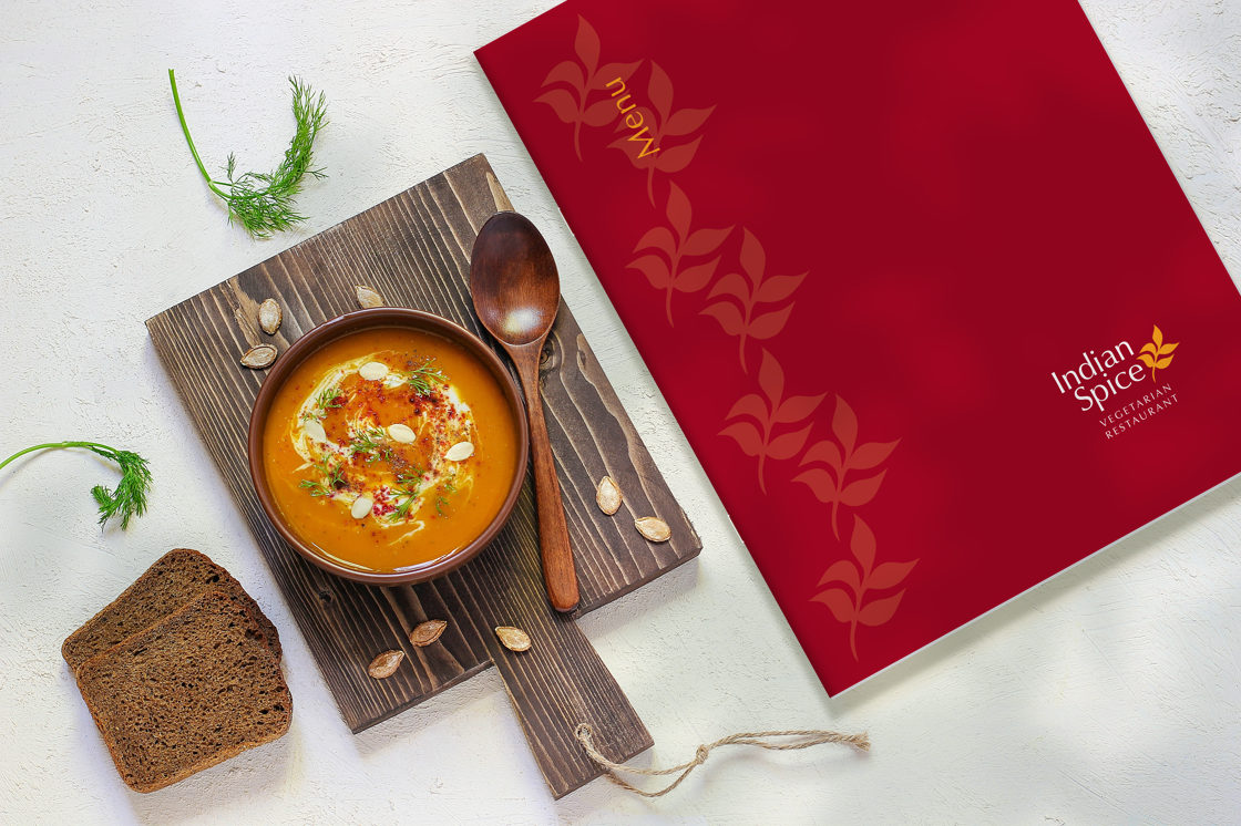
The tagline Vegetarian Restaurant was added to the logo unit. In a part of the world (North-West India) where a sizeable chunk of the population is vegetarian and many choose to visit eateries that serve vegetarian food only, this was very important.
Technical Notes
Owing to its simplicity, the logo was easy to print or reproduce in small as well as very large sizes, carved in stone and fabricated in metal for exterior signages. It could also be easily screen printed.
A Grayscale version of the logo for reproduction in single colour or black and white was also submitted to the client.
Brand Identity and Visual Language
As communication design work for Indian Spice started after its launch, the logo paved the way to establish a visual identity for the restaurant. The logo including its right alignment, the typeface or font, the leaf graphic and maroon and orange colours along with their tints, went on to define a visual language for the brand; in other words they became brand elements.


In Essence
The logo not only became an identifier for the restaurant, but helped it stand out from the competition. It also paved the way for creation of a strong brand identity — thanks to the management’s efforts to uphold high standards of food and hospitality and use the brand elements with consistency across all visual communication.
Also read the article Indian Spice ‘We Are Moving’ Poster Design
—
KINDLY NOTE: Management and location of Indian Spice restaurant have now changed. Contact information provided in the layouts is not accurate. All designs featured in this article are copyrighted and may not be reproduced.
Photo Credits
- Photograph of ground spices courtesy Akhil Chandran on Unsplash
- T-shirt mockup courtesy Freepik.com / atlascompany, Rawpixel.com / Roungroat
- Pizza box mockup courtesy Mr.Mockup / MockupTree
- Photograph of soup on a table © Copyright, Husniyye Mammadova, Azerbaijan_stockers, leaves shadow on soup image by kjpargeter, photograph of spices and condiments around logo, and photograph of plate with cutlery, courtesy Freepik.com