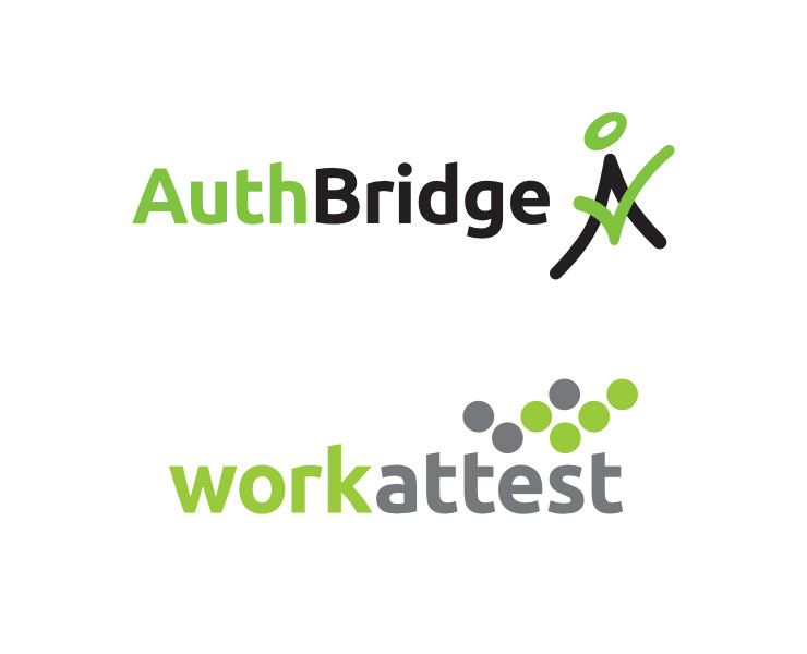
Logo for an online employee verification service in India was designed to depict its key proposition visually. It was given a digital look and a positive feel.
Background and Requirement
WorkAttest is a web based, automated and secure background screening platform in India. Using advanced technology, it offers a dedicated, automated repository of ex-employees to deliver quick and efficient verification for employment purposes.
Design of a logo for WorkAttest was commissioned in 2016, by its parent company AuthBridge — one of India’s leading background screening / verification firms. Key points mentioned in the creative brief were that the logo should depict digital verification and its colour scheme should sync with colours of AuthBridge logo (which, at that time, were black and green). The product’s core target audience was HR (Human Resource) managers in India.
Logo Design Rationale
Basis the creative brief received, a bit of research into entities engaged in similar area of activity was done. Their logos and the online verification space in India was understood. Subsequently, several design options were explored by the designer and presented to / discussed with the client.
The option or concept finalised by the client was based on two tick marks forming a ‘W’ (for WorkAttest) shape.
Development of the Pictorial Mark
The approved conceptual sketch was worked upon and several variations were tried. It was developed in stages.
The version of WorkAttest graphic or pictorial mark finalised had a strong digital look.
The graphic, at first glance, looked like an abstract arrangement of dots, but the overall shape of two overlapping tick marks soon revealed itself. Gestalt principles of visual perception — in this case similarity, proximity and figure-ground relationship — were effectively used to compose the logo.
Quite simply, the pictorial mark suggested digital or online verification. The thick dots in it symbolised and represented a database (of employees). Overall, the graphic had a strong sense of momentum and dynamism, and appeared positive and futuristic — apt for a technological solution.
The Combination Mark and Typography
The graphic was combined with the logotype — ‘WorkAttest’ written in english language — to constitute a combination mark logo. It was placed asymmetrically, towards the top right of the logotype, to reinforce its sense of dynamism.
The typeface Ubuntu was used for the logotype owing to its clarity but also for the sake of consistency with the parent company (AuthBridge) logo — which, at that time, was set in the same font. In all lowercase, the logo expressed a sense of ease. In terms of visual to verbal ratio, words dominated the logo to which the graphic added interest and meaning.
Logo Colour Scheme
The logo was dressed in a soft colour combination of yellow green and grey. The colour choice was deliberate as these were softer hues of the (older) AuthBridge logo. In terms of colour symbolism, green symbolised trust and green signal (upon verification), and grey symbolised (unbiassed) neutrality and secrecy.
Technical Notes
Upon finalisation, artwork files of the logo, for accurate reproduction in print (including two colour or screen printing) and on digital screens were submitted the client. They included a version of the logo in grayscale, for reproduction in single colour or black and white.
In Essence
WorkAttest logo visually depicted the proposition of online digital verification in a clear, dignified, positive and confident manner. It was strong enough to enable development of a visual identity for the verification service (a requirement in the creative brief). And yet, it did not overpower the parent company logo.
The pictorial mark was strong enough to be used independently, when required.
Postscript
A few years after the logo was designed, its colour scheme was updated to be in sync with AuthBridge’s new visual identity.
Copyright Information
© Copyright AuthBridge Data Services Pvt. Ltd., Gurgaon, India. All Rights Reserved.
Photo Credits
- Background image in App icon mockup courtesy Patrick Schöpflin / Unsplash
- Background in login screen mockup courtesy Gradienta / Unsplash