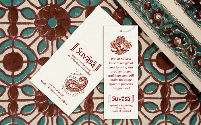
Case study about the design of a cohesive system of tags for a well respected and growing hand block printed apparel and furnishing brand in India.
Background and Requirement
Suvasa is a Jaipur (Rajasthan), India based apparel and furnishing company that creates ethnic contemporary textiles. The fashion house specialises in using natural fabrics that are printed using natural dyes with traditional block printed motifs, and fabricated in-house. Their wide and exciting product range — available online and at retail stores in major Indian cities — has a distinctive, beautiful style: a blend of traditional, modern and chic.
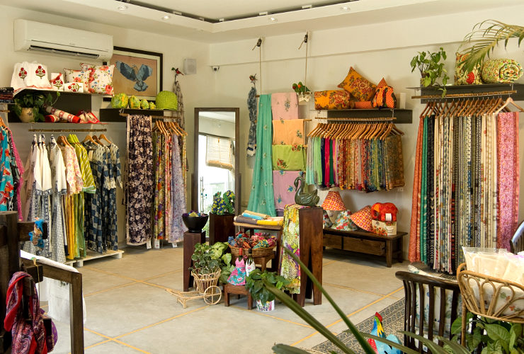
Cloth labels stitched to apparel and furnishing products contain limited information and often get hidden. Tags, however, are tied / attached to almost every product sold and usually reach customers homes. For a clothing company therefore, tags that accompany products are a very important aspect of communication as well as branding. Having grown at a fast pace since inception, Suvasa’s tags were initially designed in a spontaneous manner and appeared by and large inconsistent. They made use of a range of fonts, colours, styles and paper.
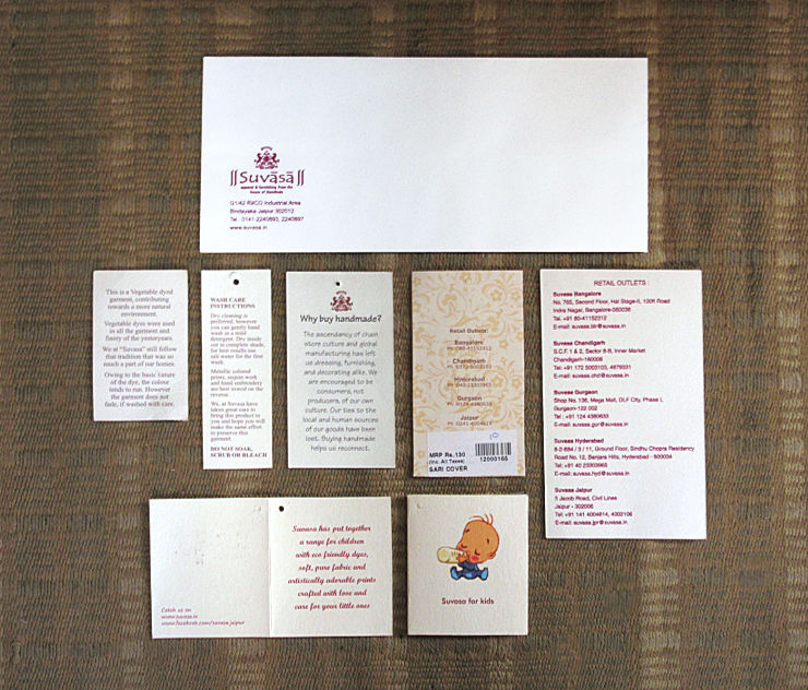
In 2016, Suvasa felt the need to have a cohesive system of tags and commissioned their design. Since the tags were required in large quantities, they had to be printed cost-effectively.
Development of a Brand Style Guide
The design exercise started by studying Suvasa’s brand elements and existing communication material. It was proposed that a quick reference brand manual be made wherein essential brand elements and styles could be defined, to facilitate a consistent look and feel in Suvasa’s printed, outdoor and online communication in the long run.
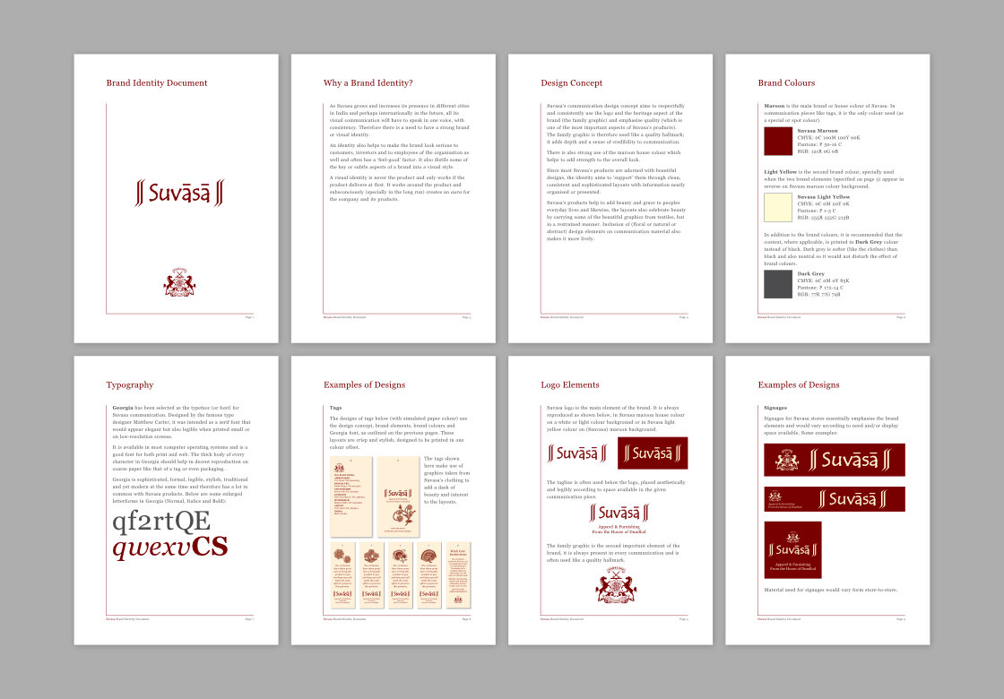
A brand manual / style guide was developed and fine-tuned as some of the initial design assignments were undertaken for Suvasa. It defined the main brand assets including Suvasa logo and crest, colours (Maroon house colour and Beige) and also proposed a typeface to be used consistently.
Apart from the Suvasa logo which used a custom font, only one typeface was proposed in the brand style guide: Georgia. This transitional serif typeface lent an elegant and formal touch to Suvasa communication. Its clarity and large x-height aided legible printing in small sizes and on rough / uncoated papers — an important aspect for tag designs. Georgia is also well-suited for use on digital screens.
Tags Design Rationale
The designer spent time at a Suvasa store, going through the products and took several reference photographs, including of printed fabrics and motifs on them. During the process, the sheer beauty of Suvasa’s products became apparent and it was decided to create a system of tags that:
- Supported (and not dominated) the products on which the tags were to be put
- Stood out in contrast to the printed motifs / designs of the products
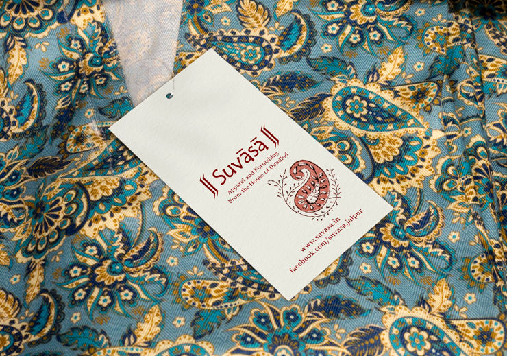
- Had a subtle element of beauty, in sync with the ethos of Suvasa products
- Subtly reinforced Suvasa’s branding
Use of Paper
As the tags were being designed, a range of paper types were explored. The process of finalising the tag sizes, paper and costing was made easier thanks to the proactive role played by the print production consultant.
Design of Main Tags
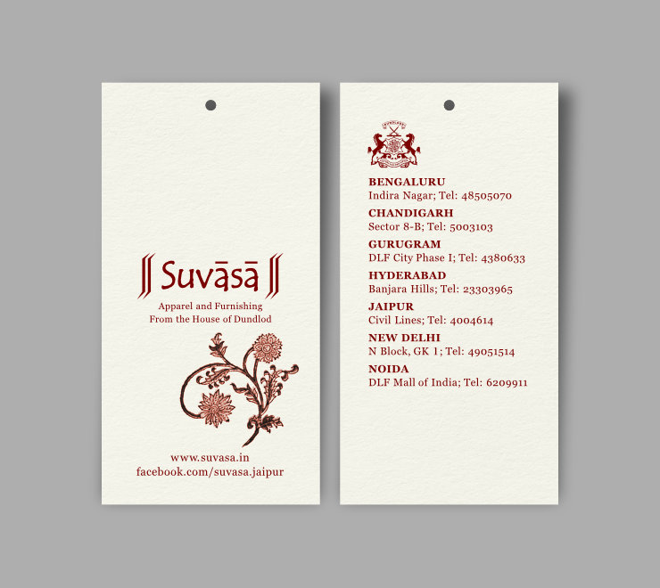
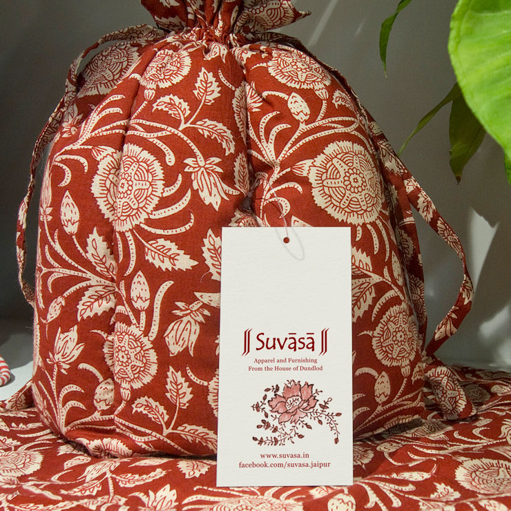
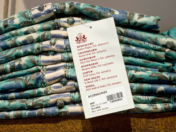
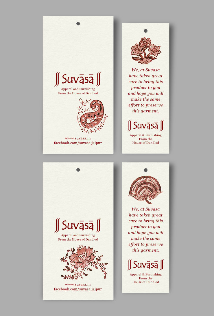
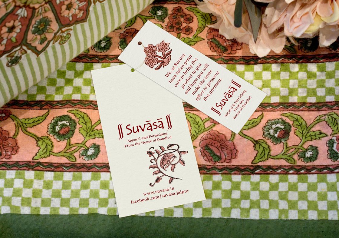
The main tags — which accompany almost every Suvasa creation — had branding (logo with the tagline: Apparel and Furnishing from the House of Dundlod) and website plus social media page details on one side. The other side had the Suvasa crest, store addresses and space for bar code. A motif borrowed from printed fabrics was also included in the front side to add a subtle element of beauty and decoration to the tags.
Multiple Motifs, Single Colour
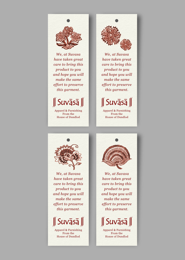
Since the finished or trim size of the tags was relatively small, the designer — in consultation with the client and printer — decided to create tags with four different motifs (for the front side). This was easily done by placing four artworks adjacent to each other in the print ready file and including a different motif on each. This prevented each and every tag from looking the same, without increasing printing / production overheads or cost.

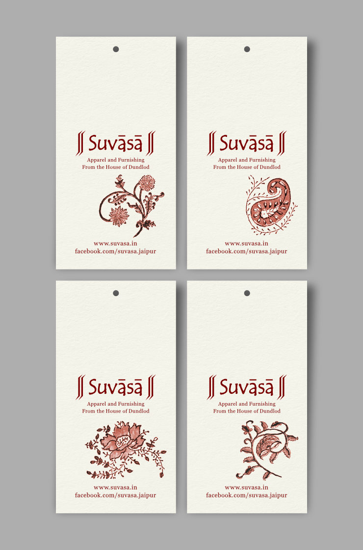
The tags were printed in single colour offset, using Suvasa Maroon house colour. The maroon subtly reinforced the company’s brand identity. Single colour made the print job cost effective.
Design of Wash Care Tags
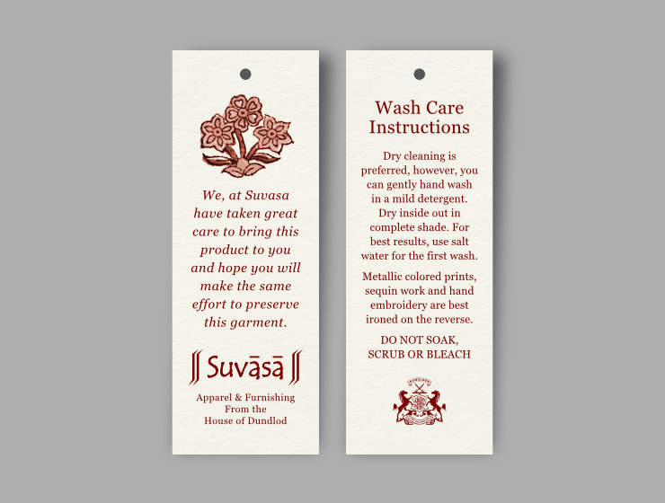
Along with the main tags, slightly smaller Wash Care tags with washing and handling instructions were also required. They carried the company logo (with tagline) and a message on the front side, and instructions and Suvasa crest on the flip side. They were again designed basis the brand style guide and all together used four different motifs. Their production method was similar to that of the main tags.
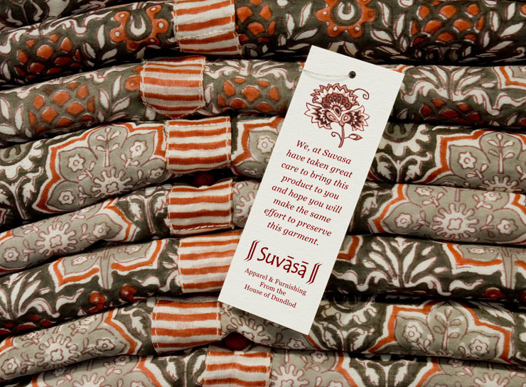
Main and Wash Care Tag Combinations
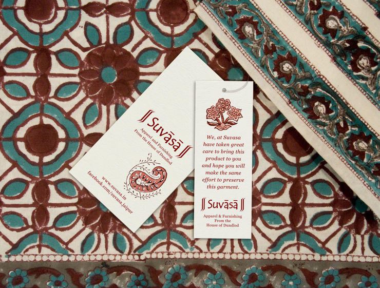
Main and Wash Care tags are often bundled with Suvasa products. With a range of motifs between the two tag types, a healthy mix of combinations could be put on products by the packaging teams in the warehouse. Customers browsing through or purchasing multiple products had a high likelihood of receiving product tags that did not look exactly the same.
Design of Handmade Tags
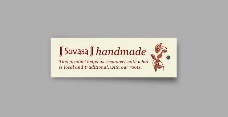
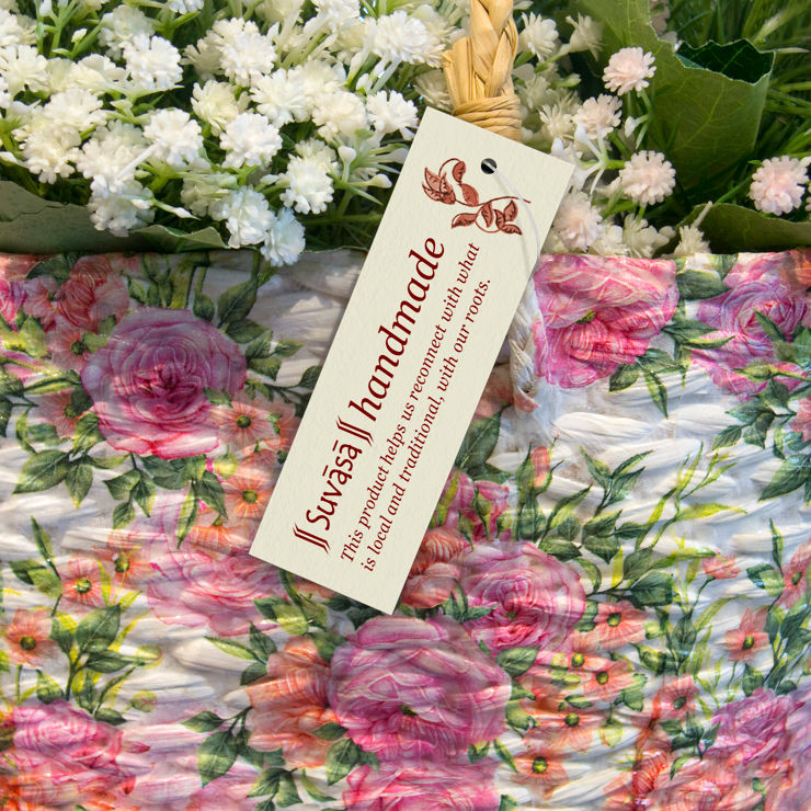
Suvasa’s range of handmade products, that are made using local and traditional expertise, had to be labelled as such. These smaller tags again made use of brand elements — the logo, house colour and typography (Georgia typeface) — and a simple motif of leaves. They were also printed in single colour offset on a slightly yellower paper.
Hand Block Printed Tags
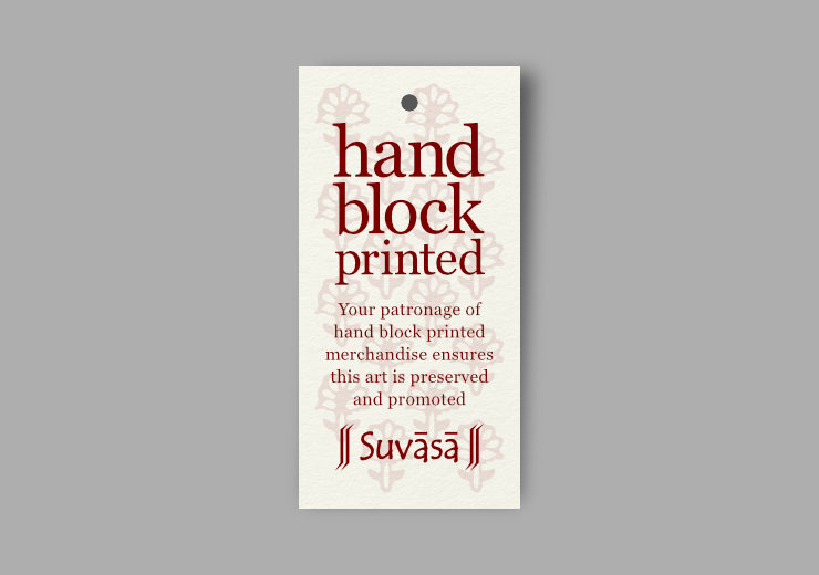
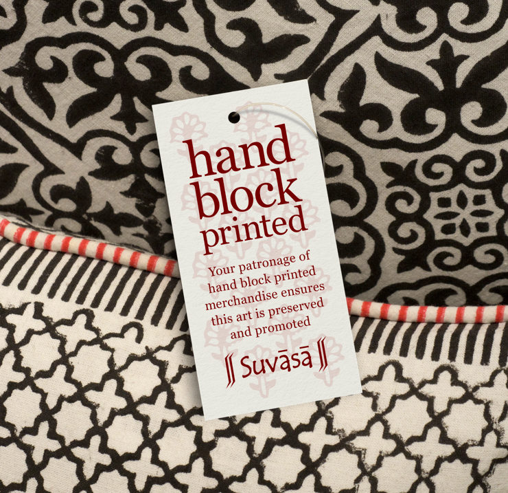
Design of tags emphasizing the tradition of hand block printing — that the city of Jaipur is known for — used large, block-like typography for the tag title and a repetitive flower motif watermark in the background. It was again printed in one / single colour offset.
Design of Natural Vegetable Dyes Tags
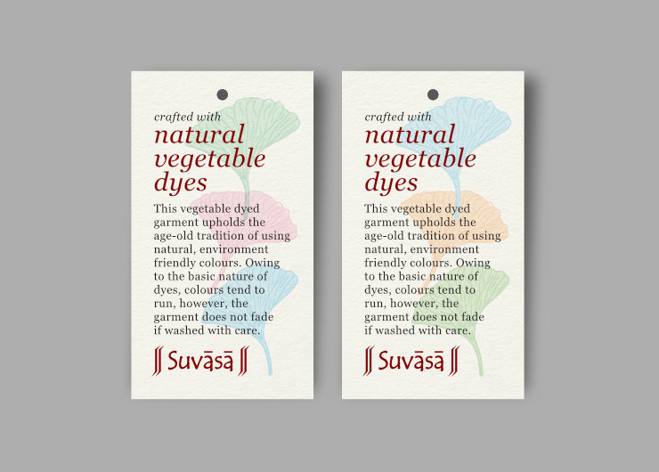
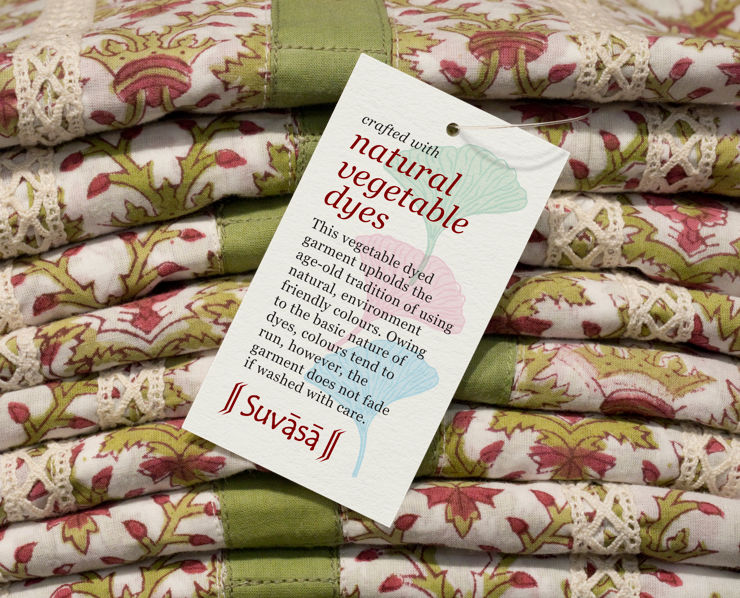
Tags highlighting the use of natural vegetable dyes carried subtle, colourful flower / vegetable like motifs in the background (like a watermark), borrowed from patterns on Suvasa fabrics. Here, the text crafted with natural vegetable dyes was set in italics and lower case, for a natural feel and to emphasise softness. In this case, colour was an important aspect so these tags were printed in four colour offset. Once again, owing to the small finished size, two different colour combinations for background motifs were printed without increasing any production overheads or cost.
Technical Details
Before work on any of the tag designs was started, the printer was consulted for tag sizes, paper type, printing specs and costing — which made the production experience smooth. A printing brief document (containing printing specs) was also prepared for every tag. No rounded edges or fancy die-cuts were made to the tags, which maximised the use of paper sheets and minimised paper wastage and cost. Editable and print ready artwork files were systematically archived to enable text changes and re-prints in the long run.
In Essence
Early understanding of Suvasa’s brand elements and creation of a style guide helped to design a cohesive system of tags to accompany the company’s stunning product range. Overall, they appeared elegant, had a strong brand feel and did not look like generic tags. They complimented and supported Suvasa’s creations and did not interfere with or dominate the product designs. Most of the tags — in single colour and in small sizes — could be printed economically.
Stay in Touch With Suvasa
If you’d like to stay updated with Suvasa’s beautiful creations and their ever evolving product range, you can follow them on FaceBook and Instagram.
Copyright Information
Suvasa logo, Suvasa crest, all product, fabric and tag designs featured in this article are copyrighted and may not be copied or reproduced in any manner. © Copyright, Suvasa (Jaipur, Rajasthan, India). All Rights Reserved.
Read related article: Gift Card Designs for Suvasa
Credits
- Print production: Mr. Deepak Kesari and the Multiplexus Offset team in Delhi
- Photographs of Suvasa store, fabrics and products © Copyright, Suvasa
- Paper texture on tag mockups courtesy Kues1 on Freepik.com
