Case study about the design of a logo and visual identity for European Union’s Resource Efficiency Initiative for India (EU-REI), based on the concept of a circular economy.
Background and Purpose
India’s robust economic growth has lead to an increase in resource consumption, including extraction of primary raw materials, dominated by minerals and metals. To foster efficient and sustainable use of the country’s natural resources, European Union’s Resource Efficiency Initiative for India (EU-REI) commenced in 2017. It aimed to support the country in implementation of United Nations global Sustainable Consumption and Production (SCP) agenda, facilitating adaption of international standards and best practices in Resource Efficiency (RE).

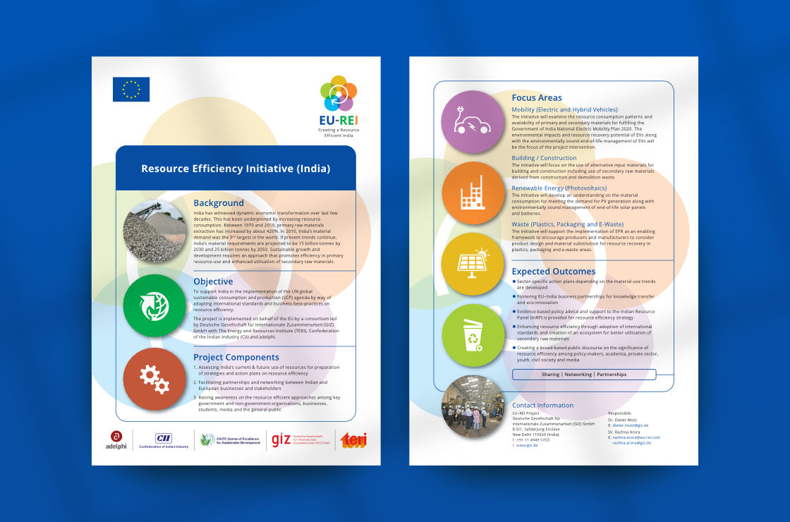
EU-REI project is being implemented on behalf of the European Union (EU) by a consortium led by Deutsche Gesellschaft für Internationale Zusammenarbeit (GIZ) GmbH, along with The Energy and Resources Institute (TERI), Confederation of Indian Industry (CII) and adelphi. The initiative aims to facilitate partnerships between Indian and European businesses and stakeholders on resource efficiency and circular economy. Primary sectors of interest being mobility, building and construction, renewable energy (photovoltaics), and resource recovery from waste (through use of policy instruments like Extended Producer Responsibility).
Design Requirement
Design of a logo for EU-REI was commissioned at the project’s inception, in 2017. The creative brief required the logo to visually depict the initiative’s core idea in a pleasant or positive manner. A visual identity style guide was also to be developed, to facilitate internal and external communication with a consistent look, feel and voice. The initiative’s target audience comprised of the government, private sector, academia, youth and civil society. The designer worked on the project in close coordination with the EU-REI team.
Logo Design and Development Process
Basis the creative brief received from the client, several logo options / concepts were developed by the designer.
Initial Logo Options and Feedback
The initial options comprised of ‘EU-REI’ set in all caps in a bold font, in EU Blue and India flag colours, together with simplistic graphics depicting efficiency and re-use.
After the first round of presentation, the client wanted to see more options based on the idea of a circular economy — which was technically and conceptually central to the initiative.
The client asked the designer to further work on / develop the second round of options.
The Approved Pictorial Mark Design
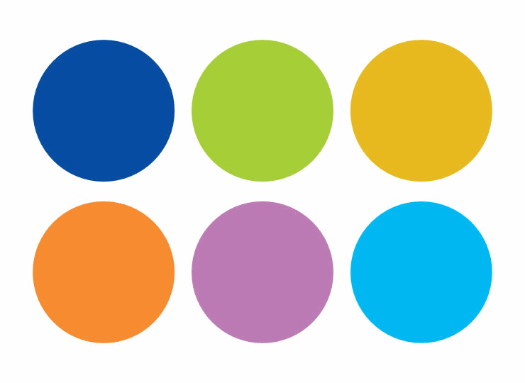
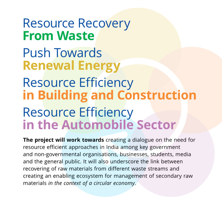
One of the logo options further developed by the designer was approved by the client. It comprised of a flower-like graphic or pictorial mark with five round petals symmetrically arranged in a circular formation. Each petal was in a different colour, suggestive of the sector it represented. The fifth petal (in sky blue) represented the larger concern for the environment.
In the graphic, the five petals overlapped one another — which depicted inter-linkages between the different sectors and the larger environment as a whole. A circular arrow placed over the graphic in a clockwise direction, like the recycling symbol, signalled and reinforced the idea of a circular process or economy. It was positioned to start in the green circle and end in the blue one (representing the environment).
Logo Colour Scheme and Symbolism
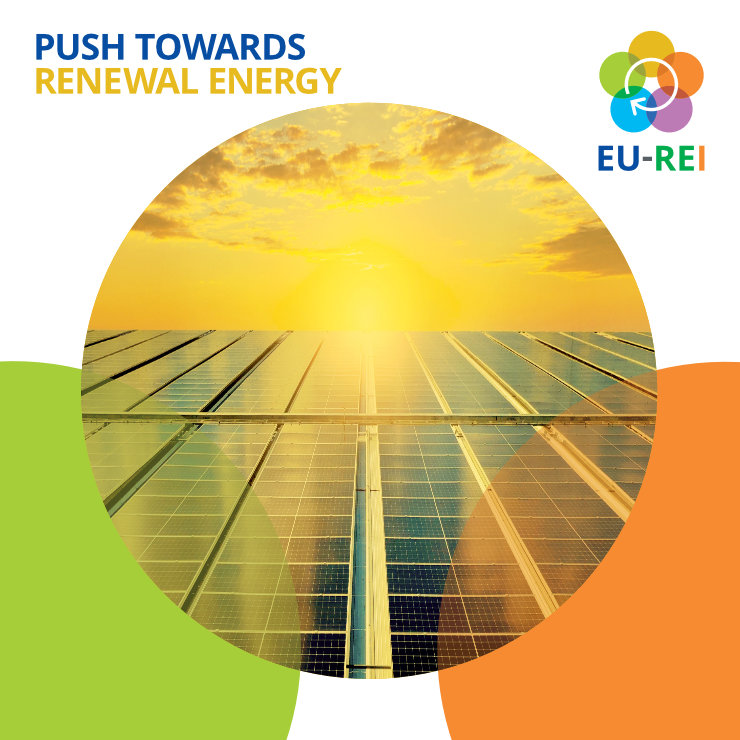
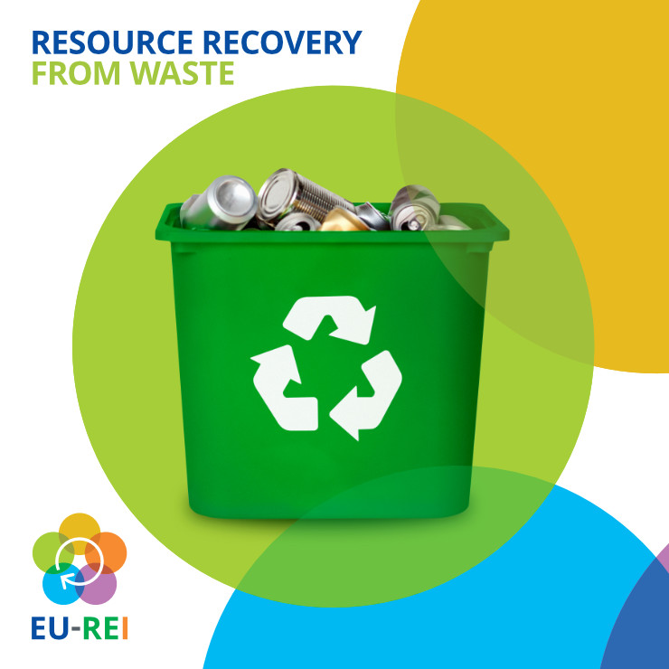
The sequence of colours used in the graphic was harmonious and faithful to the progression of colours in the colour wheel. Green represented resource recovery from waste (and regeneration). Yellow represented push towards renewal (notably solar) energy. Orange (the colour of bricks) represented resource efficiency in building and construction. Purple (inspired by flashy colours often seen on cars) represented resource efficiency in the automobile sector. Blue represented concern for the larger environment or the planet.
In terms of specifics, colour names and their breakups — in CMYK, RGB and Hex — for accurate reproduction in print and on digital screens, were as follows:
- Yellow Green: 40c 0m 100y 0k / 166r 206g 57b / #A5CE3A
- Yellow Ochre: 10c 25m 100y 0k / 231r 187g 32b / #E6BA20
- Orange: 0c 55m 90y 0k / 246r 139g 51b / #F68B33
- Medium Purple: 25c 60m 0y 0k / 189r 124g 181b / #BD7BB5
- Sky Blue: 80c 0m 0y 0k / 0r 185g 242b / #00B9F2
EU-REI Combination Mark
The pictorial mark was clubbed with the acronym ‘EU-REI’ set in the typeface Open Sans, in bold and in all caps. For ‘EU’, EU Blue colour (as per EU brand guidelines) was used. The hyphen was dressed in (neutral) dark grey. Green was used for ‘RE’ and orange for ‘I’, which were derived from colours of the Indian flag. The acronym, which also became the EU-REI logotype or wordmark, was positioned right below the flower graphic to constitute a combination mark logo.
The logo was also clubbed with the tagline Creating a Resource Efficient India.
Logo Artwork and Technical Notes
Once the logo was finalised, its artwork files were created by the designer, as follows:
- A highly accurate and symmetrical mechanical drawing of the logo graphic was first created in vector format and tested in small and large sizes — on printouts as well as on the computer screen.
- Colour combinations were fine-tuned for faithful reproduction in print and on digital screens. For print, CMYK values were adjusted to a maximum of three inks per colour hue for bright reproduction.
- Several file types of the logo were created along with a ‘Read Me’ document which carried instructions on using them for different purposes.
The artwork also included a version of the logo in grayscale, for reproduction in black and white or single colour printing.
In Essence
EU-REI logo visually symbolised the initiative’s proposition in a vibrant, positive and neutral manner. Overall, it depicted recycling / regeneration and circular use of resources. Its interlinked components represented the sectors of interest as well as collaboration and partnerships. It also had a strong sense or feel of motion, energy, harmony and balance — the latter two being important aspects from an environment perspective.
EU-REI Visual Identity Style Guide
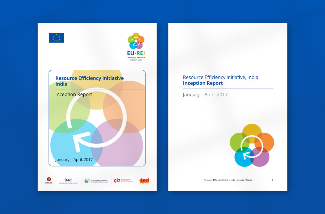
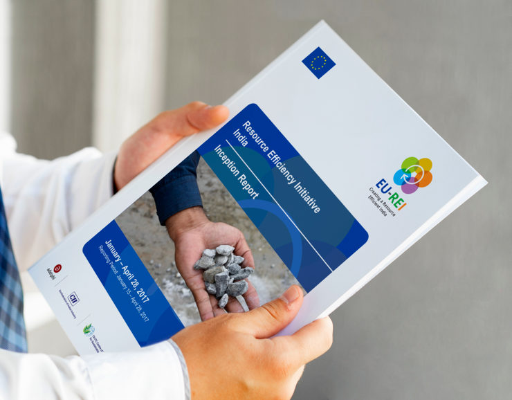
Work on a visual identity style guide for the initiative commenced as soon as the logo was finalised. The guide was meant to facilitate consistent look and feel in the project’s visual communication, including proper use of EU, EU-REI and partner logos. As part of the assignment, several design templates were also required using which technical experts, policymakers and partners / stakeholders could make presentations and publish papers. Keeping this in mind, EU-REI visual identity was kept simple and straightforward. A few template options were presented to the client and the style guide was developed basis approvals and feedback received.
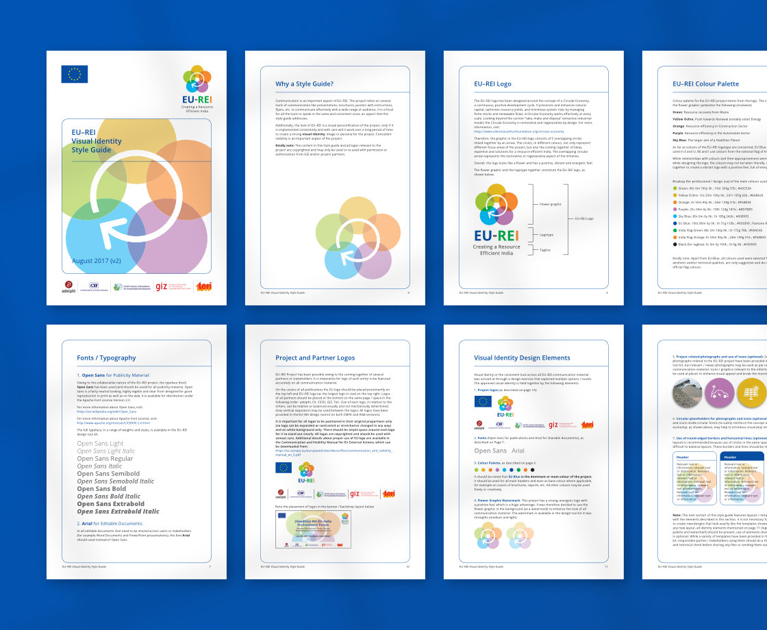
The style guide was essentially based on the logo. In terms of visual treatment, it took the circles (representing focus areas and the larger environment) forward and used them as placeholders for relevant icons and images to add interest, context and meaning to compositions. The idea of circularity / circular economy with reference to the planet was thus subtly reinforced.
Colour scheme and typography for the style guide were again derived from the logo. EU Blue colour was kept dominant and other colours from the logo were used where required. The open source humanist sans serif typeface Open Sans was chosen for its neutral feel, clarity and good legibility in both print and on digital screens. A watermark of the pictorial mark logo was also used in template backgrounds to add a hint of dynamism to (otherwise static) layouts and to capitalise on the logo’s visual attractiveness.
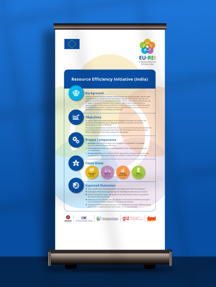
Templates for documents and presentations were kept clean and straightforward, to enable technical / policy experts to edit the text and use them with ease.
Copyright Information
All text, images and designs featured in this article are copyrighted and may not be reproduced or copied in any way. © Copyright 2017 EU-REI India, © Copyright 2017 Deutsche Gesellschaft für Internationale Zusammenarbeit (GIZ) GmbH. Logos of European Union (EU), The Energy and Resources Institute (TERI), Confederation of Indian Industry (CII) and adelphi used in the layouts are copyrighted.
Graphics and Photo Credits
- Font Awesome icons used under a Creative Commons Attribution 4.0 International license
- Photograph of open cast mine courtesy Vlad Chețan on Pexels
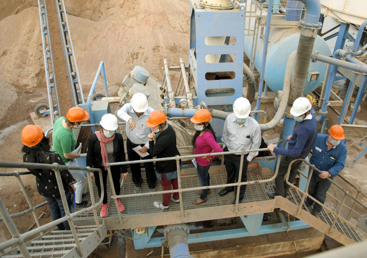
- Photographs of experts in the field, heaps of construction material and hand with stones courtesy and © Copyright EU-REI and GIZ India
- Images of presentation in a hall and slide background, and image of waste bin courtesy Rawpixel on Freepik
- Image of curtains in presentation background courtesy Starline on Freepik
- Image of solar panels courtesy on Tawatchai07 on Freepik
- Roll up poster mock-up designed by Vector_Corp on Freepik
- Project report cover in hand courtesy Image by Freepik on Magnific
Disclaimer
Colours from the India flag in EU-REI logo are for representational purposes only and not accurate.