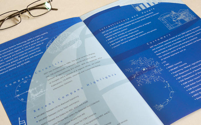
Scientific visual elements and the company logo were to used to weave together a brochure layout for GIST. It was given a strong brand or corporate look.
Background and Creative Brief
Global Information Systems Technolog (GIST) is India’s leading subscription agent and represents global Scientific, Technical and Medical (STM) publishers in the country. GIST plays a valuable role in enabling the delivery of scholarly content to academic and research institutions in India.

In 2006, during the first meeting to discuss the requirement of a 4 page corporate brochure for the company, the client shared with the designer their expectations and an outline of the content. They did not wish to have images about the company in the brochure and yet wanted it to have a strong corporate feel. That GIST represented international publishers and therefore scientific knowledge from across the globe was an aspect they hoped the brochure would also depict.
Design Rationale
During the ideation phase, the designer browsed through several scientific journals and collected random pieces of text along with references of scientific / technical illustrations. They were used to create two different layout options. The one the client approved had a background layer of scientific text and illustrations juxtaposed with a large globe graphic (from the company logo).
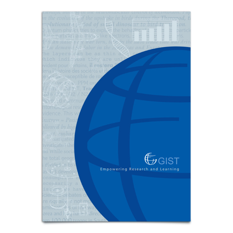
In the approved brochure layout, shades of dark blue colour (which related to the company logo) were contrasted with light grey or light steel blue to create a sober, predominant colour scheme. Scientific text and imagery were placed in a subtle, watermark style, as if they were present in the background while the company outlined its offerings. This visual treatment also supported the company’s tagline Empowering Research and Learning.
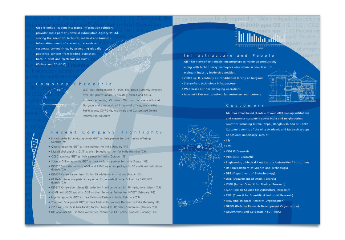
Complementary colour scheme was used across facing pages or sides of the brochure to get more focus into the layout. Use of the two dominant colours brought in a strong corporate look and the feel of technology. Text was loosely spaced to entail easy reading. Only one sans-serif typeface was used in the entire brochure.
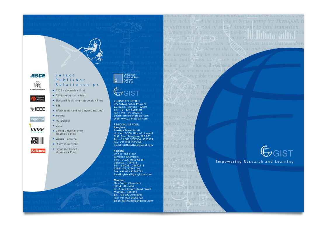
In Essence
The brochure helped to give a concise overview of the company and its offerings in an interesting, dignified and professional manner, along with a strong brand and academic touch. It was devoid of clichéd corporate imagery.
Technical Notes
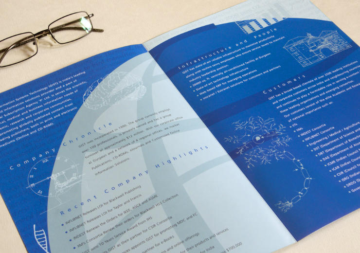
The A4 (closed) and A3 (open) size brochure was printed in 4 colour offset on 170 GSM matte paper.
—
Kindly note: Since the brochure was designed (in 2006), the logo and visual identity of GIST have changed.
Photograph of journals and notebook in a library courtesy Aaron Burden on Unsplash
