Consistent, vibrant and on-brand design of a nature themed and Eco-conscious products catalogue, helped to connect with and support WWF-India’s conservation mission.
Background and Creative Brief
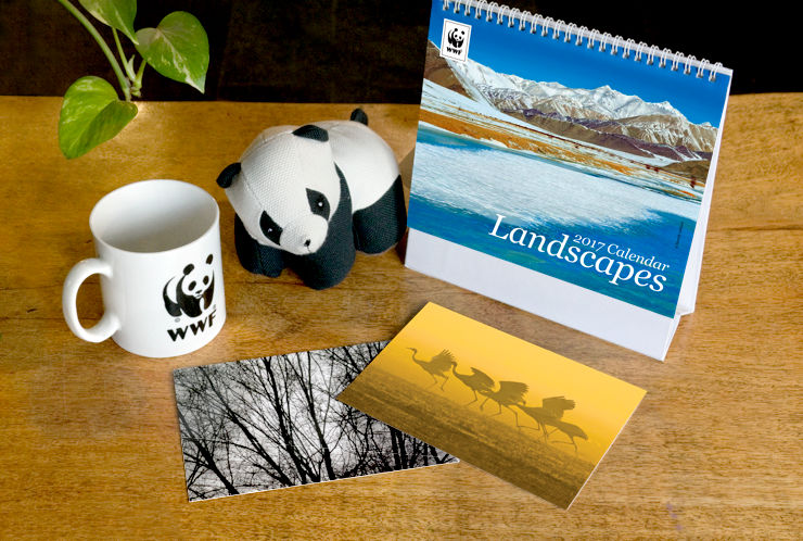
WWF (World Wide Fund for Nature) India is one of the foremost organisations working for the conservation of India’s wildlife and natural habitats. A wide variety of nature products are available at the WWF-India Nature Store, proceeds from the sale of which support the organisation’s conservation mission. They include Eco-friendly and Eco-conscious alternatives, stationery, clothing, camping gear, toys for children and environment education products.
To facilitate bulk orders for corporate houses and institutions, WWF-India brings out a catalogue of products every year. Design of the 2016–17 catalogue was commissioned in early 2016. In the creative brief received from the client, the catalogue had to clearly show, describe and categorise the products, stick to brand guidelines in terms of look and feel, and be economical in use of paper and printing cost.
Main Challenges
In the catalogue layout, all products and related information had to be arranged within a relatively small form factor or page size, with a sense of visual balance. The products had mostly been photographed individually — over a period of time — in varied angles and lighting conditions. In the catalogue however, they had to look like a family. These were some of the main challenges before the designer.
Design Rationale
The designer worked in close co-ordination with the WWF-India team throughout the design / development process of the catalogue.
Printing Specifications
At first, an economical paper size for the catalogue was finalised by consulting the printer. A Printers Brief document containing printing specifications was created basis which cost estimates were received. The document also ensured that the press was prepared well in advance for print production, without any last minute surprises.
Adherence to Brand Guidelines
WWF International brand guidelines were consulted basis which two catalogue layout options were created and presented to the client, one of which was approved. The layouts made use of brand / style elements like cover page template, fonts (WWF font, Georgia and Arial), typographic hierarchy and colour palettes or combinations.
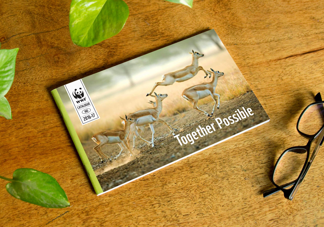
Design of the Catalogue Cover
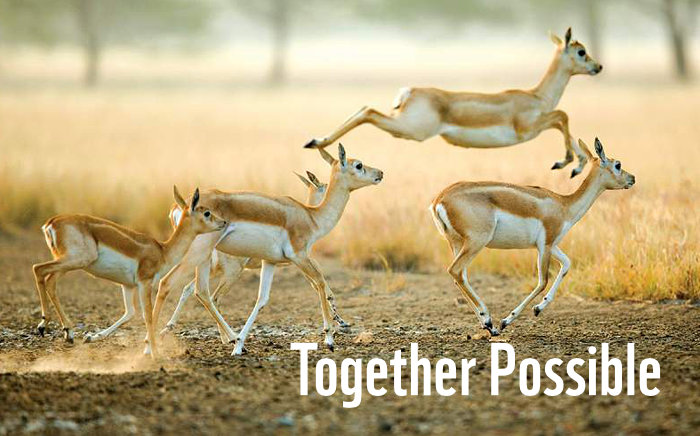
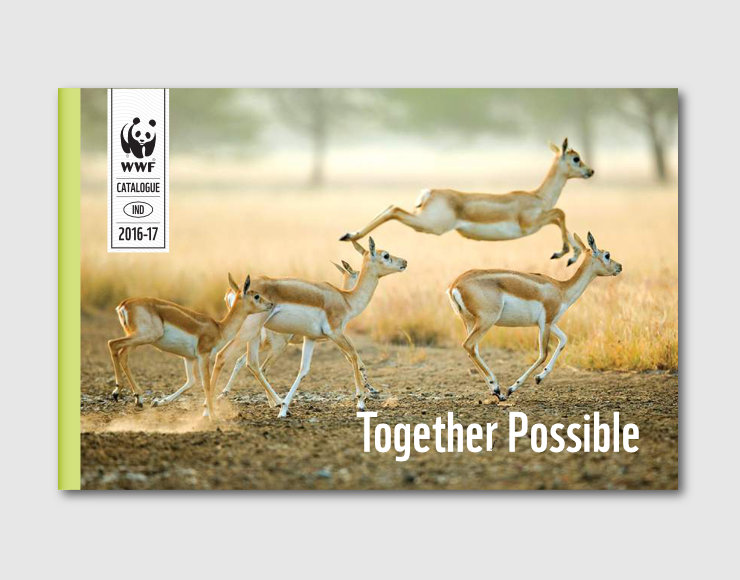
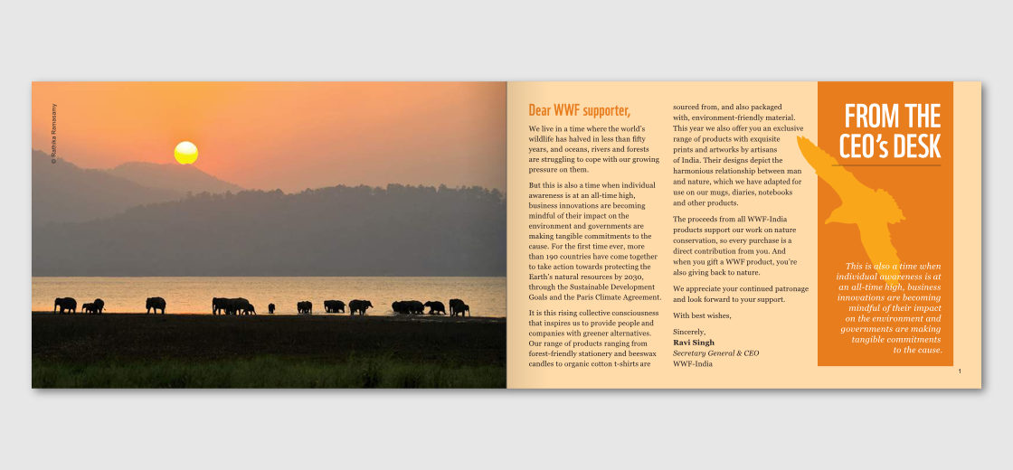
Catalogue cover was designed as per WWF publication guidelines and followed a template. A positive, thematic image of wildlife dominated the available space, along with a message of collaboration and working towards a larger purpose — Together Possible.
Categorisation of Products
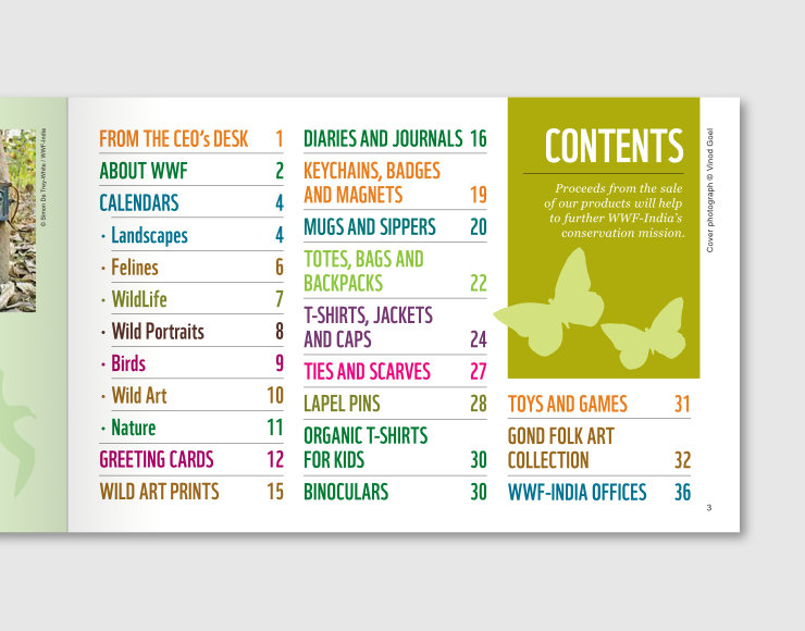
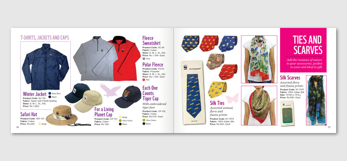
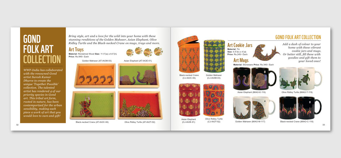
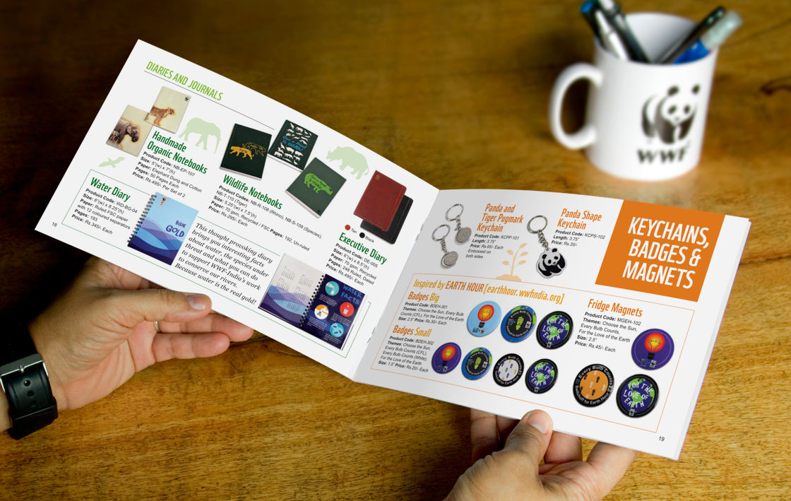
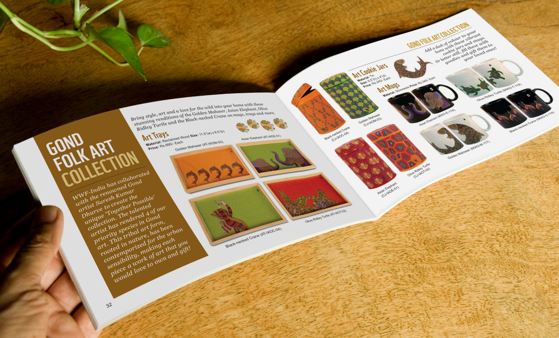
An important aspect of the catalogue was categorisation of products. WWFs wide colour palette came in handy in this regard. Each category was gives its own colour scheme, which was also visually marked in the table of contents page.
Design of Page Spreads
The catalogue’s compact form factor was a result of economisation of paper (and cost). In publication design, beyond the layout of individual pages, how the left and right (verso and recto) pages together — known as page spread — look, is an important consideration. This aspect was kept in mind while designing every page of the catalogue.
Page Grid, Organic and Balanced Layouts
A three column background page grid was used to arrange text and other visual elements in the initial pages of the catalogue.

The same grid was also used for tabs (coloured boxes) containing category headers and descriptions on product pages. However, as a wide range of products — which came in all shapes and sizes — and related elements had to be placed in a dense or tight manner, next to one other, the background grid could not be enforced. Several other grids were tried specifically for the product pages, but they did not work out.
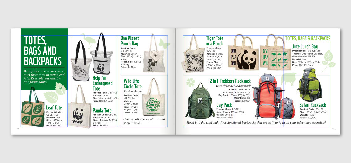
During the layout stage, products were placed in an organic manner on each page and their arrangement was fine-tuned in relation to one another. Nature related species silhouettes, often in light colours, were placed in empty or negative spaces to balance the layouts.
Use of Gestalt Principles
Catalogue layouts also made use of Gestalt Principles of Visual Perception, that help users to understand visual elements and related information on a page by means of structures and patterns. The following three Gestalt Principles were frequently used:
- Similarity: Font styles for product names and descriptions were similar or consistent
- Proximity: For every product, its image, name and specifications were in close proximity to one another
- Figure-ground relationship: Products were visible clearly as their cut-out shapes stood out against lighter / white backgrounds

Typographic Hierarchy
Typographic hierarchy is an important aspect of catalogue design. It often works subliminally and helps users to understand the content through emphasis / dominance, variation and consistency of text styles. Here is how the hierarchies worked in this case:
- Category names were in all caps (in WWF font) in large font size, category descriptions were in italics (in Georgia). They were placed within tabs or rectangular coloured blocks for emphasis or dominance.
- Theme names were also in all caps (in WWF font) in large font size, product descriptions were in italics as well (in Georgia).
- Running headers (that mark the continuation of a section) were in all caps (in WWF font), smaller size and in a lighter colour / tone.
- Product names were in smaller WWF font and product specifications were in smallest size in Arial font, owing to its good legibility.
Only four font or type sizes were used in the catalogue pages. Sizes of category headers and theme names, category and product descriptions, running headers and product names were the same, respectively.
Typographic hierarchies — including font choices specified by WWF brand guidelines — were instrumental in giving a consistent look to catalog pages, specially as the products were quite varied. They also helped to enhance the overall brand look.
Colour Schemes
Colour palettes or schemes, as specified in WWF brand guidelines, were liberally used in the catalogue. Different sections were dressed in different colour combinations, which also helped to make the catalogue appear vibrant.
For clothing, colour options — where applicable — were marked very simply, through use of coloured dots.
Technical Details
The catalogue was printed in four colour offset, in a finished (folded) size of 8.5 inches (with) x 5.5 inches (height), on FSC (Forest Stewardship Council) Certified paper. It consisted of 40 pages (20 spreads) in all, including cover and back cover.
In Essence
The catalogue design helped to categorise, organise and present a wide range of products and related information within a compact format. Its consistent layout structure allowed for easy understanding of categories and the products. Overall, it had a vibrant, positive feel and a strong brand look. Its nature theme and the products — most importantly — connected with and supported the larger and very important work of environment conservation that WWF-India does.
WWF-India Nature Products
A wide and exciting range of nature products are available at the WWF-India Online Nature Store. They help us connect with and learn more about nature, make Eco-conscious choices and most importantly: support WWF-India’s conservation mission.
Copyright Information
- Design of the catalogue and of all products featured in the catalogue layouts are copyrighted and may not be copied or reproduced in any manner. © Copyright, WWF-India. All rights reserved.
- WWF® and ©1986 Panda Symbol are owned by WWF. All rights reserved.
- © 1986 Panda Symbol WWF – World Wide Fund For Nature (Formerly World Wildlife Fund). ® “WWF” is a WWF Registered Trademark.
Photo Credits
- Photograph of Blackbucks on catalogue cover layout © Copyright, Vinod Goel
- Photograph of Elephants on catalogue introduction page layout © Copyright, Rathika Ramasamy
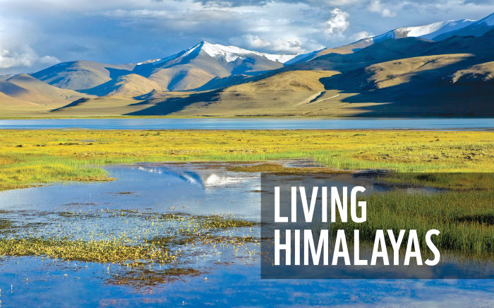
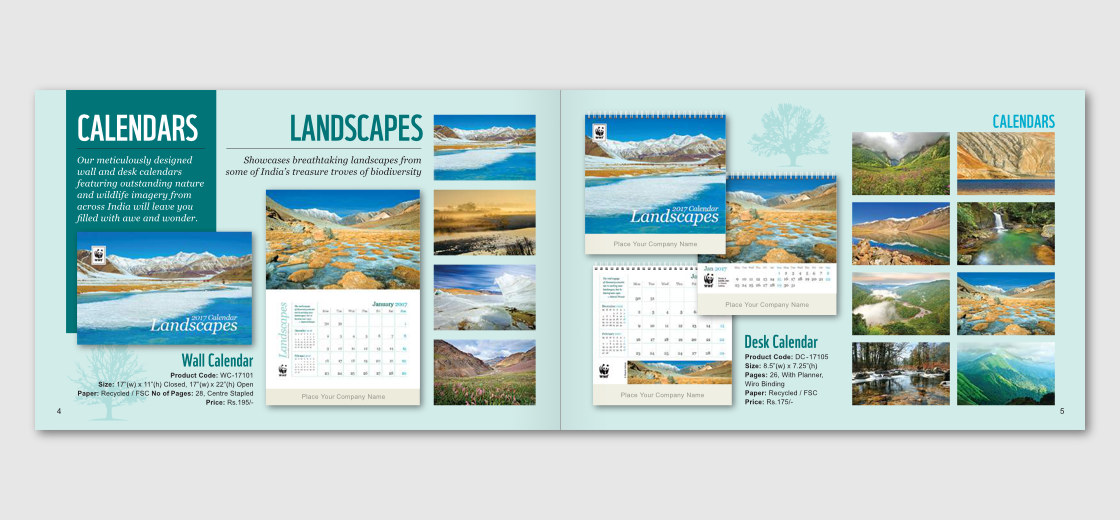
- Photographs featured in the Landscapes calendar layout / spread are the copyright of respective photographers: © Manish Lakhani, © Aruna Bhat, © Sunil Sachi, © Pratap J, © Soumyajit Nandy, © Souvik Chakraborty, © Radha Rangarajan, © Dipankar Ghose. Reproduced with permission from WWF-India.
Disclaimer
Availability, specifications and pricing of WWF-India products shown in the catalogue are subject to change.