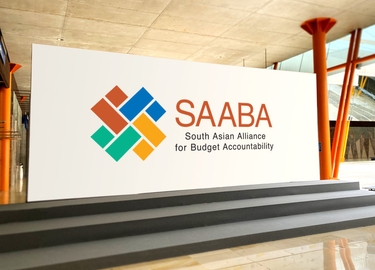
Logo for a budget accountability alliance was designed to depict its core idea in a clear, vibrant and formal manner. It also symbolised optimism, unity and diversity.
Background
For the purpose of strengthening governance accountability in the South Asian region, an alliance of civil society organisations engaged with budget analysis and advocacy was initiated in 2010–11 by the Centre for Budget and Governance Accountability (CBGA), New Delhi (India), with the support of Oxfam Novib.
Design of a logo for the initiative — aptly named South Asian Alliance for Budget Accountability or SAABA — was commissioned at its conception.
Design Rationale
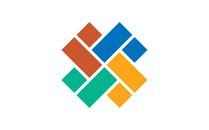
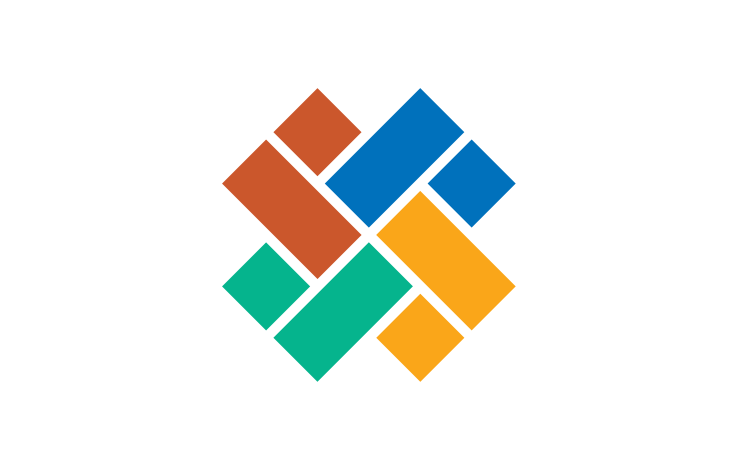
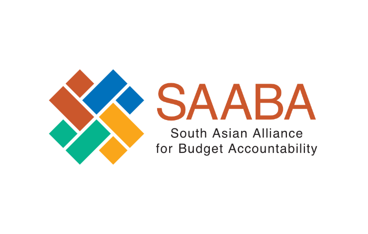
Of the several logo options presented to the client basis the creative brief, the one approved was a simplistic combination of bar graphs representing budget accountability. Four pairs of bar graphs, each in 1:2 proportion, were symmetrically grouped to create a strong pictorial mark or symbol suggesting alliance.
Logo Structure and Semantics
The bar graphs, appearing to be joining in from four different directions, suggested sharing and coming together of ideas and experiences from different regions — for mutual gain. Their diagonal arrangement gave the pictorial mark a sense of momentum or dynamism.

While the symbol appeared abstract at first glance, the bar graphs easily revealed themselves to the glancing eye. They seemed to be interacting or networking with each other. The overall graphic also looked like a fusion of two ‘S’ (for SAABA) letterforms.
Logo Colour Scheme and Symbolism
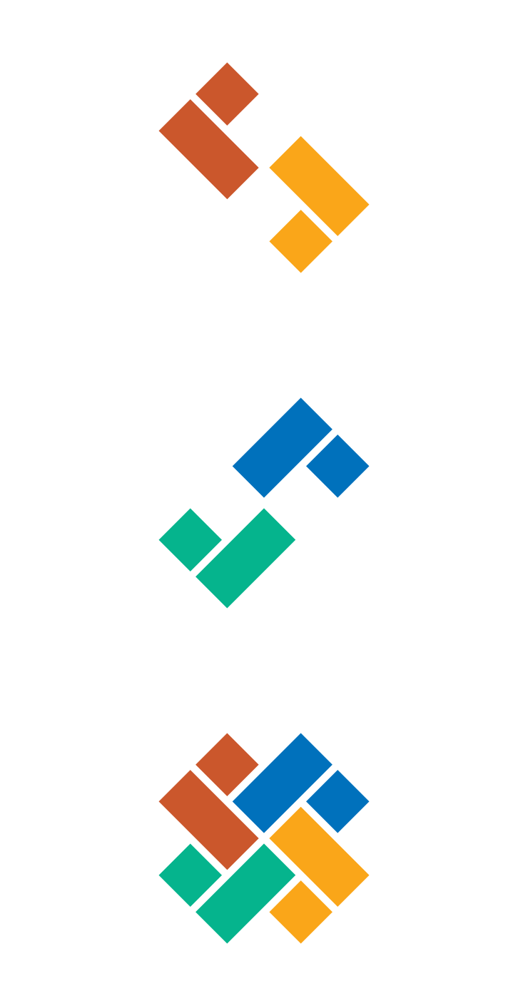
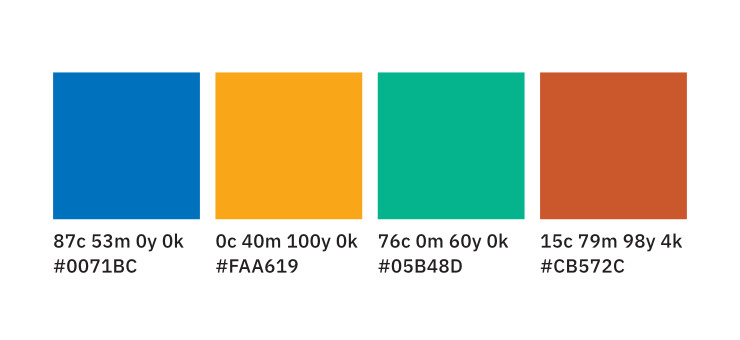
Each pair of bar graphs was dressed in a different colour. Like their four directions, the colours used came from four sections of the colour wheel and constituted a tetradic colour scheme. Sea Green, Dark Orange, Dark Steel Blue and Dark Coral (Red) were complementary to each other, suggestive of different regions / countries and ethnicities.
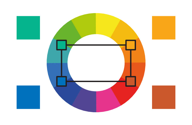
The vibrant pictorial mark — with homegenous bar graphs in varied colours — symbolised unity as well as diversity, optimism and openness.
Combination Mark
The symbol was combined with the SAABA acronym (positioned to its right) and full form of the entity below it to constitute a logo unit or a combination mark. Text was set in Helvetica — a typeface regarded for its clarity, objectivity and modern, democratic connotations.
Look and Feel
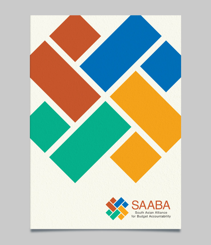
Overall, SAABA logo appeared formal and dignified, but also vibrant and had a strong feel of an alliance.
Technical Notes
Upon approval, artwork of the logo was created by the designer and submitted to the client. It included different file types for accurate colour reproduction in offset / digital printing, in single colour printing, in screen printing and on the web.
Photo Credits
- Photograph of hands joining courtesy Kwanloy / Rawpixel and Freepik
- Event backdrop courtesy berlionemore_contributor / Freepik
