A concise and handy brochure designed for the art photography show ‘Water’ was given a subtle, poetic look, like the images it represented. Owing to optimal paper use, it was also economical to print.
Background and Requirement
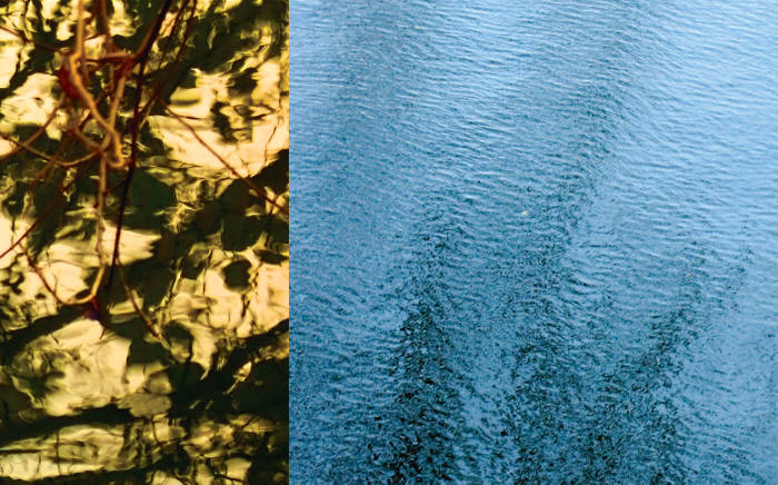
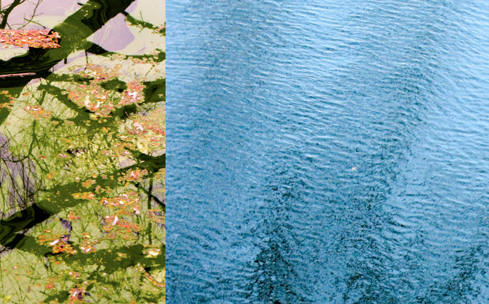
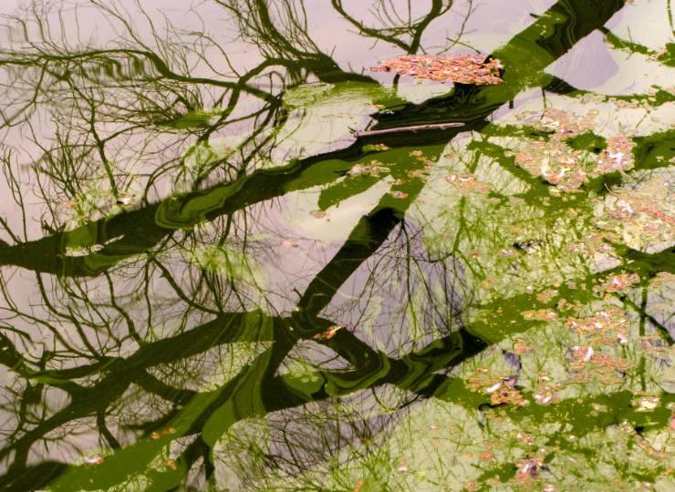
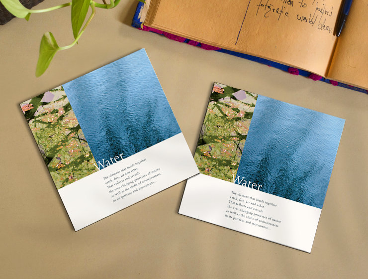
‘Water‘ is a series or collection of fine art photographs by Mayank, that look at water from an aesthetic perspective. Compositions of ripples, reflections and floating vegetation on the surface of water along with hints of surrounding foliage, each work in the series has an abstract quality.
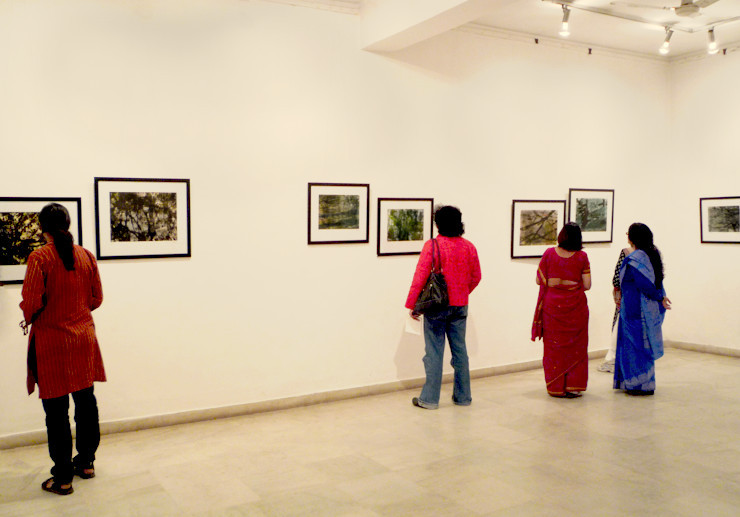
The series was exhibited in solo shows held at Triveni Kala Sangam, New Delhi (in July 2009) and Jawahar Kala Kendra, Jaipur, India (in February 2010).
As the show dates neared, design of a brochure containing a concept note, show details and information about the artist was envisaged. It had to be handy, concise and economical to print.
Design Methodology
Working Backwards from Printing Specs and Paper Sizes
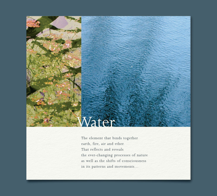
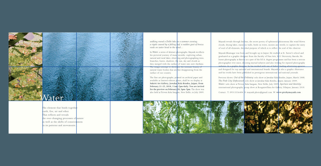
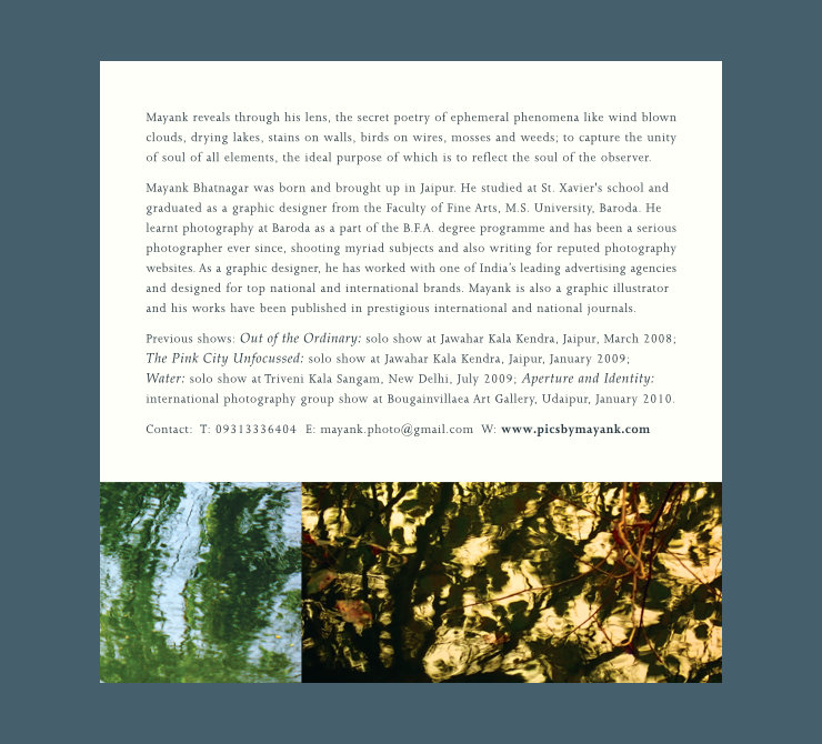
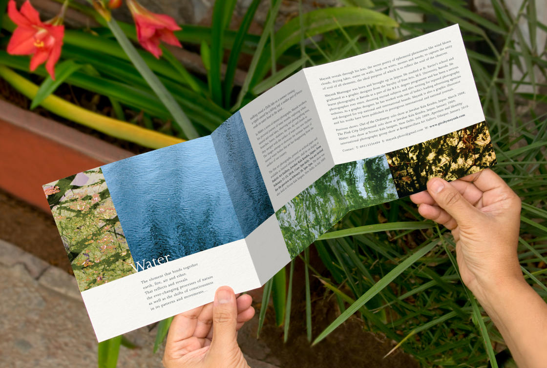
As the first step, a print production professional (late Mr. Sridhar Arvamuthachari) was consulted for printing specs from where the designer worked backwards. Since the printed quantity required was only 400, keeping cost and logistics in mind, conventional offset printing was ruled out and digital offset chosen as the printing process. Considering the maximum size of 19×13 inches that the digital offset machine could accommodate, an open size of 18×6 inches was selected as the brochure size so that two brochures could print on a single sheet of paper.
The open size of 18×6 inches was divided into three equal (square) parts: cover page, show information page and artist information page. After printing and trimming, each brochure was creased at two places and folded into a ‘Z’ shape to become a 6×6 inches handout. Back side of the brochure was left blank.
Use of Rule of Thirds Grid
Layout of the brochure was created around the classic rule of thirds (in this case isometric) grid, wherein the images were also horizontally offset by a third to break the rigidity or confines of each page. Rule of thirds is one of the most popular means / ratios that photographers use to compose images.
Showcasing the Fine Art Imagery
The design aimed to arouse curiosity about the artworks and therefore only showcased crops or small portions from four selected fine art photographs. The four abstract images had a mix of patterns and colours between them and together gave a nice impression of the variety of photographs to be displayed at the show.

Typographic Subtleties
Brochure text, composed in a poetic and understated manner, was set in delicate serif typefaces. It was dressed in bluish-grey colour to relate to the subject (water). Photographer’s name and venue details were downplayed, allowing the writing and the imagery to take over.
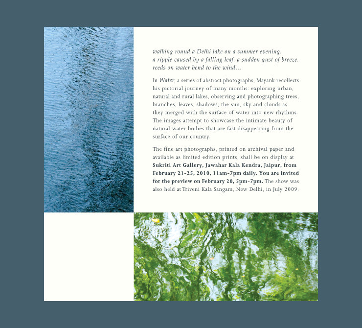
Brochure layout was put together keeping the lengths of text in mind. Width of paragraphs in the different sections was varied to prevent the pages from looking monotonous. Apart from the brochure title, brochure text had no hierarchy and typographical variations were kept minimal (restricted to normal, bold and italics with only one paragraph text size).
Technical Notes
Cordenons 145 gsm Natural Evolution Ivory paper was selected for the print run after considering its bulk, texture, subtle warm tint and cost. Use of the FSC Certified, chlorine-free paper also supported the photography show’s underlying message of water (or nature) conservation. Not very ambitious in scope and optimised for the digital offset process, the brochure was printed economically, with minimal paper wastage.
Conclusion
In essence, the brochure carried a mix of artworks and information in an attractive, dignified avatar. Its subtle, poetic look and feel was representative of and inspired by the images showcased. The brochure was also handy and economical to print.
An electronic or PDF version of the brochure, light in file size and consisting of three separate pages, was also created and e-mailed to invitees. (Kindly note: this file can be opened via a PDF viewing plug-in which most modern web browsers already have, or by downloading the file on your desktop and opening it via a PDF reader.)
Related article: ‘Water’ Photography Show Poster Design
Production and Photo Credits
- Print production: Mr. Sridhar Arvamuthachari
- Photographs of Water © Copyright, Mayank Bhatnagar
- Paper texture in mockups courtesy Kues1 on Freepik
- Opened brochure mockup designed by rawpixel.com / Freepik
- Leaves overlay on brochure courtesy freepik.com/starline