Logo for Tiger Lagoon nature resort was designed to depict its unique proposition in a clear and interesting manner. It had an exotic touch and a strong reference to the Tiger.
Background
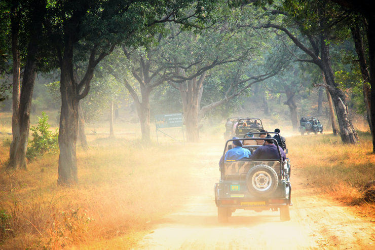
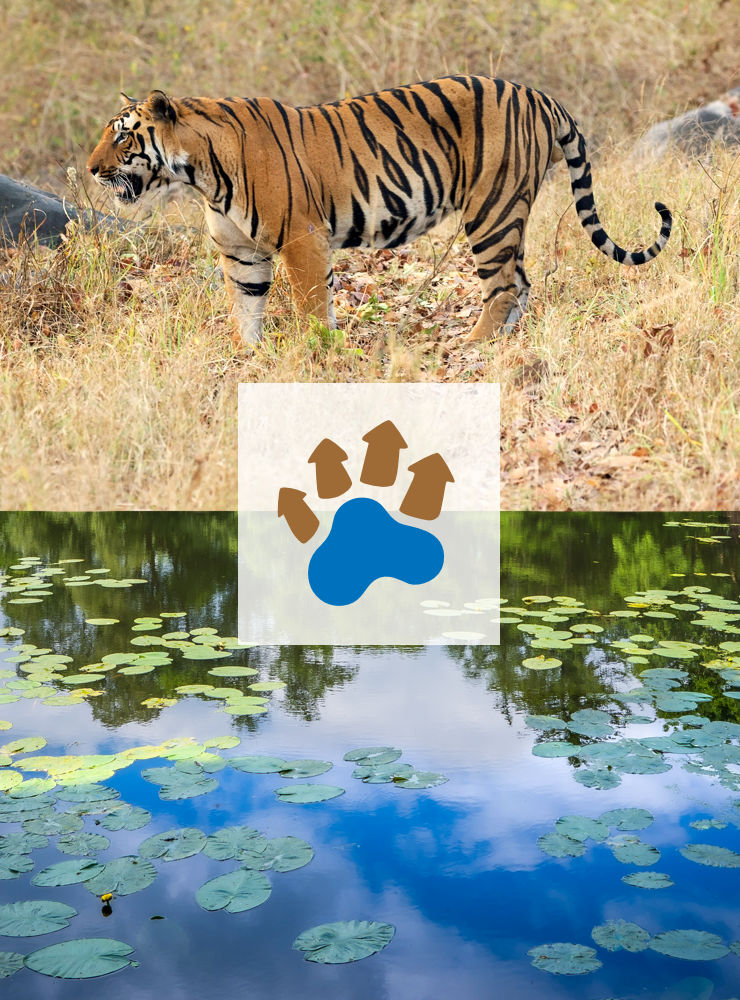
Tiger Lagoon is a nature resort located in close proximity to Bandhavgarh National Park in the state of Madhya Pradesh, India. The park is known to have one of the highest densities of Tigers in the world and is a magnet for nature lovers.
The resort offers its guests a unique experience of stay in mud and thatch finished cottages that overlook a private lagoon. It is this aspect that the client wanted the logo to highlight, design of which was commissioned before the launch of the resort, in 2010.

Design Rationale
During the research and ideation phase, basis the creative brief received from the client, several logo options were tried. The most appropriate and interesting option created comprised of a graphic depiction of huts / cottages adjacent to a lagoon, in the combined shape of a tiger pugmark. It was approved by the client to become the resort’s logo.
Overall shape of the graphic or pictorial mark was based on one of the reference images (of a pugmark) collected by the designer.
The pictorial mark depicted the resort’s proposition or uniqueness very clearly, with an indirect yet strong reference to the Tiger.
Logo Colour Scheme
The graphic was dressed in brown and blue colours, wherein the brown represented the cottages and the blue represented water or the lagoon. The colour scheme was inspired by one of the images of the resort shared by the client.

Logo Typography
The pictorial mark was combined with the name of the resort set (with loose letter spacing or tracking) in the typeface Skia, that lent to the logo an exotic touch.
Combination Mark
The organic and thick nature of the graphic was contrasted with the sleek and geometric nature of the typeface or font. Together, they constituted the Tiger Lagoon logo unit or combination mark.
Technical Notes
Upon finalisation, artwork of the logo comprising of several electronic file types — for faithful reproduction in print and on digital screens — was created and submitted to the client. It included a black and white or grayscale version of the logo for reproduction in one colour or screen printing.
Examples of Logo Usage
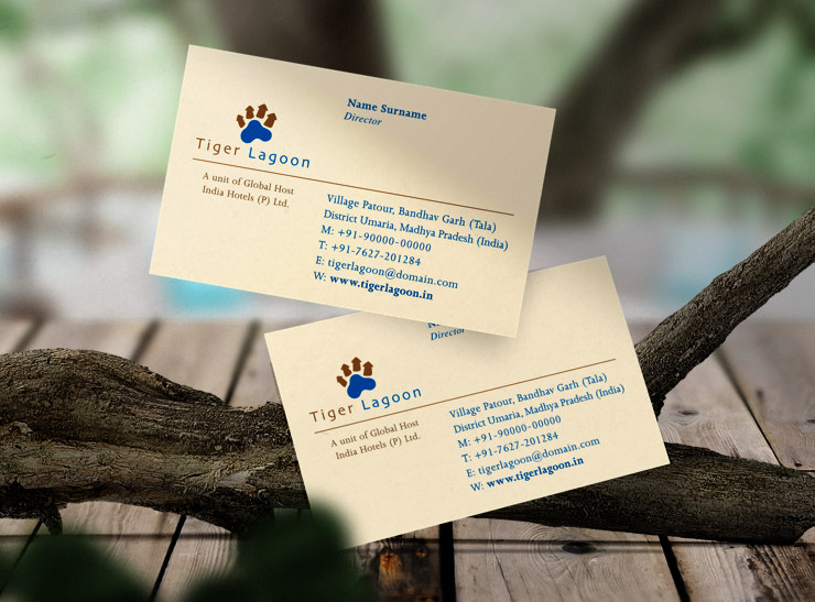
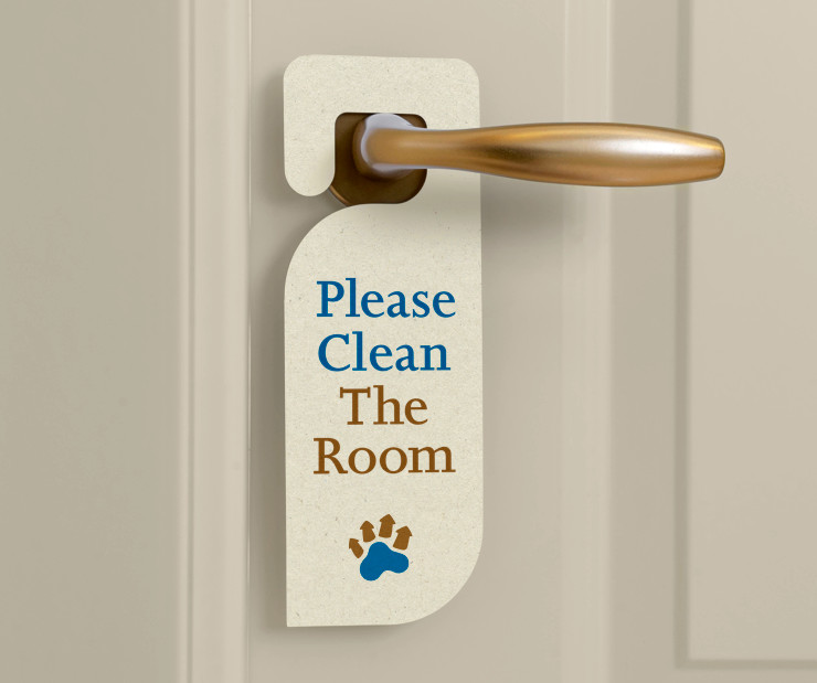
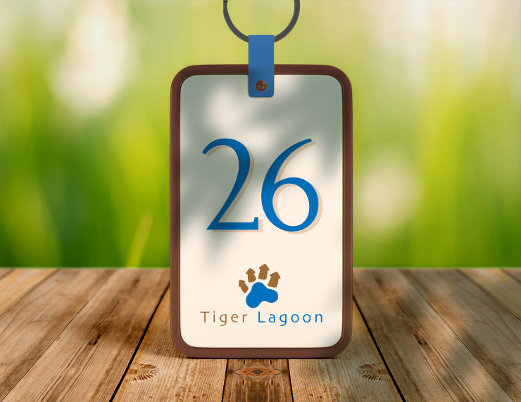
Stationery and other items designed for Tiger Lagoon had a formal touch. They carried forward the two colours used in the logo.
In Essence
The logo depicted the resort’s uniqueness in an easy to understand and interesting manner, with a strong reference to the Tiger. Its overall clean feel or appearance, with an exotic touch, was appropriate for an upscale nature resort.
—
KINDLY NOTE: All designs and images featured in this article are copyrighted and may not be reproduced.
Photo Credits
- Photograph of jeep safari courtesy Amit Jain / Unsplash
- Photograph of Bengal Tiger courtesy Hans Veth / Unsplash
- Photograph of lagoon water courtesy Jonny Gios / Unsplash
- Business card mockup courtesy CreativeNT / Freepik
- Gift bag and man wearing hat mockup courtesy Rawpixel
- Door hangar mockup courtesy Freepik
- Room keychain mockup courtesy Xvect intern / Freepik
- Wooden table background courtesy Tirachard / Freepik
- Leaves shadow on keychain courtesy Kjpargeter / Freepik