How and why I developed a logo for a do it yourself, role play Cafe concept, as part of a logo design study course.
Background and Purpose
Since the proliferation of the internet in the early 2000s, many professionals (including myself) started working from home. In my country, India, Cafes also started mushrooming around the same time. To break the monotony of working alone from home, I, as many professionals do, would sometimes go to a Cafe to work.

It is a fact that a different context / environment helps us think differently. Working for an hour or two from the relaxed environment of a Cafe usually helps me refresh, break rigid thinking patterns and the change is particularly suited for ideation. Of course, I also enjoy the beverages / drinks and food there 🙂
There were times when I yearned for a change of workplace but, for various reasons (like online meetings, the weather or unavoidable situations like ill health or the Covid-19 pandemic), was not able to go to a Cafe. So the idea of a ‘cafe time’ at home came to my mind — to entail a change of mindset. In 2024, as a part of the project submission for the course Logo Design from Concept to Presentation on Domestika, I decided to work on a logo to bring this idea to life.
The steps I took to design the logo and visual identity for the project are as follows:
Clients and Target Audience
For feedback, as clients I involved three other professionals who work from home / home offices: Ms. Ruchika Tara Mathur, a research scholar, and architects Megha and Gaurav Bhatnagar from Archeus Design Studio.
I wanted the logo be used by other professionals who would also like to create a temporary, role play Cafe environment at home or in their offices — to entail a change of mindset and infuse fresh energy into their work. So, professionals worldwide became the target audience for this project.
The Creative Brief
As per requirements of the course, I answered the following questions before proceeding to design the logo:
- Who are your audiences?
Adults. Primary: freelancers, remote workers, working professionals, even students. Secondary: anyone who wishes to create a temporary role play cafe environment at home. - What is your vision for the future, in the next 5 to 10 years?
I would like the idea to grow, catch on and people to take it forward. - Who are your main competitors?
In this case, actually none, only partners. Real cafes are an inspiration, not competitors. - If there is a single idea or feeling that can be distilled into the logo, what should it be?
It should have a DIY (Do It Yourself) feel. - Do you have any thoughts about colour?
As choice of colour is subjective and individuals have their own preferences, the logo should have a varied colour palette. However, it should be vibrant because the concept is all about feeling fresh / energetic.
Logo Design Rationale
Cafe / Project Name
After considering a lot of names, Play Cafe was decided as the name for the project. It is simple, the words ‘play’ and ‘cafe’ are easily and universally understood. The word ‘play’ in it is suggestive of role play, and seems to take the pressure out of work 🙂 On Trademarkia and Marcaria websites, the logo was available for registration but my wish was to release the design under a Creative Commons license, to be used and taken forward by anyone and everyone!
Concept Development
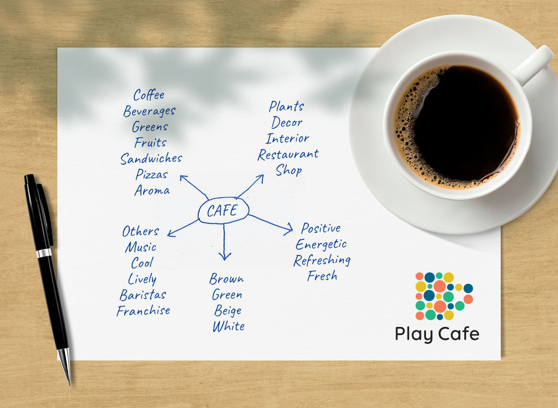
I wrote down keywords related to the concept (including synonyms) and created thumbnail sketches over a period of several days; filled many pages. They varied from typographical options to abstract forms to logos about ideation to coffee cups to the play symbol. Of course, I researched a lot of existing coffee shop logos from around the world.
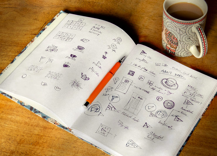
Once enough ideas had been scribbled down, I selected the more interesting options / concepts from the pool of sketches and quickly finished some of the logos in a design software.
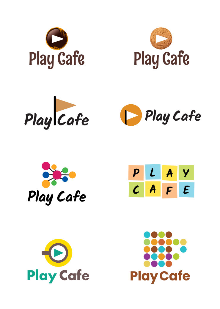
Concept Presentation and Feedback
I selected and presented four logo options to the other professionals / clients for their feedback.
- Logo option 1 was a graphic representation of the top view of a coffee cup on a vibrant plate, with the play symbol on it
- Logo option 2 was about facilitating productivity / ideation and was borrowed from the design of Post-it pads
- Logo option 3 was again about work / ideation and looked like a mind-map with an overall play symbol shape
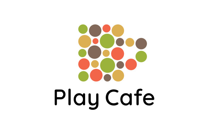
- Logo option 4 had an overall coffee cup shape made up of dots of varied sizes and colours
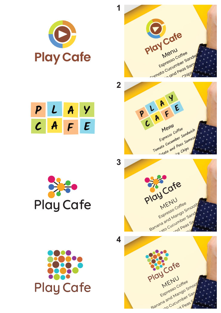
The feedback received was quite insightful. I gathered that while the designers liked option 2 (based on Post-it pads since they could relate to it), others liked the more direct coffee / cup related options. This was important feedback because the logo was not targeted simply at creative professionals / designers. So option 4, with a more obvious coffee cup shape was finalised, it was also liked by the majority. In it, the idea was simple: bring your creativity / energy / inputs (symbolised by dots of varied sizes) to create your own temporary role play cafe, then get into a fresh mindset and work 🙂 It had a strong DIY (Do It Yourself) feel, which was a requirement of the brief.
Another interesting feedback received was about colours. Different professionals liked different colour schemes, so I decided to finalise / artwork the logo in multiple colour combinations.
Logo Refinement
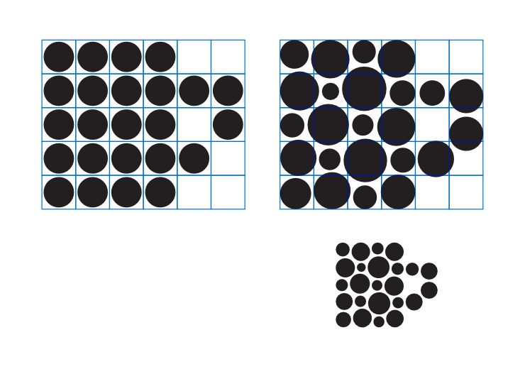
The graphic or pictorial mark of logo option 4 was worked upon and several versions of it created with different cup shapes. An overall rectangular shape looked the best and strongest. It was refined with the aid of a grid. Then, it was viewed on screens in different sizes and printed out in large and very small sizes. Finally, spacing between the dots was adjusted / fine-tuned for optimum reproduction and legibility.
Logo Typography
Once the pictorial mark was finalised, I considered several sans-serif fonts with an overall neutral but contemporary feel and a touch of style to go with it. My wish was to enable users of the logo to make their own customised Play Cafe menus using Doc files. So, I explored several fonts on Google Fonts by creating mock menus. Legibility and readability were important factors while considering fonts. Four fonts / typefaces were shortlisted: Montserrat, Nunito, Poppins and Quicksand.
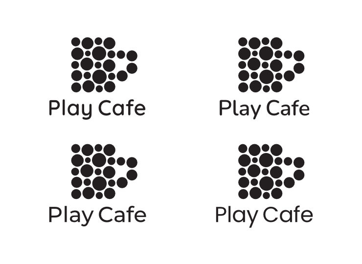
After making mock Menus with the fonts, printing out the four options and putting them through the overnight test, the geometric sans-serif font Quicksand was finalised (for the project identity as well). The font balances clarity, legibility and style very well, in my humble opinion. Overall, it appears contemporary, friendly and approachable. Character spacing in the logo name was manually adjusted / fine-tuned.
The Final Logo and Colour Schemes
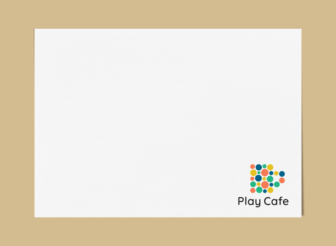
The final logo was a combination — a combination mark — of the refined graphic and ‘Play Cafe’ (composed in Quicksand typeface) placed below it.

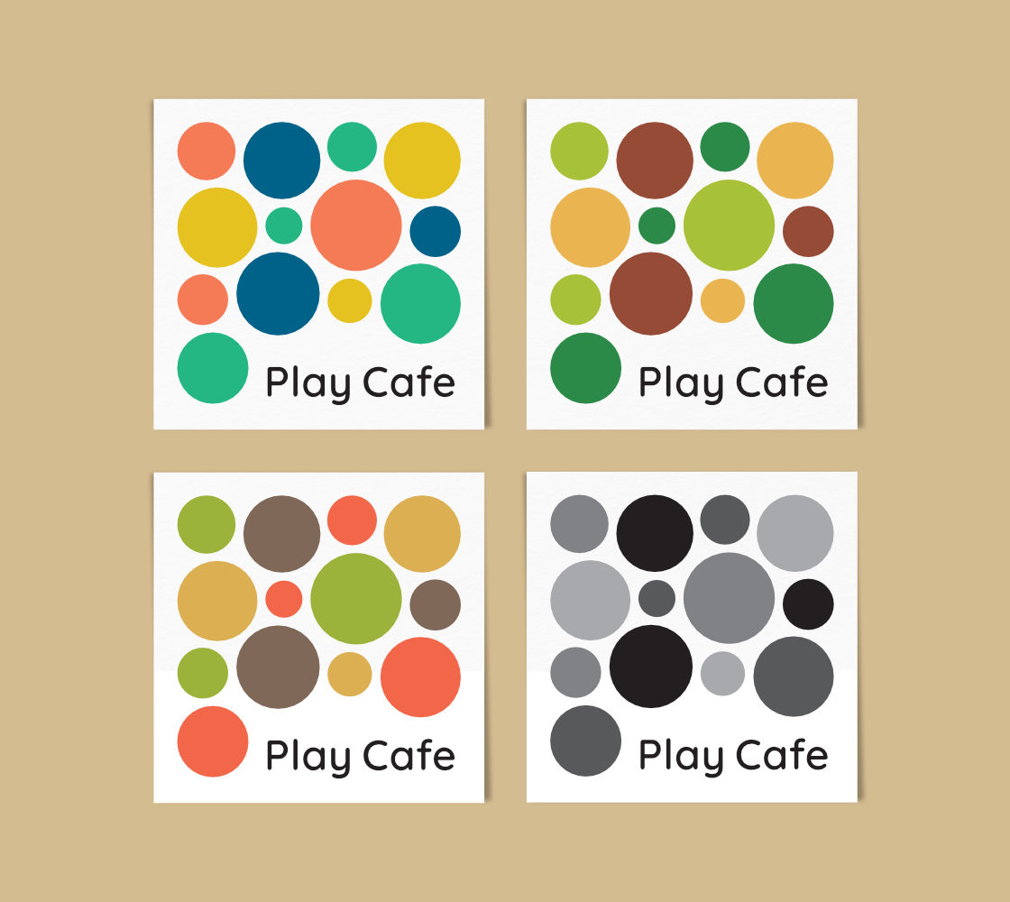
Several colour combinations were explored and the logo was finalised in four different colour schemes to appeal to varied tastes. I chose combinations that looked serious and not childish (since the target audience was professionals). They were:
- Refreshing — This fruity combination was inspired by the concept of feeling refreshed / rejuvinated
- Eco / Healthy — This natural colour scheme was inspired by the thought of eating / drinking healthy while ‘playing cafe’ and using or re-using existing / available resources
- Coffee Shop Ambience — This colour scheme was derived from a reference photograph of a lovely coffee shop interior
- Black and White — The logo was also made available in a black and white / grayscale version to facilitate printing on home and office laser printers
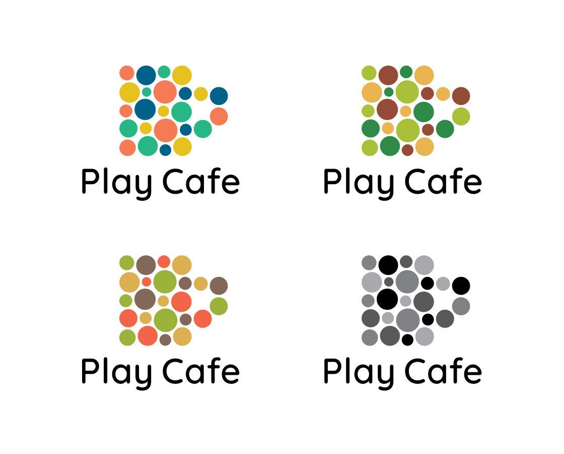
‘Play Cafe’ name was kept in black in each instance, for the sake of simplicity, clarity and ease of use. The logo was artworked / converted to a variety of digital file types, in both RGB and CMYK colour spaces, for accurate reproduction in print and on computer / mobile screens. Colour hues and combinations were carefully fine-tuned.
In Essence
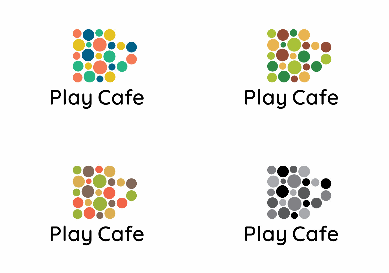
The final logo was based on a single / simple idea. A cup composed of varied dots suggested bringing or combining one’s unique inputs and / or resources to create a role play Cafe environment. It was appropriate and I believe interesting, distinctive or unique as well. In it, the graphic mark as well as the typography had a sense of rhythm. All these, as taught in the course Logo Design from Concept to Presentation, are good qualities to have in a logo.
Play Cafe Logo Usage and Visual Identity
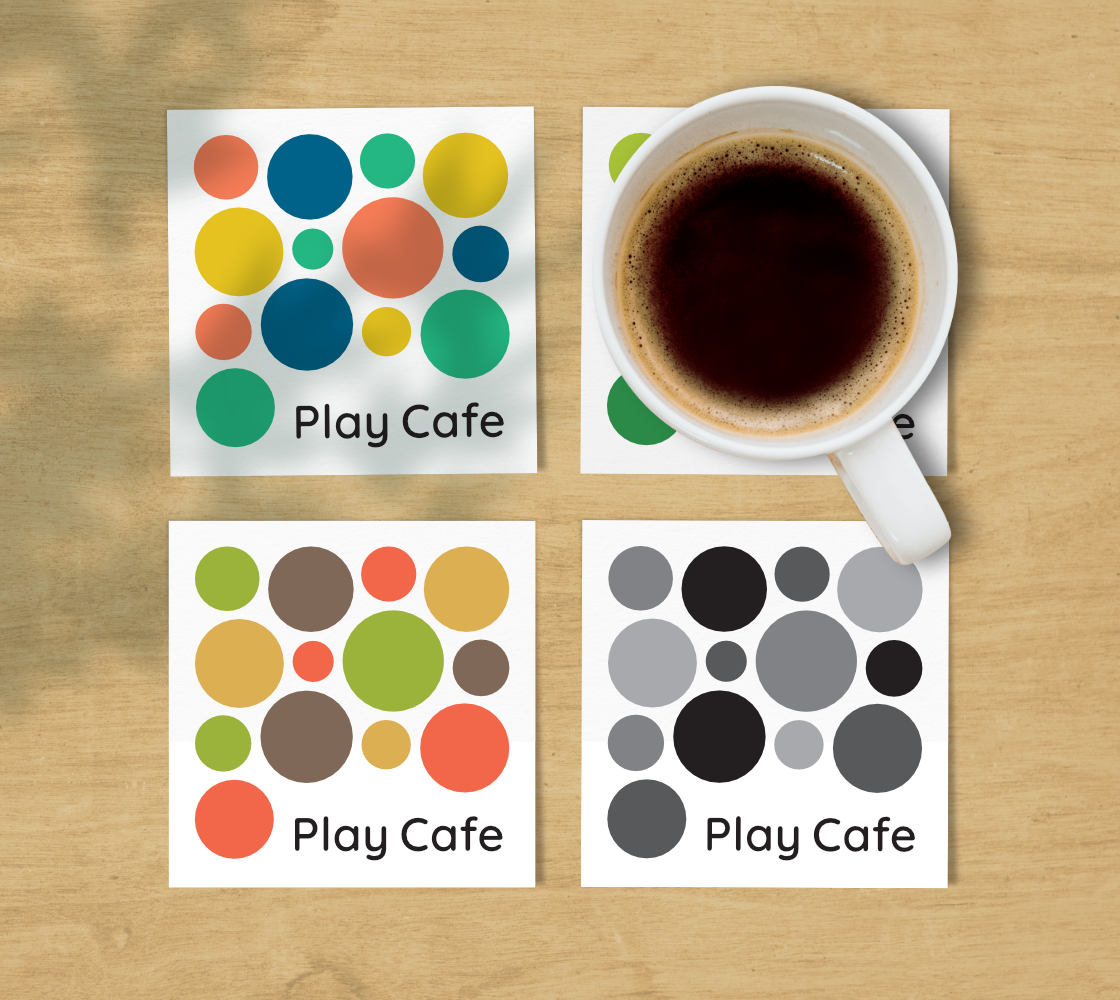
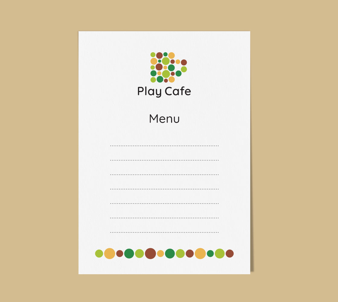
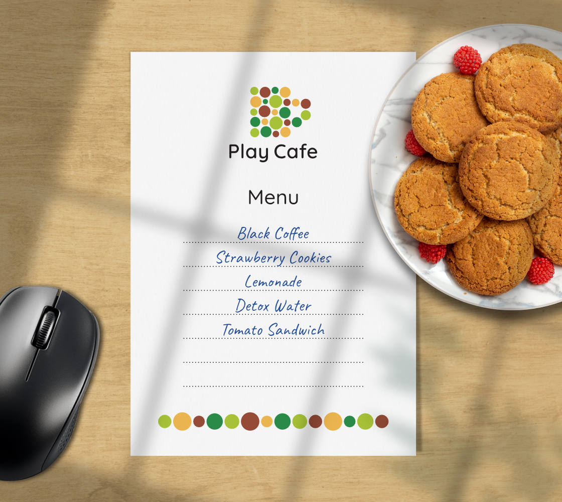
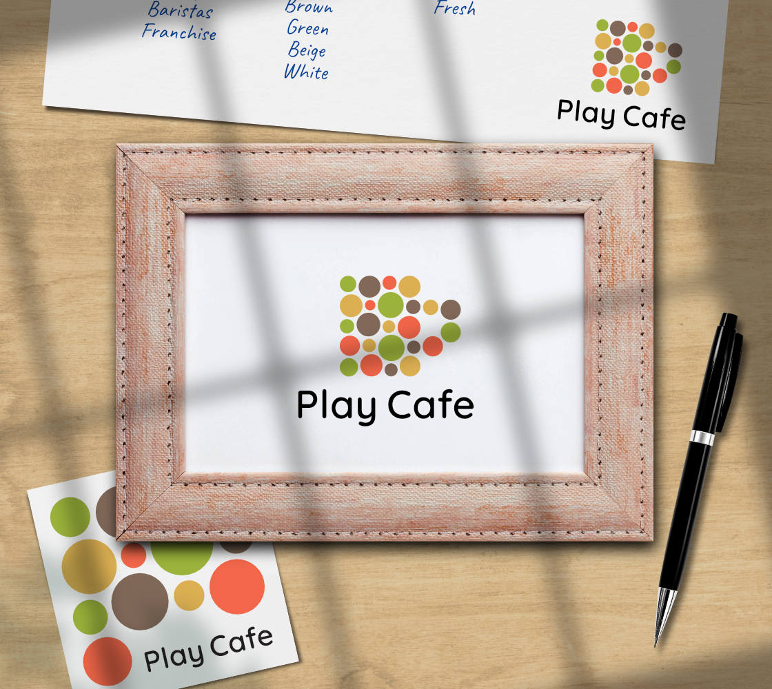
A logo is not just about aesthetics / look and feel, it has to work! Upon finalisation of the logo, I created designs for table mats, coasters, menu, and a signage for a photo frame, to be downloaded, printed and used by anyone who wishes to Play Cafe. The logo and the templates, in all four colour schemes, were released under a Creative Commons license (CC BY-NC-ND 4.0).
As far as visual identity for the project goes, it was derived from the logo and kept very simple. It made use of the same font (Quicksand), colour schemes and dots from the logo graphic were use as decorative elements. Here are some examples of logo usage and Play Cafe at work 🙂
How to Play Cafe
If you are interested in taking the concept forward and creating your own temporary role play cafe at home / office, please look forward to the article Do It Yourself ‘Play Cafe’ (coming soon on this website). It would features tips and links to downloadable Play Cafe logo and resources.
A Note of Thanks / Acknowledgements
Am grateful to the Domestika team and to noted graphic and logo designer Mr. Sagi Haviv for creating and teaching the lovely and insightful course Logo Design from Concept to Presentation, owing to which, this idea of mine could be realised. I thoroughly enjoyed doing the course!
Thanks also to Ms. Ruchika Tara Mathur and architects Megha Bhatnagar and Gaurav Bhatnagar, for supporting this project and providing their invaluable feedback.
Photo Credits
- Photograph of woman working outside a coffee shop courtesy Andrea Piacquadio / Pexels
- Wooden background texture used in mockups courtesy rawpixel.com on Freepik
- Shadows of leaves used in mockups courtesy kjpargeter on Freepik
- Coffee cup on plate, coffee cup, pen and photo frame images used in mockups courtesy Freepik
- Image of cookies on a plate used in mockup courtesy KamranAydinov on Freepik
- Computer mouse used in mockup courtesy Tohamina on Freepik
