How I designed a cover for my favourite music album, in four steps, as part of a refresher course in Visual Design.
Background
An opportunity to design the cover for one of my favourite music albums presented itself as I was doing a refresher course in Visual Design, in 2022. Of course, I jumped to it 🙂 It was a part of the portfolio building exercise of the course — Visual Design: The Ultimate Guide at Interaction Design Foundation (IxDF).
The album cover was designed in four steps or stages, as the course progressed to different aspects of Visual Design. This article outlines the linear process that was followed to conceptualise, develop and finalise the cover.
My Choice of the Music Album
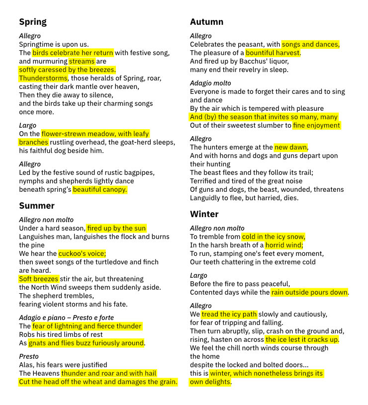
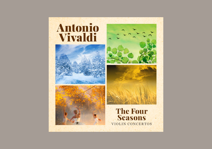
I had chosen the famous western classical instrumental music album The Four Seasons by Antonio Vivaldi for this portfolio design project. The album comprises of violin concertos inspired by elements of nature, categorised into four seasons — Spring, Summer, Autumn and Winter.
Initial, Research Phase
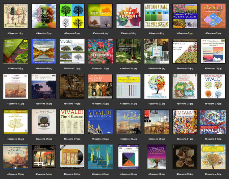
I started by researching existing cover designs for this iconic album. Came across countless ones and collected 40! They were quite varied and consisted of visuals ranging from images of nature to paintings of old towns / monuments, some were abstract.
After collecting reference covers, I studied the sonnets (poems) — possibly written by Vivaldi himself — for each season and deriving visual cues from them.
I also read more about the album, listened to the beautiful compositions and watched a few orchestras on YouTube. With the groundwork done, proceeded to the conceptualisation stage.
Step 1: Using Visual Design Elements and Principles
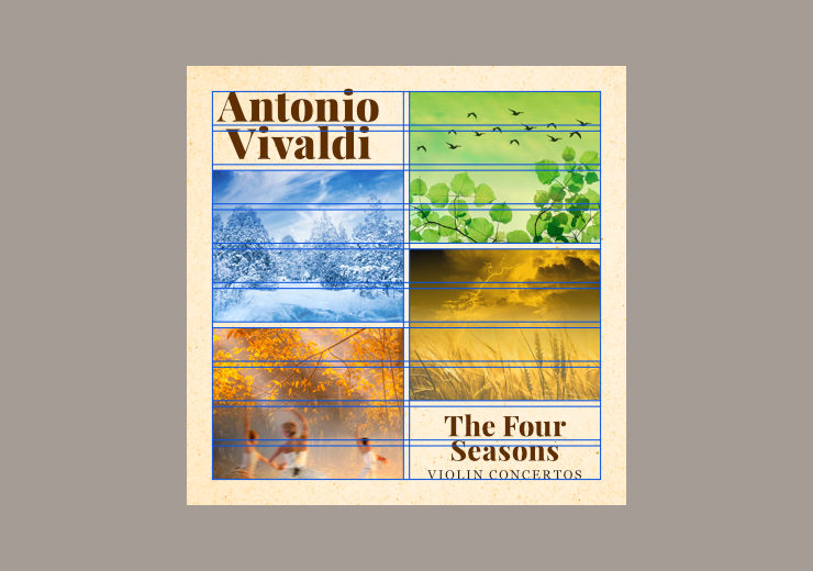
I wanted my interpretation of the cover to be visually descriptive. Keeping this in mind, several thumbnails or low-fidelity wireframes (in square format / 1:1 ratio) were sketched out. They made use of visual design elements like line, shape, space, texture and value or tone. The wireframe finally selected was dominated by four boxes with textures inside them, representing images for each season. Thick horizontal lines were used to indicate text — in this case album title and description.
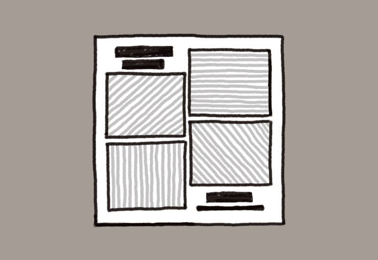
Textures — perhaps an appropriate visual representation of music — inside the boxes, in a soft tone, indicated that the images would have a soft or poetic feel.
The wireframe also made use of several visual design principles, as follows:
- Unity: The boxes representing seasons were of the same size, which brought in a sense of unity or harmony into the composition. This, of course, was driven by the fact that each season has equal importance in the album.
- Gestalt Principles of Visual Perception (Similarity and Proximity): The four boxes, similar in appearance and placed in close proximity to each other, appeared to be related, like a family, but also separate in their own right.
- Balance: Owing to the dynamism of Vivaldi’s compositions, pairs of boxes were arranged in a diagonal manner, to introduce a sense of tension into the layout. The visual asymmetry arising from this arrangement was balanced by placement of thick horizontal lines (representing text) in the resulting (top left and bottom right) negative spaces.
- Dominance: The four boxes dominated the available space in the wireframe, as I wanted the layout to be visually descriptive.
- Hierarchy: The name of the composer — indicated by thick lines — was placed on the top left, giving it more importance. Album name and description — in comparatively smaller sizes — were placed towards the bottom right.
- Contrast: Mid tones / values for the images and darker tones for text stood out in contrast to the lighter background in the wireframe.
Step 2: Adding Colour
The Colour Scheme
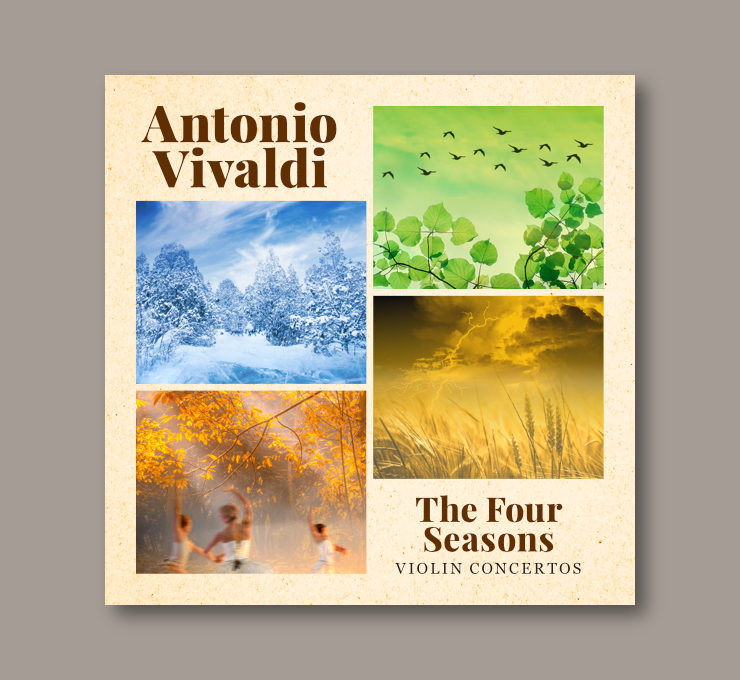
The sonnets gave a lot of cues with regard to selecting the album cover’s colour combinations. Each season was matched to an appropriate colour or hue on the colour wheel, resulting in a tetradic colour scheme. I wanted the visuals / images to be bright so avoided the darker shades.
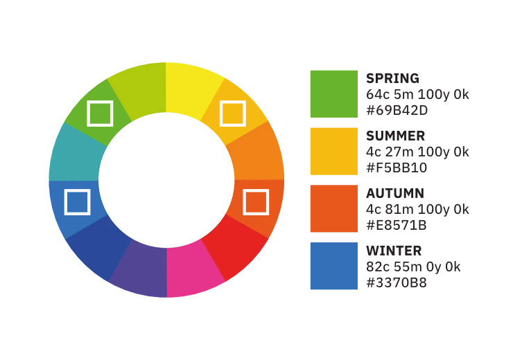
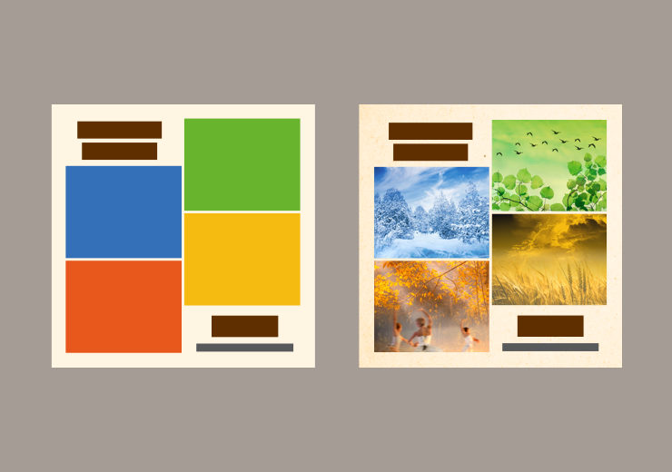
Building upon the wireframe (from step 1), four blocks of color (each representing one season) were arranged in a clockwise manner in the layout, as per the order of the musical compositions in the album: Spring > Summer > Autumn > Winter.
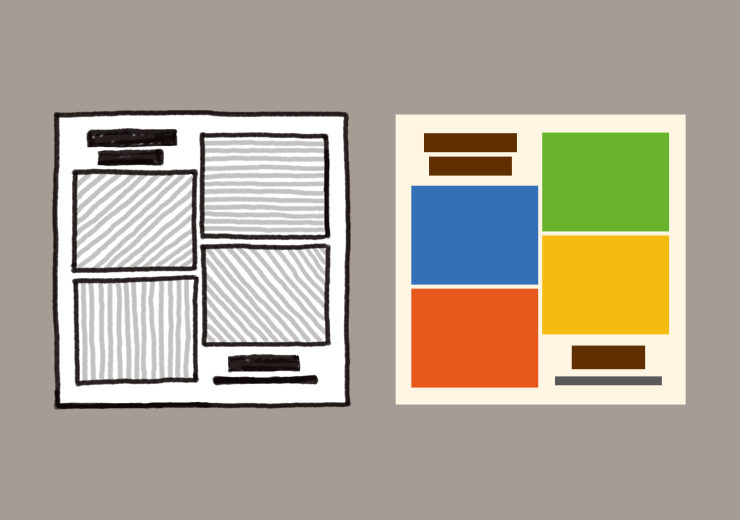
The bright colours chosen were contrasted by dark brown for blocks of text and beige for the background. Dark brown represented the Violin and the deep feelings often evoked when the instrument is played. Beige / light yellow / parchment background colour with a slight paper texture (inspired by an old poster about the concert) gave an old or classic feel (since The Four Seasons is an 18th century composition) and brought in some warmth to the cover. For the album description on the bottom right, neutral dark grey was selected.

In terms of colour symbolism, in this case leaf green represented spring and renewal, yellow ochre represented summer and warmth, red / coral red represented autumn and romance, and blue / cornflower blue represented winter, coldness and serenity. The clockwise order of the four coloured blocks matched the progression of colours in the colour wheel as well as the annual cycle of seasons.
Visuals for The Four Seasons
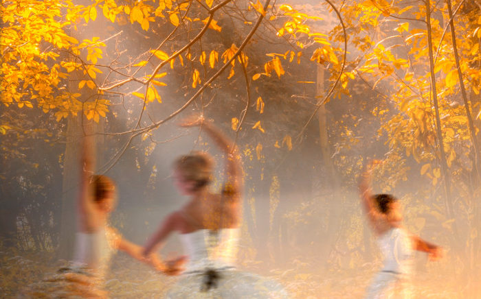
Taking the sonnets (poems) as the creative brief in this case, compositions of images (sourced from Unsplash and Pexels) were created in Affinity Photo by juxtaposing multiple photographs, taking care to maintain the unique colour / hue for each season. I wanted the images to have some sense of motion in them, since they were representing musical compositions.


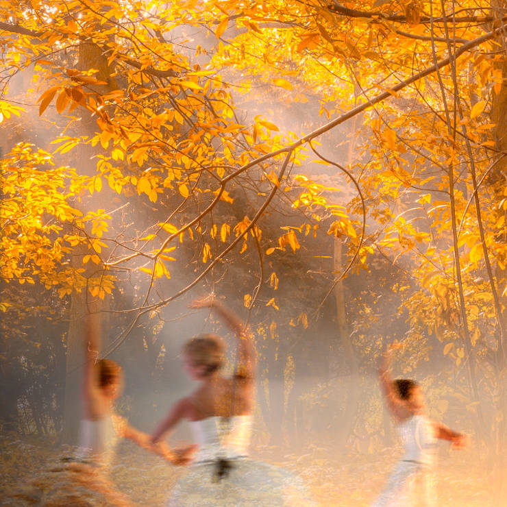

Finding relevant images and doing the juxtapositions took a bit of work! Once finalised, the four images were placed in the layout.
Step 3: Typography
I wanted to depict through the typography that a) this is a classic / classical work of music and b) the music in this Baroque style album is quite powerful. After considering several typefaces including some old style serif faces, a combination of Playfair Display and Georgia was finalised. Both are transitional typefaces — a genré of type design that came into being around the same time (18th century) as when this music was originally composed. Central alignment of text lent to the layout a formal touch.
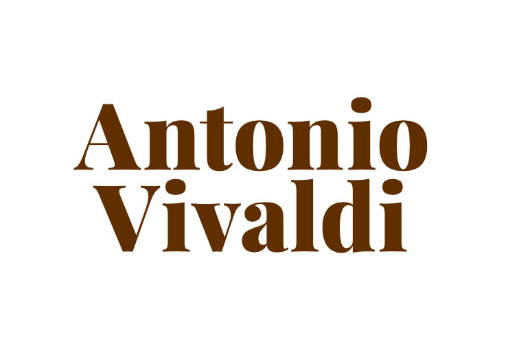
Playfair display (black) has a classic and powerful look. I specially liked its combination of thick and thin strokes, which seemed to appropriately represent Vivaldi’s dynamic musical compositions that are powerful but also subtle and fine.
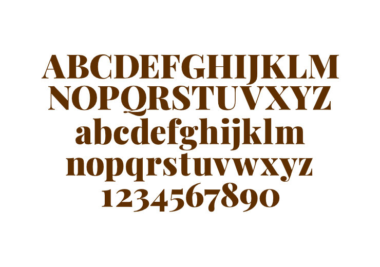
Since Playfair is a display font (ideal for use in large sizes), Georgia (in all caps, with loose tracking) was used to compose the album description — Violin Concertos — which allowed the classic look to be retained. Georgia is recommended to (functionally and stylistically) accompany Playfair. Both the faces are optimised for digital screens — an important factor since most music nowadays is played via digital music Apps.
Step 4: Fine-tuning with a Grid System
To recap, my design solution was to visualize the four seasons into dominant images of equal size, and place them diagonally to get a sense of dynamism (like Vivaldi’s music) into the layout. To achieve this, a 2 column by 10 row modular grid system within an outer page margin worked very well. It helped me arrange the elements with accuracy.
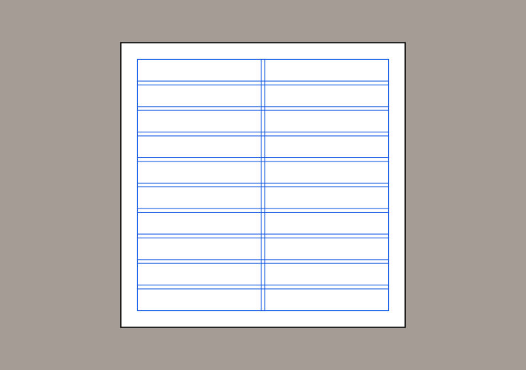
Album titles were aligned with the help of the grid as well. Composer’s name was placed optically center aligned (in the available negative space on the top left) whereas the album name and description were centrally (mechanically) aligned to the grid.
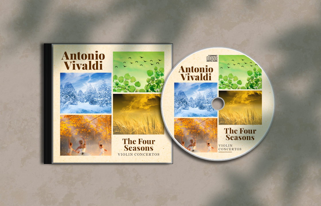
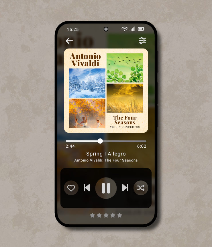
The Resulting Album Cover Design
After following the step-by step process of research, conceptualisation, wireframing (using visual design elements and principles), adding colour, typography and using a grid system, the cover design was ready!
Looking back at the whole exercise, I enjoyed it thoroughly! Even though this was a self and course motivated project, I felt privileged to delve into this great piece of music and interpret it in the form of a cover design. My interpretation was quite straightforward, nowhere near as brilliant as Vivaldi’s interpretations of the four seasons in the form of instrumental music.
If you haven’t heard The Four Seasons album, I would highly recommend that you do. Also, the version by Jeanine Jensen on YouTube is truly worth watching.
IxDF Visual Design: The Ultimate Guide Course Recommendation
This project became possible because of the course Visual Design: The Ultimate Guide at Interaction Design Foundation (IxDF). Even as an experienced designer, I thoroughly enjoyed doing it! The course has very interesting and informative content in both text and video formats. It also features works and theories of several famous designers. Whether you are an art or design student, a designer just starting out in your career, or an experienced designer, I would highly recommend the course to you. You will surely gain from it, learn something new, and (I hope) enjoy it too!
Disclaimer
The name ‘Antonio Vivaldi’, album name ‘The Four Seasons’, the sonnets and reference album cover images have been used in this article under Fair Use, non-commercial terms.
Tools / Software Used
Affinity Designer on iPad and macOS, Affinity Photo on macOS, Firefox web browser, Dictionary and Text Edit on macOS.
Photo Credits
- Photographic collage for Spring: Min An and Manideep Karne on Pexels
- Photographic collage for Summer: Glenn Carstens-Peters on Unsplash and Сергей Леденёв on Pexels
- Photographic collage for Autumn: Tim Gouw and Pixabay on Pexels
- Photographic collage for Winter: Cristina Gottardi and Mila Young on Unsplash, and Julia Volk on pexels
- Background texture in CD mockup: Alex Kotomanov on Unsplash
- Leaves shadow overlay on CD mockup: Kjpargeter on Freepik