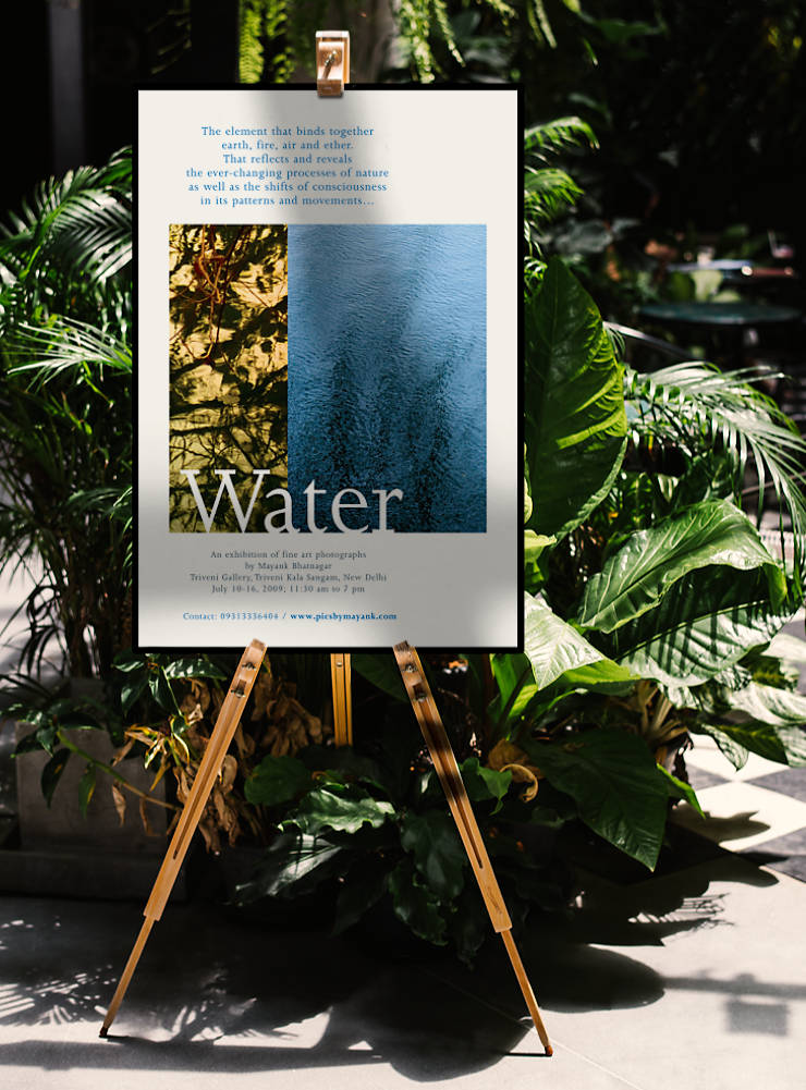
Poster for the art photography show ‘Water’ was designed to arouse curiosity and set an elegant tone for the event. It was printed economically, on environmentally certified paper, with minimal paper wastage.
Background and Requirement
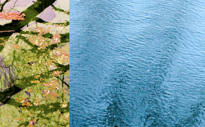
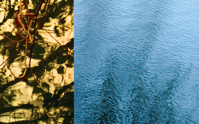
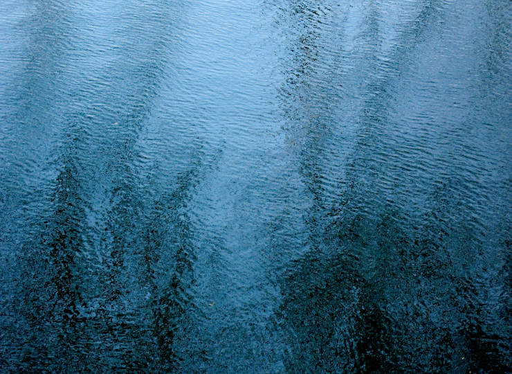
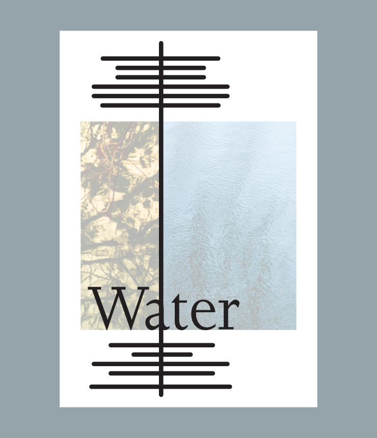
‘Water‘ is a series of fine art photographs by Mayank, that look at the subject from an aesthetic viewpoint. Compositions of ripples, reflections and floating vegetation on the surface of water along with hints of surrounding foliage, each work in the series has an abstract quality.
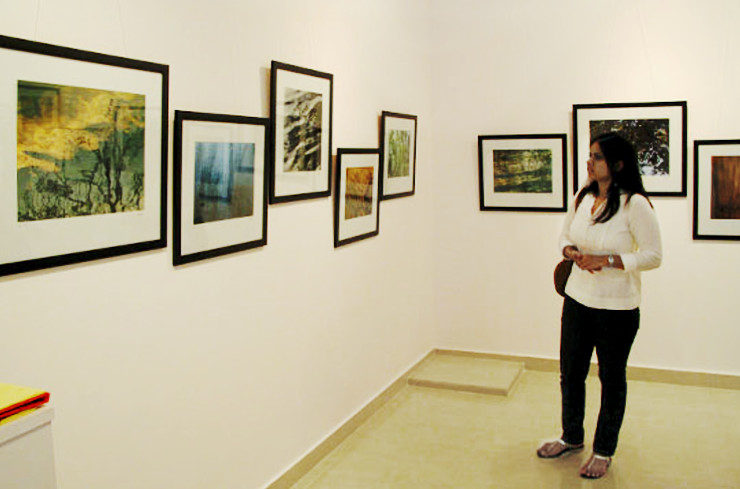
The series was first displayed at a solo show of photographs held at Triveni Kala Sangam, New Delhi (India), in July 2009. To inform local audiences and art and photography aficionados about the show, a poster was required.
The designer was keen to have the poster printed economically, on environmentally certified paper, with minimal paper wastage. It was designed in conjunction with the ‘Water’ brochure.
Design Rationale
A print production expert (late Mr. Sridhar Arvamuthachari) was first consulted. As only 20 copies of the poster were needed, he recommended digital offset as the printing process (a fairly new technology then), which allowed complete control over the print run. The designer thus worked backwards from the maximum size of 13 x 19 inches that the digital offset machine could output.
Photographic Collage in Golden Ratio
The poster layout consisted of a dominant collage of two photographs from the ‘Water’ series, with the show title overlayed on them. The collage became the central focus of the poster and attracted the viewer’s eye from a good distance. Combination of the two photographs was set in Golden Proportion or Golden Ratio.
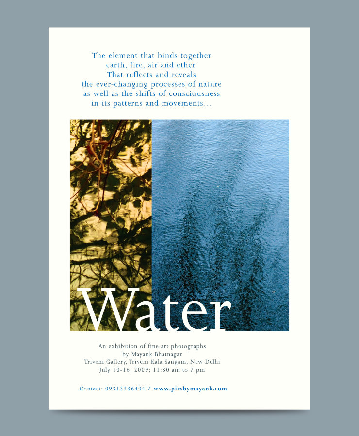
The collage only showcased or revealed parts of two photographs (with complimentary colour scheme between them), hoping to arouse the viewer’s curiosity.
Bilateral Typographic System
Poetic text related to the series was placed above the collage. Show information and contact details were placed below it. Together with the large show title, poster text was centrally aligned to the axis formed between the two photographs. The layout thus used a bilateral typographic system.
Typeface and Colour Scheme
Text was composed in a delicate serif typeface, which added a formal touch to the poster. It was dressed in Cyan (symbolic of water) and Bluish Grey (subtle and neutral) colours.
Optimum Use of Paper
The layout was left open, with no design elements or backgrounds touching the edges. This allowed full use of the (13 x 19 inch) paper sheet and eliminated any further need for trimming or paper wastage.
Usage
The poster was put up at the venue and on bulletin boards of well-known public art centers in New Delhi. Overall, it looked clean, elegant and poetic — apt perhaps, for an art photography show with a discerning audience.
Technical Notes
The poster was printed on Cordenons 145 gsm Natural Evolution Ivory paper after considering its bulk, texture, subtle warm tint and cost. Use of the FSC Certified, chlorine-free paper also supported the photography show’s underlying message of water (or nature) conservation.
Credits
- Print production: Mr. Sridhar Arvamuthachari
- Photographs of Water © Copyright Mayank Bhatnagar
- Image of easel courtesy rawpixel.com / Freepik