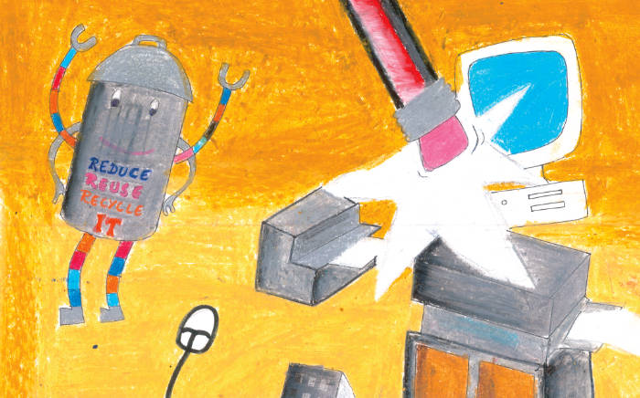
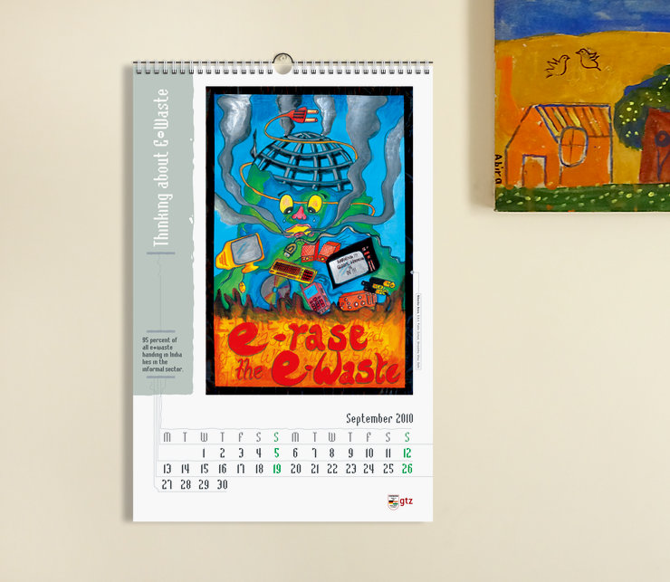
A playful and supportive layout helped to showcase some stunning artworks by school children in the 2010 GTZ-ASEM wall calendar about Electronic Waste.
Background and Purpose
To create awareness about the issue of E-waste or Electronic Waste, GTZ-ASEM (now GIZ India) in collaboration with Chintan Environmental Research and Action Group and The Department of Environment, Government of Delhi, had organised a painting competition with select high schools in Delhi, in 2009. Children were educated about the issue and encouraged to express their thoughts in the form of posters.
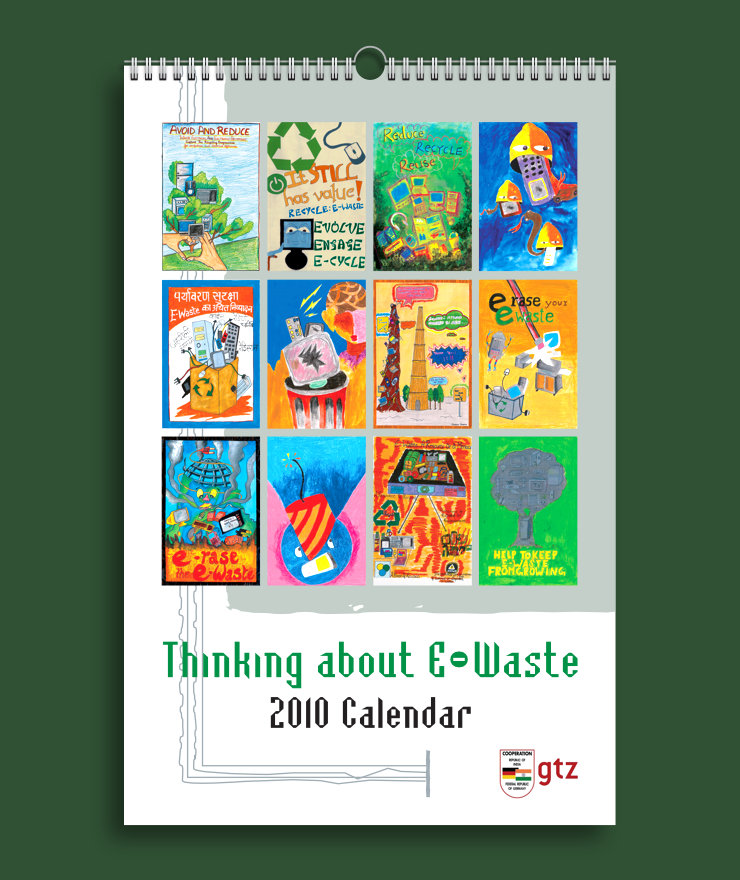
Design of a 2010 wall calendar — featuring 12 selected posters from the competition — was commissioned to foster a public understanding about the issue. With stunning artworks and facts/trivia about e-waste, the calendar aimed to encourage users to put on their green thinking caps everyday!
Design Rationale
Calendar Format
Portrait format of the 12 posters defined the vertical orientation of the calendar. The content was laid out in 11″(w) x 17″(h) size in consultation with a print production expert.
Supportive Layout
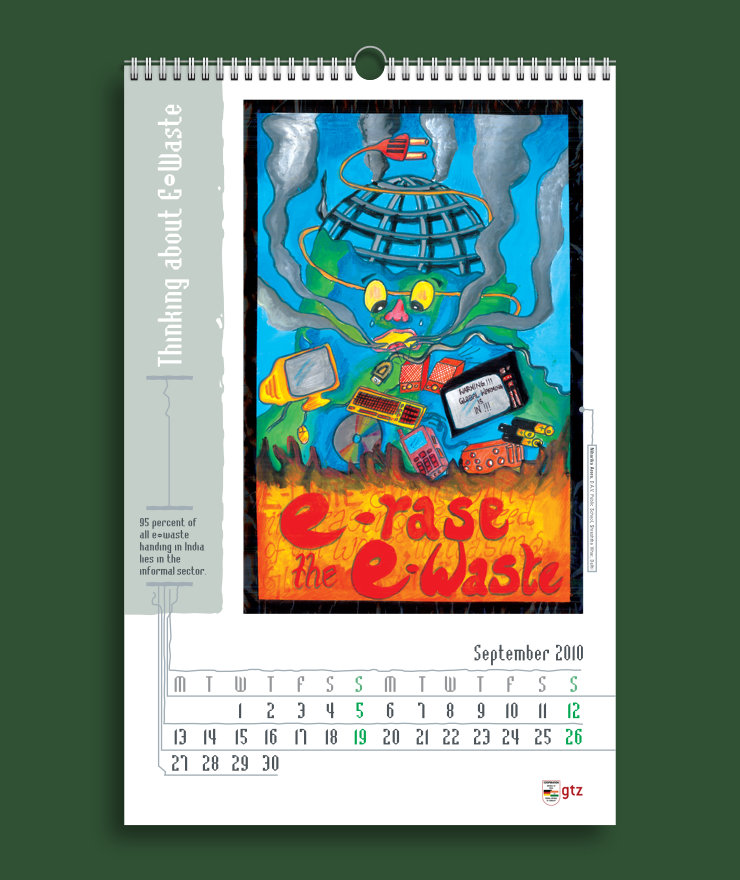
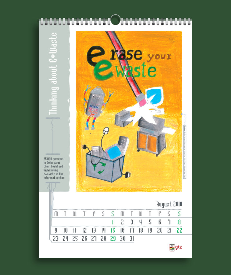
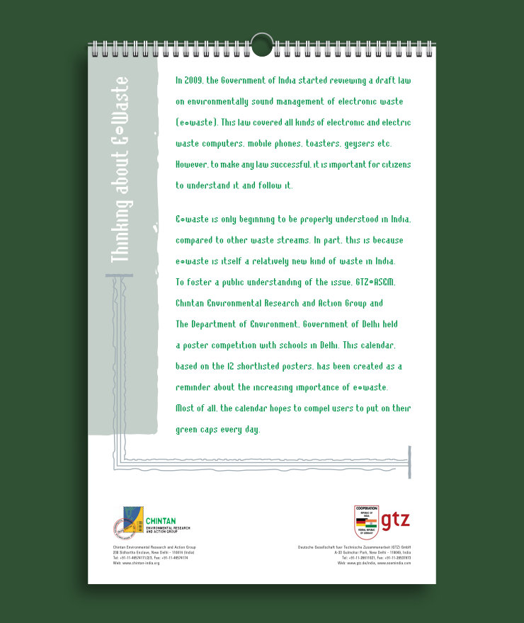
Effort was made to do a layout which was consistent across pages and allowed the artworks to stand out. In it, a vertical bar — appearing worn out like old metal — lent support to other visual elements.
Calendar Colour Scheme
Shades of Grey (light and dark, representative of old / worn out metal) were used to dress most visual elements in the layout, including text. The largely neutral colour scheme allowed the vivid artworks to stand out in contrast. Green (which has strong connotations to the environment) was also used to highlight key pieces of information such as calendar name (on the cover) and Sundays.
Playful Graphic Elements
Graphic depictions of old, twisted wires and connectors were used as visual elements in the composition. They added a playful touch to the calendar, in sync with the spirit of the artworks. They also helped to put focus on key pieces of information like dates, artists’ details and facts or trivia relating to e-waste.
Calendar Typography
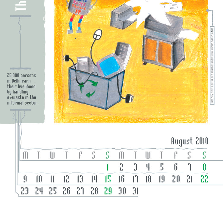
A novelty typeface or font with a strong ‘electronic’ feel was consistently used in the layout. It made the calendar look more topical and also playful.
In Essence
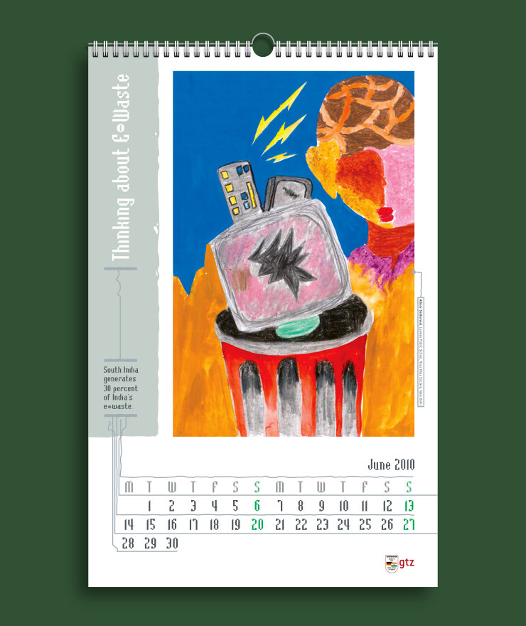
The vivid and creative artworks by schoolchildren dominated the layout, allowing them to positively impact the living or office spaces in which the calendar would be hung. Dates on all calendar pages were also conspicuous and could be easily discerned from a distance of 6–8 feet. Overall, the calendar looked attractive, intelligent, playful and refreshingly different.
Technical Notes
The calendar was printed in four colour offset on 170 GSM matte paper. The pages were compiled using Wiro binding.
Read Related Article: WEEE Recycle Logo and Identity Design
Copyright Information
© Copyright GIZ India and Chintan Environmental Research and Action Group. All Rights Reserved. No part of this article including images may be reproduced.
Photo Credits
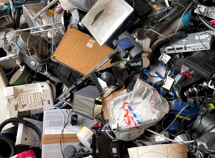
Photograph of e-waste courtesy John Cameron on Unsplash
