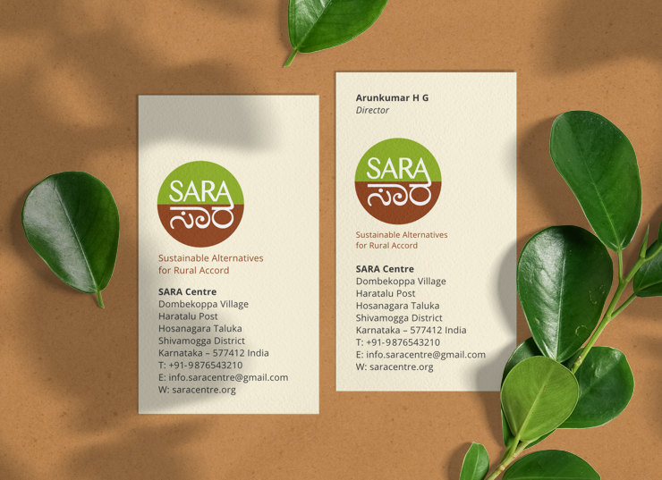
The simplistic, bilingual logo designed for a Karnataka based NGO symbolised local ecological concerns and collaboration for hope, in the larger context of the planet.
Background
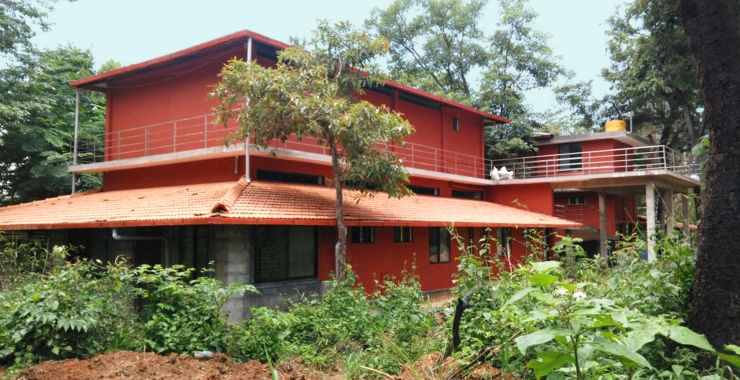
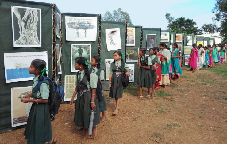
SARA Centre is a community-driven, artist-run initiative located in Dombekoppa Village of Shimoga District in rural Karnataka, India. Established as a platform for dialogue, the centre invites artists, intellectuals, environmentalists, farmers, teachers and students to share and to raise public awareness about sustainable life practices that specifically address ecological concerns of the region. Sustainable Alternatives for Rural Accord is the full form of SARA. In Kannada language, Sara means essence.
Requirement
Design of a logo for SARA was commissioned in 2016, soon after the Centre was established. The client wanted the logo to look clean, simplistic or minimal, suggestive of the environment and be bilingual.
Design Rationale
Basis the creative brief received, several logo concepts / options were sketched out and shared with the client. Some of the initial options were organic in appearance and based on forms of plants, pods and seeds.
The client, however, wanted a simpler logo. After several rounds of presentations, the logo option approved comprised of a round or circular shape containing the centre’s name in English and Kannada languages.
Logo Colour Scheme and Symbolism
The circular shape of SARA Centre logo was divided into two equal portions. The lower portion in Burnt Sienna / Brown colour with lettering in Kannada symbolised the earth, soil, fertility and ethnicity. The upper portion in Olive Green colour with lettering in English symbolised vegetation, yield, ecology, livelihoods, learning, knowledge, empowerment, hope and prosperity. Kannada represented local concerns while English represented collaboration. The logo’s overall round shape referred to the larger issue of environmental sustainability in context to the planet.
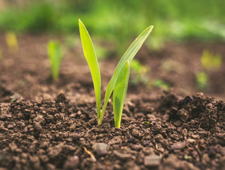
Colour scheme for the logo was also inspired by imagery of soil / plant regeneration. Farming is an important activity and means of livelihood in this part of rural Karnataka and its sustainability is one of SARA Centre’s key areas of concern.
‘SARA’ — lettering in English (Latin) and Kannada scripts — was placed in the upper and lower halves, respectively, and joined together at one end. This suggested the joining of hands or collaboration between the local and a larger / global community, with the aim of addressing ecological concerns of the region.
Overall, the logo represented SARA Centre’s ethos of holding on to the roots but growing and absorbing the best that the world has to offer — socially, culturally and environmentally. Its strong sense of balance symbolised harmony and environmental balance.
Logo Typography
Typography for the logo was the tough bit, a challenge for the designer. The letters or characters (in the two scripts) had to be balanced in the two circular halves and appear homogeneous as well. They were manually tweaked / fine-tuned to achieve optimal contrast and a balance of curves with smooth and sharp edges. The logo was also tested for legibility in small sizes.
Upon finalisation, SARA Centre logo was also paired with the tagline Sustainable Alternatives for Rural Accord.
Technical Notes
Different versions / digital files of the logo — for faithful reproduction in print including screen printing and on computer screens — were created and submitted to the client.
SARA Logo Conceptual Images and Usage
In Essence
SARA logo met the requirements of being simplistic or minimal, bilingual and symbolic of the environment. Its honest and straightforward nature represented the Centre faithfully in rural / local as well as national and international settings.
Photo Credits
- Location photographs courtesy and © Copyright SARA Centre
- Photograph of soil and plant courtesy Roman Synkevych / Unsplash
- Photograph of green crops in the field courtesy Steven Weeks / Unsplash
- Business cards mockup courtesy CreativeNT / Freepik / Nuttakarnth / Pinterest