Logo for an electronic waste recycling initiative in India was designed to become its eco friendly face. A visual identity style guide was also developed for the project to facilitate external communication with a consistent voice, look and feel.
Background and Purpose
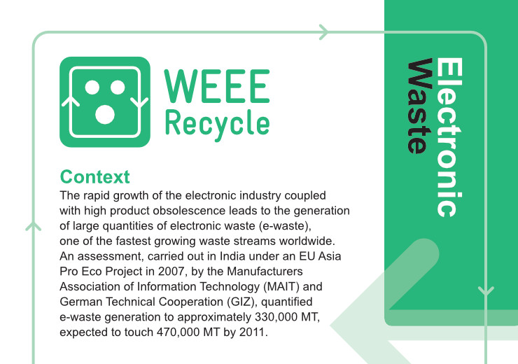
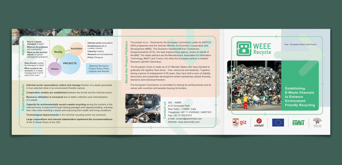
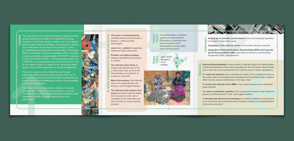
Rapid growth of the electronic industry and high rate of obsolescence of electronic products has resulted in generation of huge quantities of Electronic Waste (E-Waste) worldwide. E-waste is considered to be the fastest-growing stream of waste on our planet.
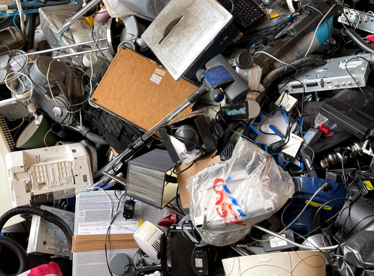
India too has been grappling with the issue. E-waste recycling has become an economic activity in the country with most of it carried out by small, informal recyclers. The recycling process is not easy, it can negatively affect the health and safety of workers and pollute the environment.
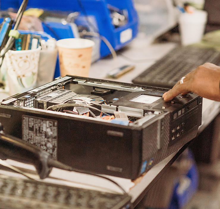
WEEE Recycle project, initiated in India in 2010, aimed to institutionalize a collection system and channelization of e-waste for recycling using environmentally sound technologies, involving SMEs in the informal sector and relevant stakeholders in the value chain. (The term WEEE stands for Waste Electrical and Electronic Equipment.) Deutsche Gesellschaft für Internationale Zusammenarbeit (GIZ), India, was the lead implementing agency.
The project was co–financed by the European Commission (EU) under its SWITCH-Asia programme and the German Ministry for Economic Cooperation and Development (BMZ). Indian partners were the Manufacturers’ Association for Information Technology (MAIT) and Toxics Link while the European partner was adelphi (Germany).
Requirement
Design of a logo for WEEE Recycle was commissioned shortly after the project’s inception. In the creative brief received from the client, it was mentioned that the logo should look inclusive, eco-friendly and dynamic. Along with the logo, a visual identity style guide was also required to facilitate external communication with a consistent voice, look and feel. The designer worked in coordination with the GIZ team to develop the logo and the style guide.
Logo Design Rationale
Of the several logo design options presented to the client, the one approved consisted of an inverted electric plug shape (of the type commonly found in India) in graphic form, which also resembled a human face. An outline around the face with top and bottom pointing arrows on either side — that resembled ears — symbolised the proposition of recycling.

The graphic or pictorial mark was dressed in Green colour (Medium Sea Green hue) — which is often associated with regeneration, safety and nature and the environment. It was combined with the name of the initiative (in the same colour) to constitute a logo unit or combination mark. The name was set in the sans-serif typeface Gravur Condensed which — like the pictorial mark — also had a geometric look with rounded edges.
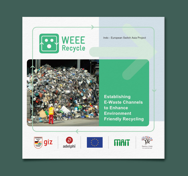
A version of the logo with the project’s tagline Establishing E-Waste Channels to Enhance Environment Friendly Recycling was also created.
WEEE Recycle logo was easy to understand. Its geometric form, rounded edges, soft green hue and resemblance to a human face made it appear friendly. It directly depicted an electric part and arrows suggesting recycling, the latter added to it a sense of movement or dynamism. The logo not only represented and identified the initiative, but personified it. It was positive — like the initiative — in overall appearance and aptly depicted the proposition of Environment Friendly Recycling.
Upon approval, artwork files of the logo — to enable it to reproduce faithfully or consistently in print and on computer screens — were created and submitted to the client. They included Grayscale and Black (0c, 0m, 0y, 100k) versions — for accurate reproduction in single colour / black and white and screen printing processes.
WEEE Recycle Visual Identity
Once the logo was finalised, a visual identity system was developed for WEEE Recycle. It took the logo design and concept forward. It also imbibed cues from the e-waste recycling process.
Design Components
Electronic equipment often consists of or is an assembly of components, which become even more obvious once they are dismantled for recycling. Taking inspiration from this aspect, a repertoire of visual components was developed for the WEEE Recycle identity. They comprised of:
- Arrows (suggesting recycling) from the logo
- Thicker arrows that could be used in the background
- Rounded rectangles (borrowed from the shape of the logo) in different colours
- Contextual strips containing tightly cropped images of e-waste
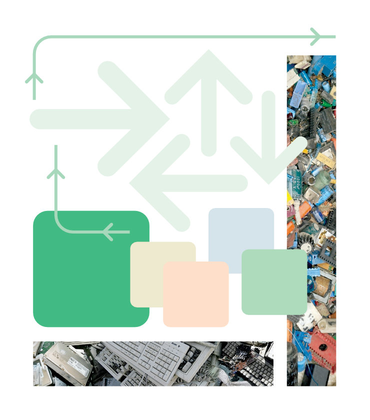
The components were specifically designed to support the text or information in layouts. They were largely subtle in feel and could be arranged in a modular way. The visual concept was of components — placed next to / overlapping one another — going in for recycling.
Colour Scheme
Green hue of the WEEE Recycle logo was the dominant colour in the visual identity system. Tints of green and other pastel colours — derived from photographs of e-waste — were also used. Again, the pastel hues (Beige, Light Salmon, Light Blue and Light Lavender) were chosen to support the content in layouts. Black and White were used for text. Shades of grey were also used to enable better separation of elements in layouts, if required.
Typography
While the typeface Gravur Condensed was used in the WEEE Recycle logo, Arial was used for all remaining text in layouts. Editable design templates (including flyer, banner and poster) were shared with project partners and stakeholders, some of which were localised. To keep things simple, Arial — a typeface that comes pre-installed on most computer systems — was chosen. Routine use of sans-serif typefaces (like Arial and Helvetica) on electronic equipment and parts also influenced the use of Arial.
Like the perpendicular directions of recycle arrows, text (headers in particular) were also placed vertically in layouts.
Style Guide
A visual identity style guide document was developed for the initiative. It was meant to act as a guidebook and checklist to entail faithful use of WEEE Recycle design elements (logo, design components, colours and typeface). Importantly, it also carried guidelines on proper usage of stakeholder / partner logos.
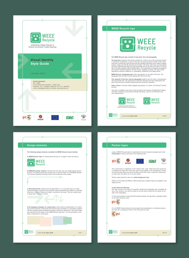
WEEE Recycle design templates, together with the style guide, were shared with partners and stakeholders as a ‘design tool kit’.
Examples of Visual Identity Implementation
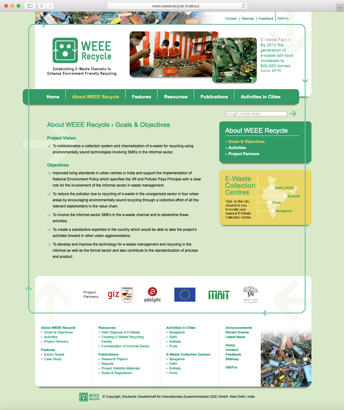
A website for WEEE Recycle was also developed. Its visual design was faithful to the style guide and skillfully implemented by Crossover Technologies. It was designed for a screen width of 1200 pixels (before the era of responsive or mobile friendly websites).
In Essence
WEEE Recycle logo became the (eco) friendly face and a visual identifier of the initiative. The style guide helped to dress the project’s communication in a consistent, topical, dynamic and modern manner. The project’s international look was representative of the best practices and technical expertise that came in from several countries.
KINDLY NOTE: WEEE Recycle project is no longer active. Information provided in the Background and Purpose section of this article was taken from the WEEE Recycle brochure published in 2010 and may be outdated.
Copyright Information
- All images / designs featured in this article are copyrighted and may not be reproduced. © Copyright 2010, Deutsche Gesellschaft für Internationale Zusammenarbeit (GIZ), India.
- Logos of GIZ, EU, BMZ, MAIT, Toxics Link and adelphi featured in the layouts above are copyrighted.
Photo Credits
- Photographs of e-waste and e-waste recyclers featured in the layouts © Copyright, GIZ India
- Photograph of e-waste courtesy John Cameron on Unsplash
- Photograph of e-waste recycling courtesy Elly Filho on Unsplash
- Paper texture in mockups courtesy Kues1 on Freepik
Related Article
Also read the article Thinking About E-Waste Calendar Design