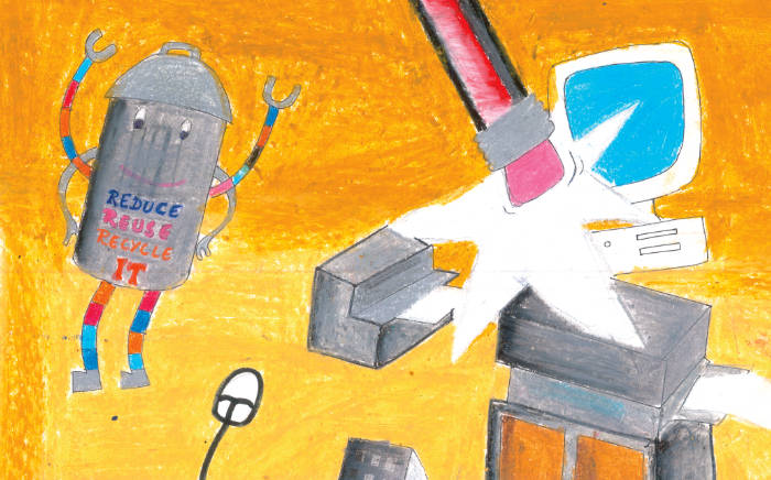
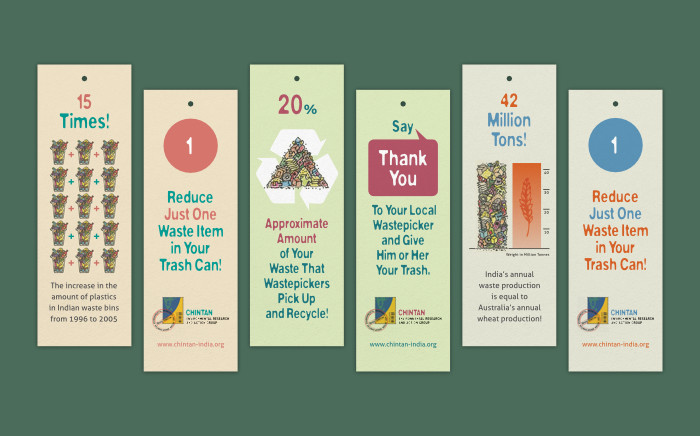
Design of a wall calendar expressing concern by school children about the future of our planet, was inspired by the artworks featured in it. Playful, vibrant and hopeful in feel, it acted as an everyday reminder of the need to do our bit.
Background and Purpose
WWF (World Wide Fund for Nature) India is one of the foremost organisations working for the conservation of India’s wildlife and natural habitats, and on a range of environmental issues. As part of its environment education initiative Wild Wisdom Quiz, a Wild Wisdom poster making competition was organised in 2018. It involved school children from states across India. In the competition, students were encouraged to express their concern for the future of our planet.
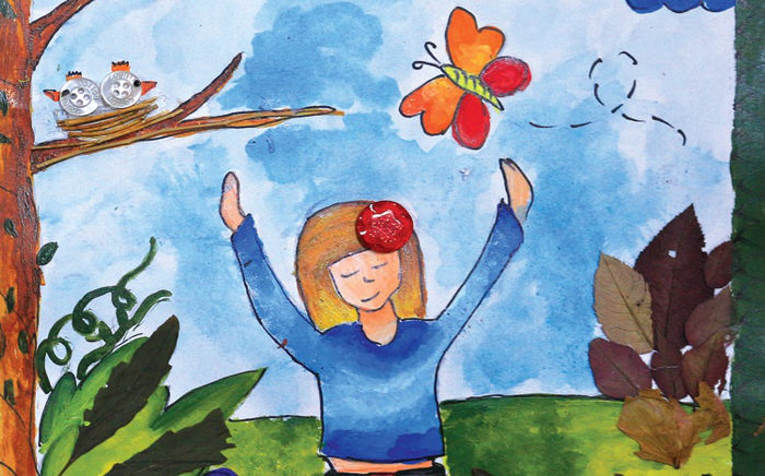
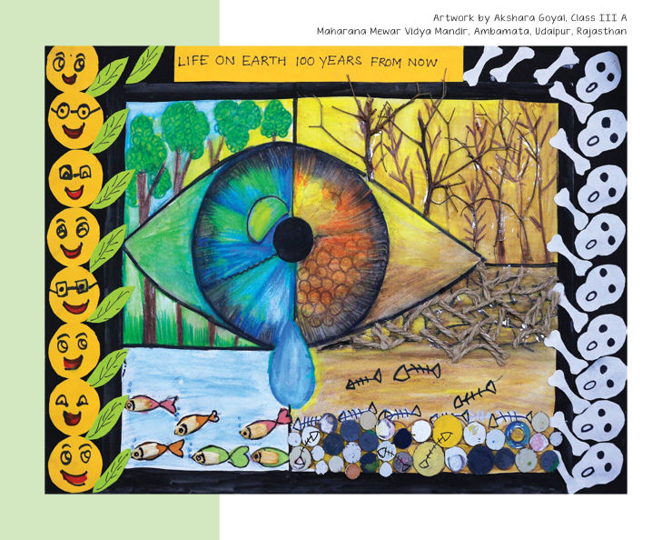
The artworks, created by students ranging from class 3 to 11, were truly stunning and thought-provoking.
Requirement
In the second half of 2018, WWF-India commissioned the design of a 2019 wall calendar showcasing some of the best artworks from the competition. Titled Our Green Planet, the calendar also featured trivia and facts about nature and environmental issues. It was meant to empower users with knowledge, love and empathy for the environment — every day of the year.
Calendar Design Rationale
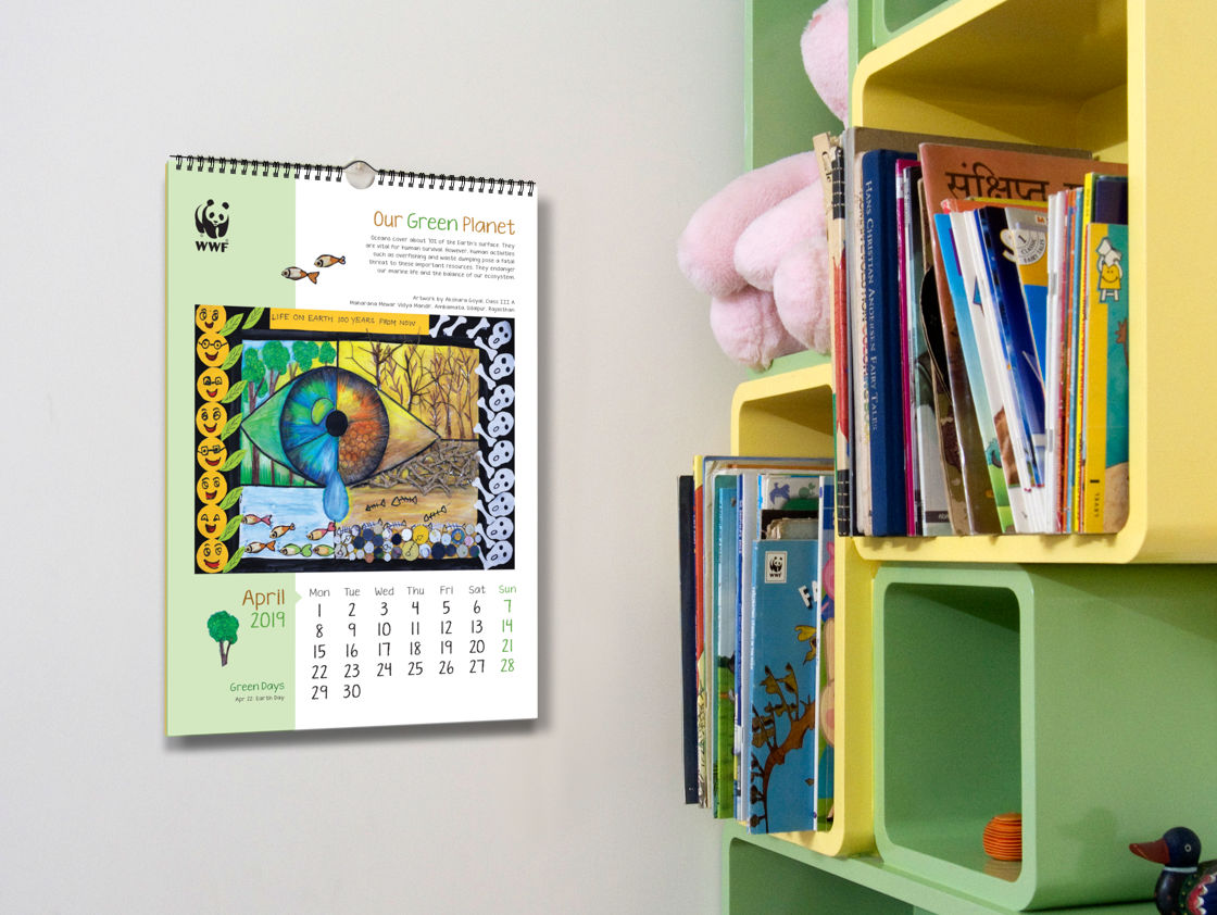
Inspiration for the design concept of the calendar — unsurprisingly — came from the beautiful and emotive artworks featured. It was decided to treat the layout as a spirited message from young minds to care for our planet. Visual elements were set within a size of 12 inches (width) x 17 inches (height), upon consultation with the printer.
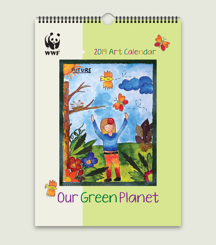
Playful, Supportive Layout
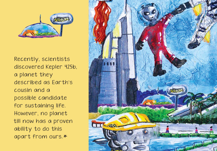
The layout became an extension of the paintings featured. A few key elements from each artwork were placed around the layout like icons, for a child-like, playful feel.
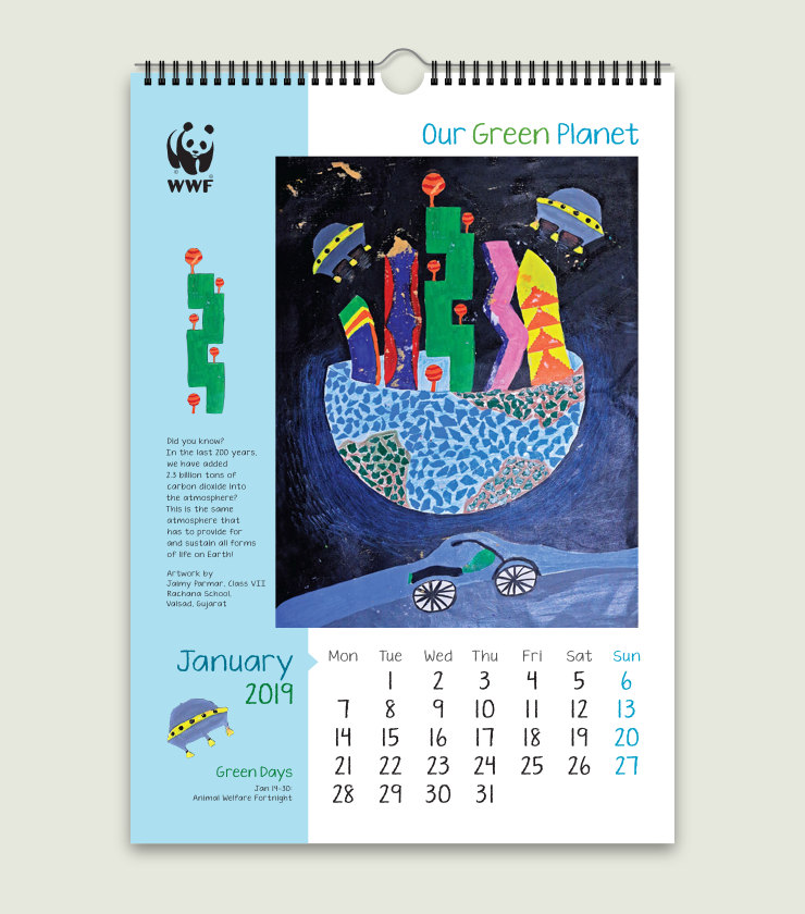
A light coloured bar on the left side of the layout supported the artwork on the page and divided the space into two broad parts for better organisation of elements. A small arrow extending from the bar acted as a connector between the two sections. The layout was flexible enough to accommodate paintings in both portrait and landscape orientation — an important consideration in this case.
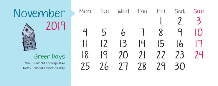
Dates were placed at exactly the same place on every page, towards the bottom right, allowing users to quickly flip through previous and next months when required. This is an important aspect of calendar usability.
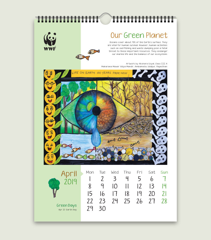
Varied and Vibrant Colour Scheme
Colour palette for each calendar page was varied, to match or compliment the artwork featured on it. This made every page appear fresh and vibrant.
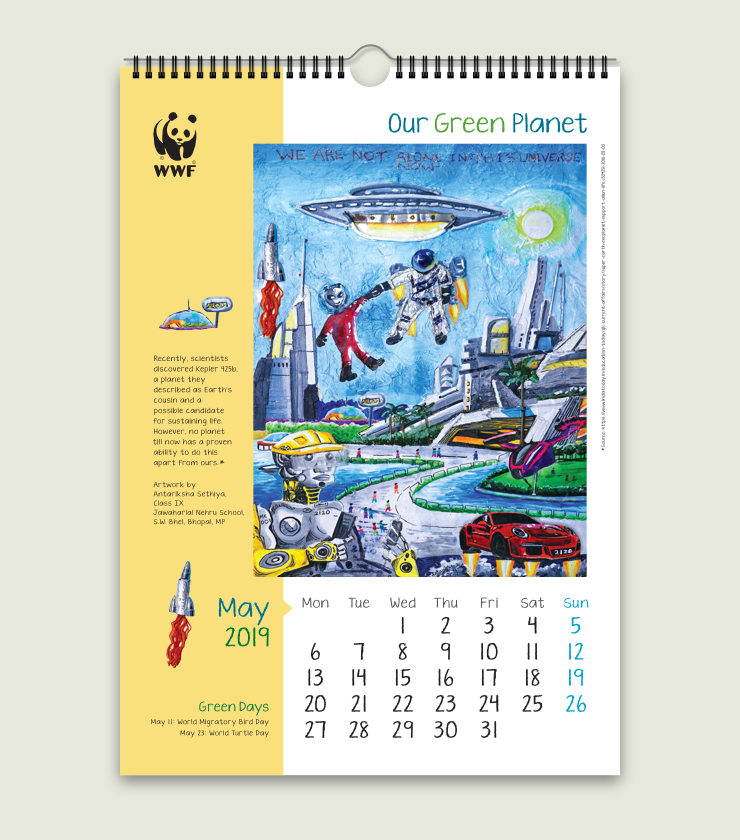
Consistent, Child-like Typography
Only one typeface was used to compose all calendar text. The font KG Ten Thousand Reasons by Kimberley Geswein was chosen for its crayon look. It reinforced the child-like feel in the calendar. The font also had good legibility. Manual kerning was done to text where required.
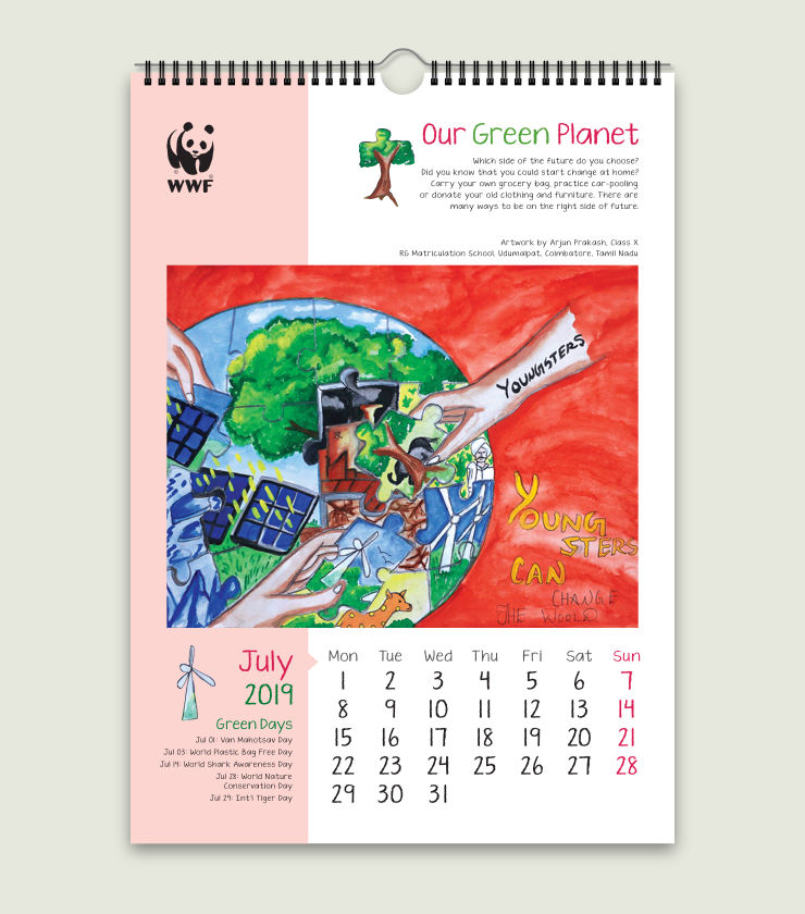
In terms of type sizes and arrangement, overall typographic treatment was consistent throughout the calendar. This brought in a sense of order and practicality to an otherwise playful looking layout.
‘Our Green Planet’ Branding
It was important to flag the calendar name / theme on every page specially as calendars are used over a period of several months if not the whole year. Our Green Planet appeared on the top right hand side of every inside page of the calendar, like a product brand name.
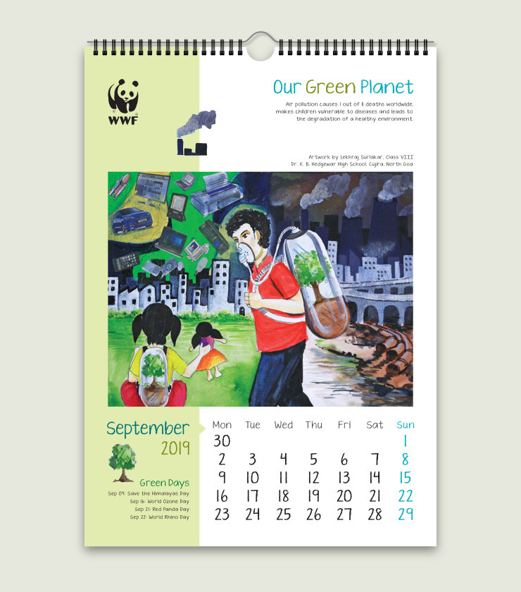
Simple and thought-provoking, the calendar name — set in a large type size — acted as a gentle reminder of our responsibility towards the planet.
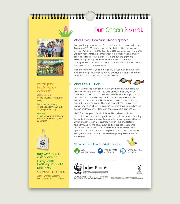
Design of the Information Page
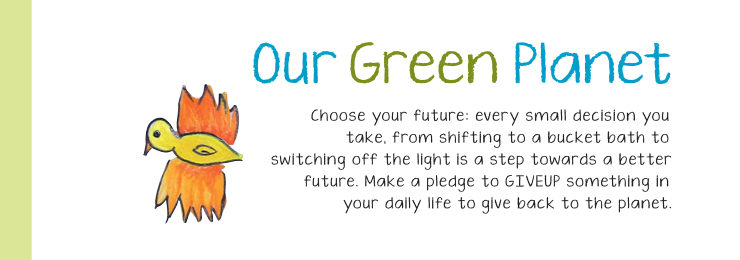
One of the calendar pages was dedicated to providing information about the organisation and its environment education initiative. It also featured links to WWF-India’s activities for children and mandatory / boilerplate text. Its design or overall layout was in sync with rest of the calendar pages.
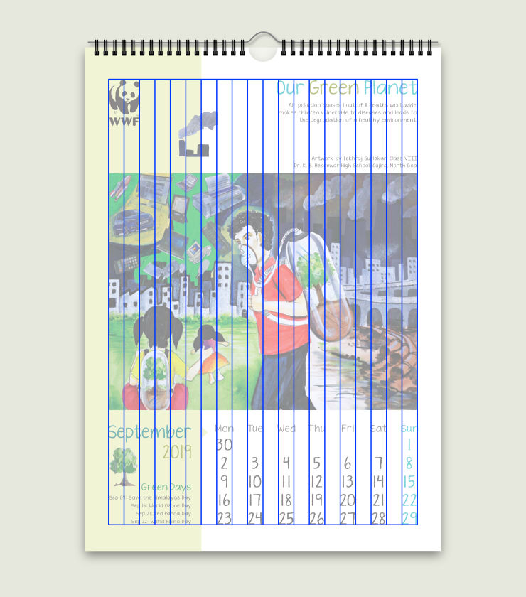
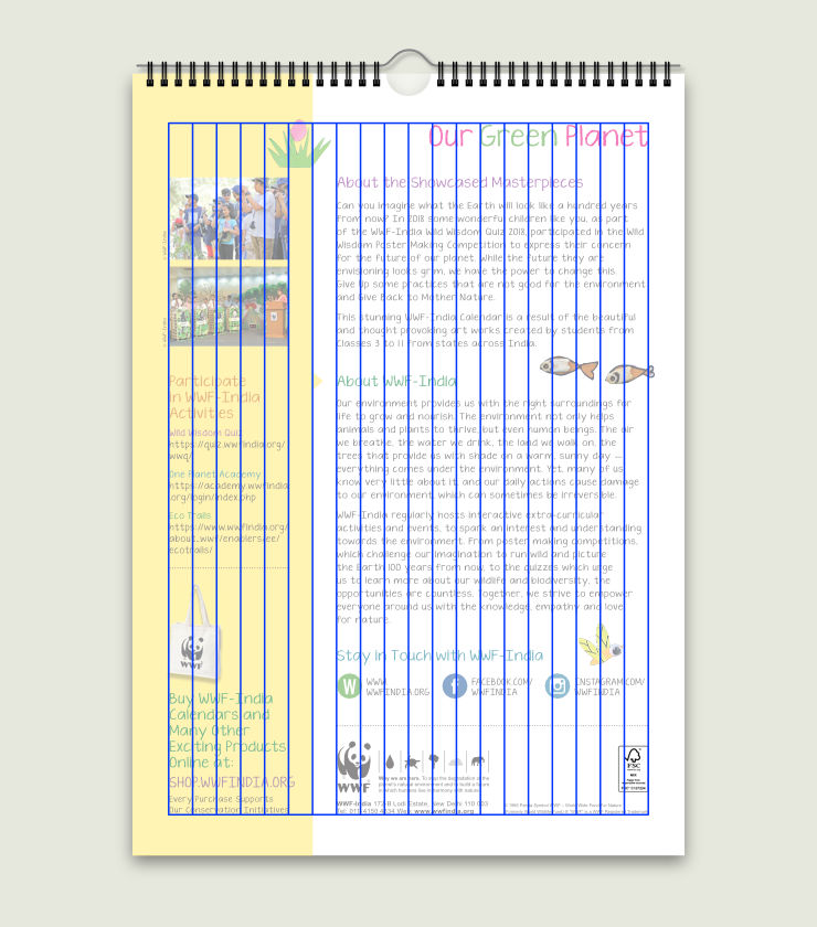
Grid Based Layout
A 20 column (background) grid was used across all calendar pages. It helped to organise content / elements with consistency, but also with flexibility.
In Essence
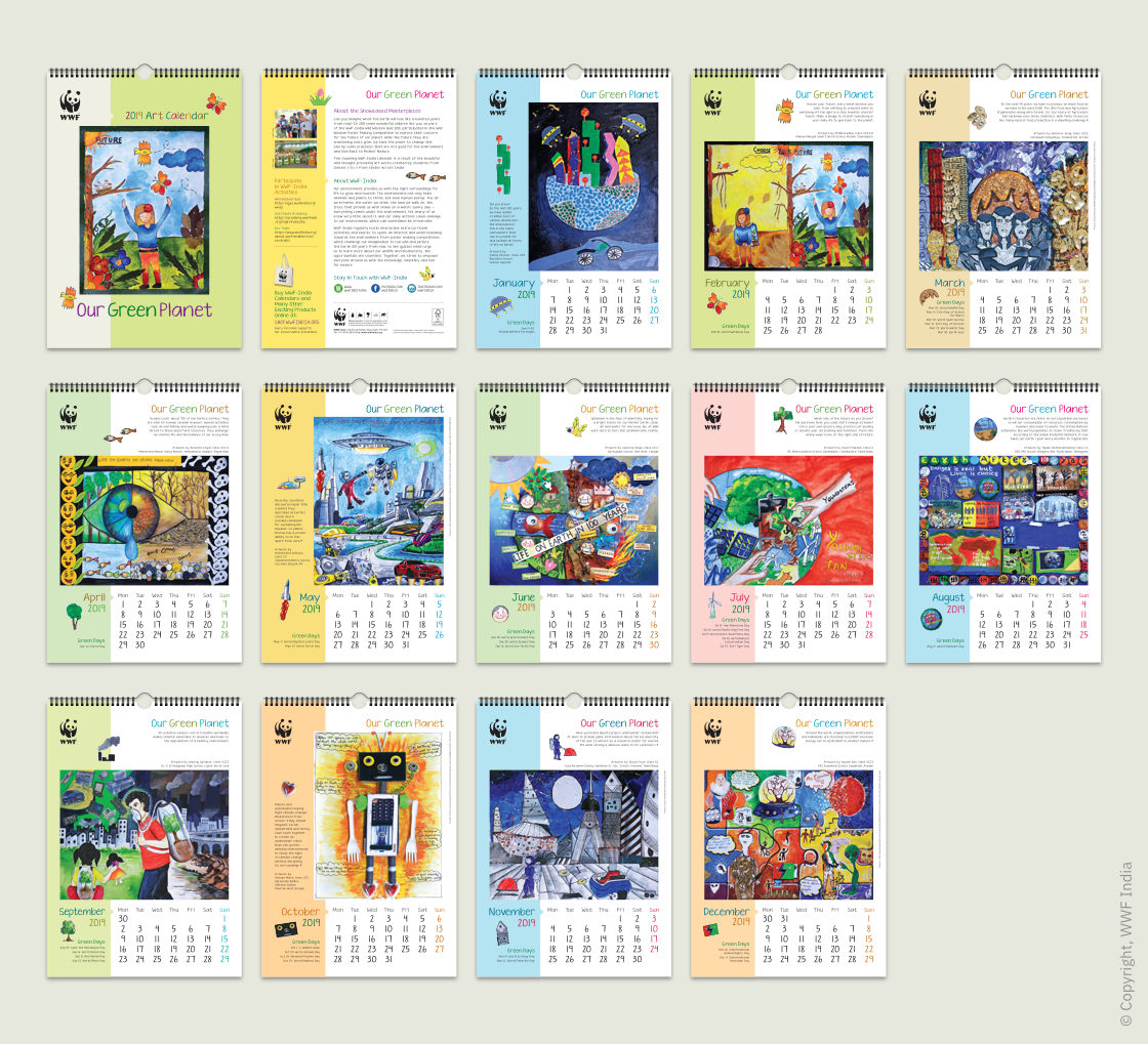
The overall playful yet structured layout of the calendar helped to showcase 12 stunning artworks expressing concern for our planet’s future. Even though some of the artworks acted as a grim reminder of the urgency to save our planet, the overall tone of the calendar was positive, vibrant and hopeful. The fact that the message about our planet’s future came from the younger generation made the calendar truly relevant.
Technical Notes
Trim or finished size of the calendar — 12 x 17 inches — was calculated to economise on and reduce paper wastage. It was printed in four colour offset on FSC (Forest Stewardship Council) Certified paper and bound with the aid of a Wiro.
WWF-India Nature Products
WWF-India calendars have a decades old legacy. Nature / wildlife enthusiasts, supporters and many others adorn their work and living spaces with them every year. Apart from calendars, a wide range of nature related / environmentally conscious products are available at the WWF-India Online Nature Store. Please visit and support if you can, proceeds from sales go towards the organisation’s conservation mission.
Copyright Information
- WWF Panda logo / symbol, all designs and images published in this article are copyrighted and may not be copied or reproduced.
- WWF® and ©1986 Panda Symbol are owned by WWF. All rights reserved.
- © 1986 Panda Symbol WWF – World Wide Fund For Nature (Formerly World Wildlife Fund). ® “WWF” is a WWF Registered Trademark
