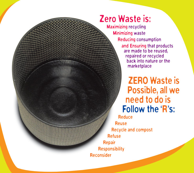
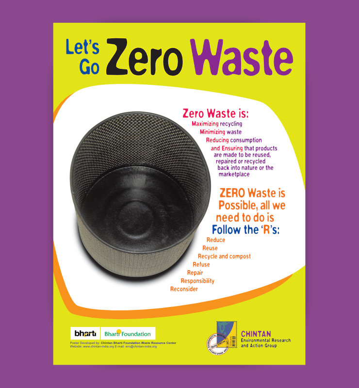
Visual of an empty waste bin was used as the key ingredient in a thought-provoking educational poster about waste. The poster was given a strong brand look with an energetic feel.
Background and Purpose
Chintan Environmental Research and Action Group is a New Delhi, India based non-profit organisation working on issues related to the environment and environmental justice. Inclusive, Sustainable, Equitable Growth For All is Chintan’s motto.
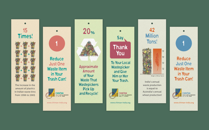
As a part of Chintan – Bharti Foundation Waste Resource Center’s environment education initiative, design of a poster on Zero Waste theme was commissioned in 2006. It was meant to inform school children (in the NCR or National Capital Region of India) about the issue of waste in an interesting manner and urge them to do their bit. Text for the poster, written by the Chintan team, was thought-provoking.

Design Rationale
Upon consultation with the Chintan team, it was decided to have a dominant visual / image of an empty waste bin in the layout. Waste bin is something everyone of-course identifies waste with, a round bin shot from the top also roughly looked like a ‘Zero’ shape-wise 🙂 One of the waste bins in use at Chintan office was thus (enthusiastically) photographed by staff of the organisation using a digital camera, for use in the poster.
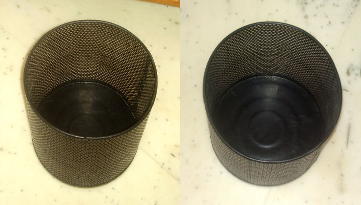
The waste bin visual was cut out by the designer using an image editing software and poster text wrapped around it in the layout, reinforcing the Zero Waste message.
Energetic Look and Feel
The visual and text combination was placed in the poster layout. Overall look and feel of the poster including the typeface (Washout Thin) used conformed to Chintan’s brand / visual identity. Bright or neon-ish colours were used to make the poster look energetic, enthusiastic and appealing to young minds.
Technical Notes
Keeping the budget and sizes of school notice boards in mind, 14×19 inches was chosen as the poster size. It was printed in 4 colour offset.
Photo Credits
- Photograph of waste bin courtesy Chintan
- Photograph of food and packaging waste courtesy Paul Schellekens / Unsplash
- Photograph of brightly painted wall courtesy Janita Sumeiko / Unsplash
- Leaves shadow overlay on poster mockup courtesy Starline / Freepik.com