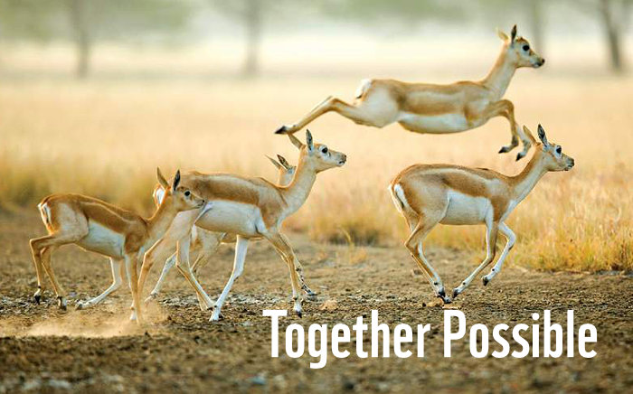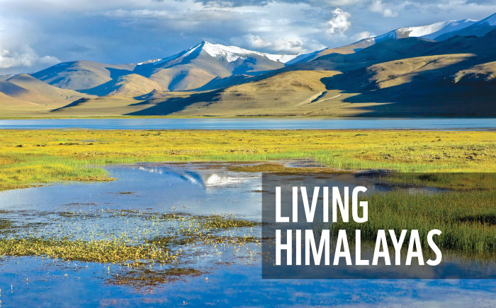
With stunning images and thought-provoking information, WWF-India’s 2023 wall calendar about the majestic Himalayas was designed to be consistent across pages, on-brand, and incorporated several usability features.
Background and Purpose
WWF (World Wide Fund for Nature) India is one of the foremost organisations working for the conservation of India’s wildlife and natural habitats. Every year, WWF-India brings out a range of calendars that foster appreciation of and disseminate knowledge about nature. They also inform users about conservation / environment related issues. Proceeds from sales help to support the organisation’s conservation mission.
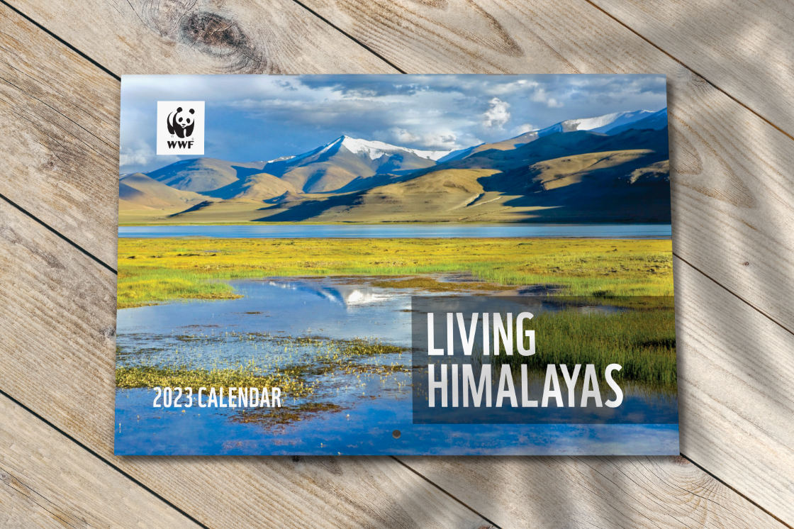
In 2022, WWF-India conceived the design of a year 2023 large format wall calendar with focus on the Himalayas. Alongside breathtaking natural landscape photographs, the calendar was to feature factual and thought-provoking information about this majestic mountain range. Its title — Living Himalayas — signified the important ecological role that the Himalayas play on our planet.
Design Rationale
The designer worked in close co-ordination with WWF-India team throughout the design and development process of the calendar. Every team member’s contribution — including planning, content writing, co-ordination with photographers and the printing press — was valuable in making the calendar a reality.
Optimisation of Images
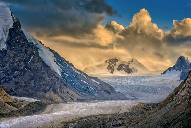
Ensuring faithful reproduction of the stunning landscape images was one of the most important aspects of the design assignment. After being carefully selected, the photographs were optimised for four colour offset printing in a professional image editing software, using several photo editing best practices .
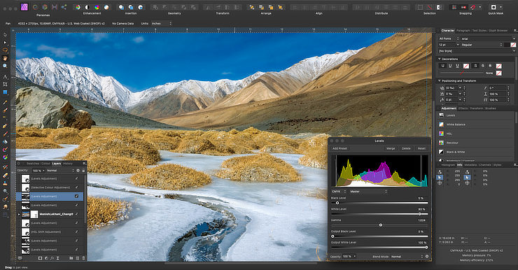
Many of the images were received from photographers in raw format. They were developed digitally using advanced image processing techniques and exported as high resolution TIFF images in CMYK colour mode. The photographs were not tweaked or tampered with in any manner.
Adherence to Brand Guidelines
Layout of the calendar was put together by studying WWF brand guidelines — which included placement of key elements including WWF logo, and use of fonts and colours.
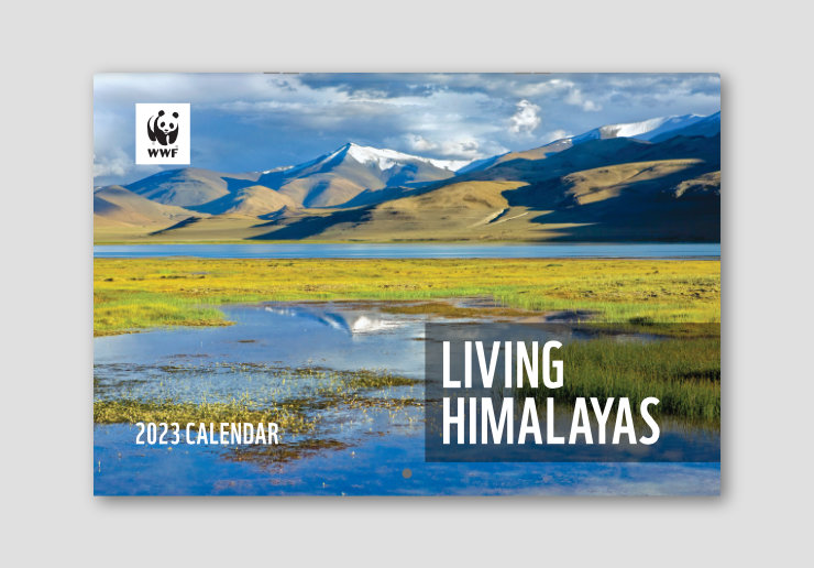
On the calendar cover, the title was set in large size to stand out in retail spaces and in thumbnail images on E-commerce websites.
The Calendar Layout
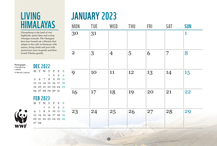
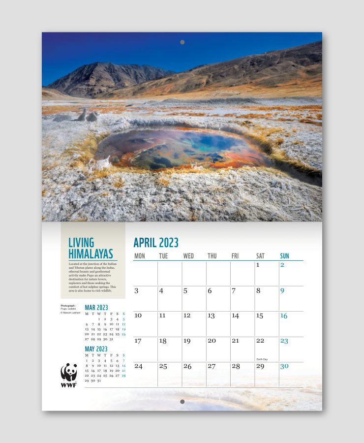
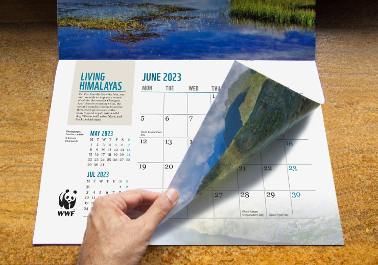
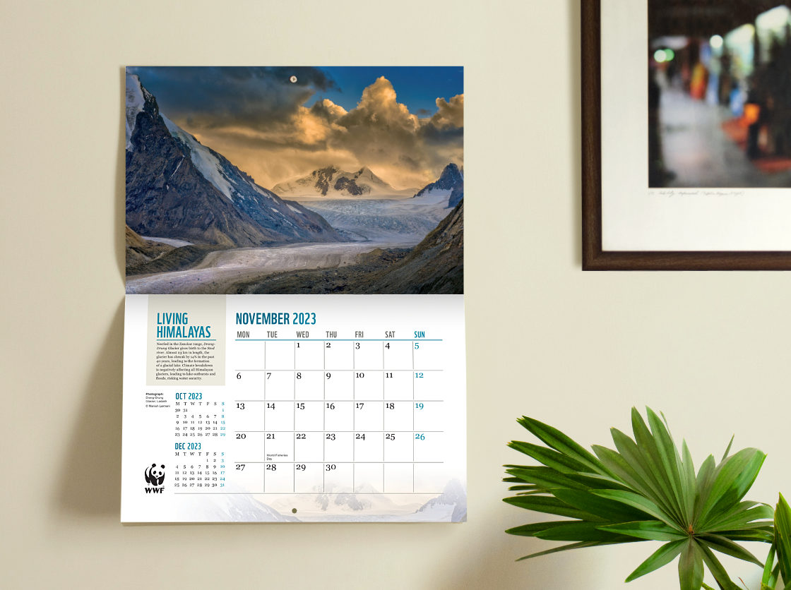
Top portion of every calendar spread — which comprised of a top and a bottom page — featured a full-bleed (edge-to-edge) landscape photograph to maximise its impact and aesthetic value.
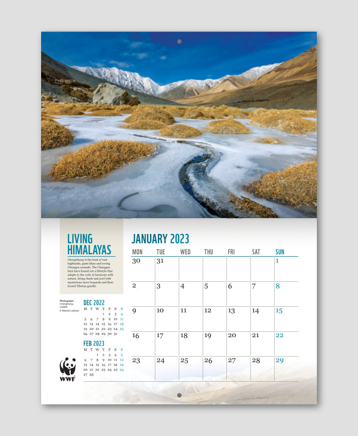
The bottom portion or page layout comprised of:
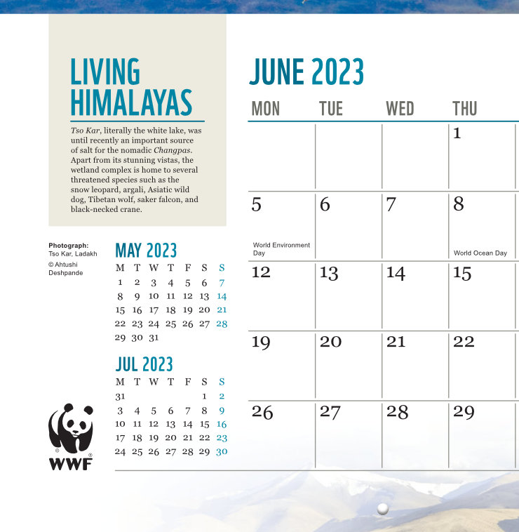
- A content box on the top left, touching and relating to the photograph above, containing the calendar name and a short write-up about the location.
- A large, clean looking, usable planner with Sundays clearly marked took up most of the space on the page.
- Photographer’s name, location name, and previous and next calendar months (in smaller size) were placed below the content box.
- WWF logo was placed on the bottom left hand side, aligned to the bottom of the planner. Negative space above the logo allowed it to stand out in the layout.
- A faint image (like a watermark) of the photograph above was placed at the bottom right of the layout to break the rigid feel of the planner section.
- Dates / green days relating to nature and the environment were also marked in the planner.
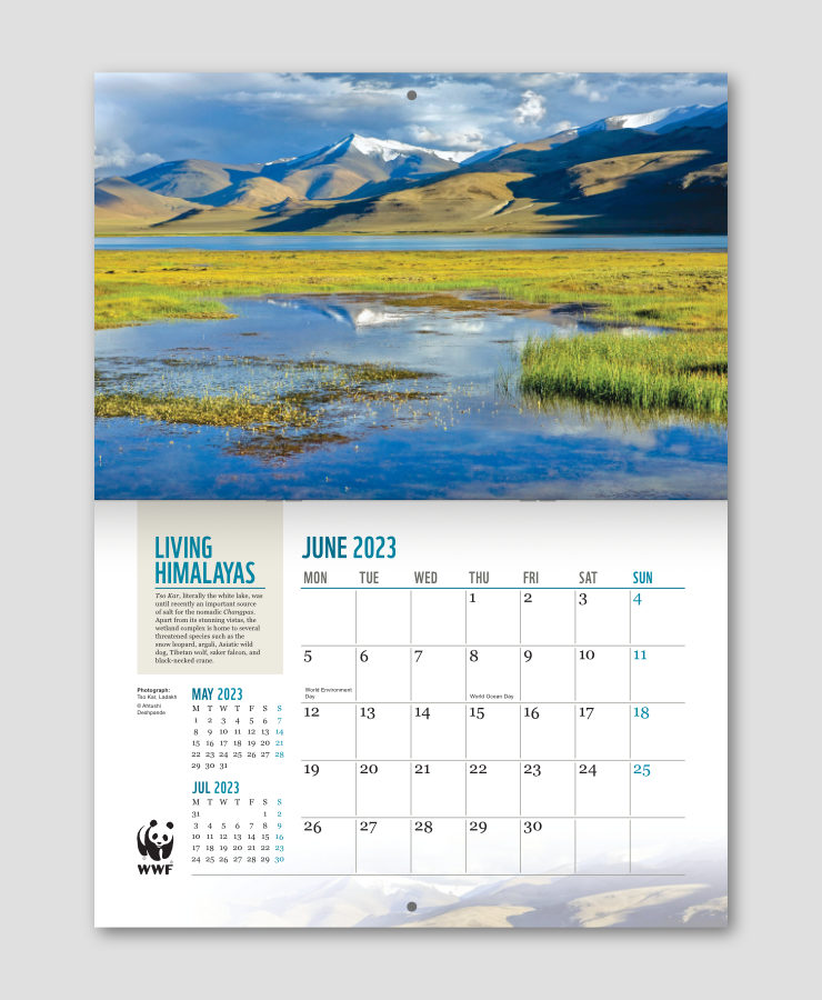
Overall, the photograph played a dominant role in each calendar spread. Bottom page layouts were visually balanced, with careful positioning of and emphasis on key elements.
Typography and Typographic Hierarchies
Typefaces used in the calendar layout conformed to WWF brand guidelines. All headers were set in WWF font and remaining text in Georgia. The clarity and boldness of WWF font helped to make the headers easily discernible. Georgia lent to the calendar an elegant touch. Its large x-height and legibility also made the text quite readable. The boldness of WWF font and the beauty and elegance of Georgia represented similar values associated with the Himalayas. Photographers names, location names and green days were set in Arial typeface (which has a neutral feel).
Typographic hierarchies — uniform sizes and styles of fonts on every calendar page — helped to make the layouts appear consistent.
Conspicuousness of WWF font and its combination with Georgia also bestowed the calendar with a strong brand look.
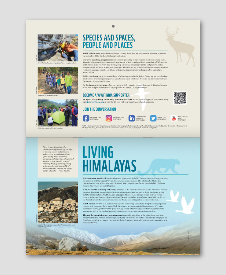
The first two pages of the calendar (inside cover and page 1) featured information about WWF-India (top section) and a thematic write-up (bottom section). Here again, the same typefaces and type styles were used.
Minimal Colour Scheme
WWF brand colour palettes were consulted for colour combinations to be used in the calendar. Blue, along with two of its tints, was chosen as the main or dominant colour, owing to its association with landscapes and the outdoors. Headers were set in Blue, it was also present in most of the featured photographs and matched them very well. All other colours used in the layouts had a neutral feel. WWF base colour (Beige) was used in the background of content boxes and on pages with information. Most of the calendar text was set in Black or Grey.

The blues also acted as accent colours, and highlighted key pieces of information like headers, month and year names and Sundays.
Overall calendar colour scheme was subtle and allowed the landscape photographs to dominate in the available space.
Use of a Grid System
A 10 column x 6 row modular grid system, within outer margins, was used to organise visual elements and content on every calendar page. Two of the columns also had sub-divisions.
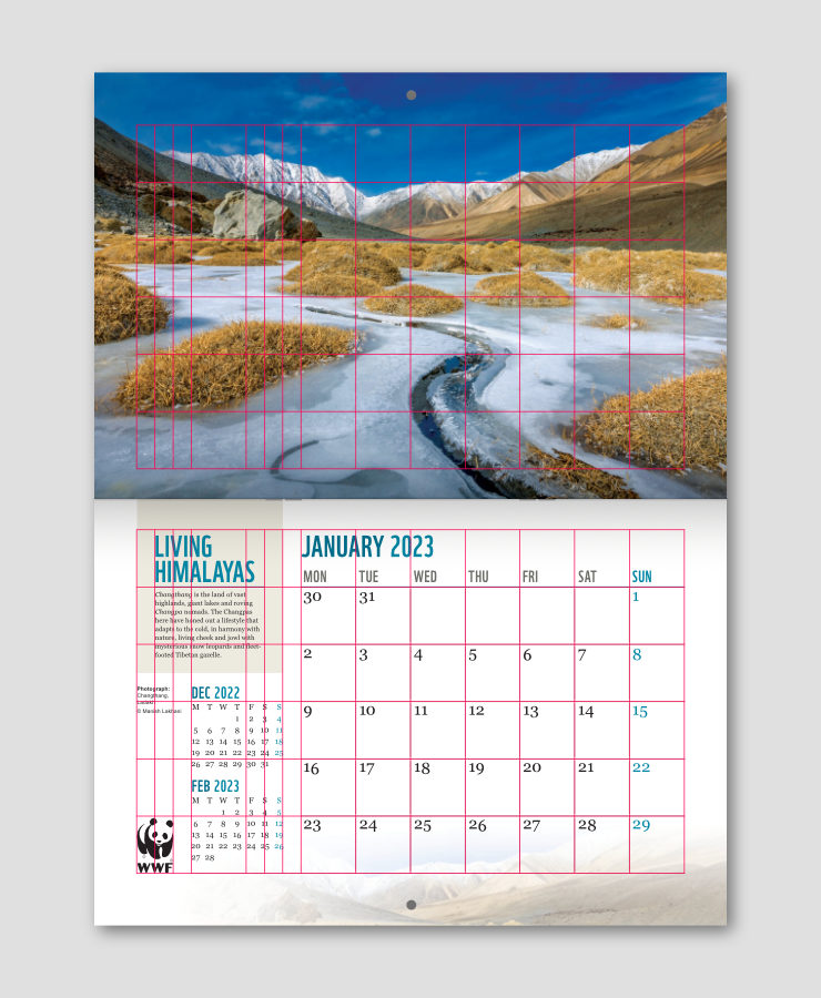
Owing to the grid, page elements could be placed with accuracy and consistency. Content in the introductory pages was also organised with the aid of the same grid system.

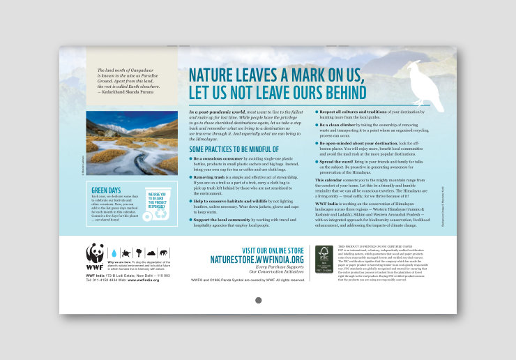
Back Page Layout
Back page of the calendar featured thought-provoking content about treating the Himalayas — including the wildlife and local communities there — with respect. Colour scheme, typographic styles and overall layout here was consistent with the rest of the calendar, and used the same grid system. Bottom portion of the page contained mandatory / boilerplate information.
Calendar Usability Aspects
A wall calendar is used on a daily basis and is often instrumental in making users plan their days. Several features were incorporated in the layouts to facilitate the calendar’s usability:
- Text sizes were kept relatively large since Living Himalayas was a large format calendar. This allowed dates to be discernible from the distance of a few feet.
- Good contrast ratio ensured that the text stood out against light or white page backgrounds, and be perceptible to users with weak eyesight.
- Typographic hierarchies made the content easy to understand.
- Accent colours — Blue and its tints — made it easy to identify key pieces of information like headers, month and year names and Sundays.
- Large enough grids in the planner on every page were helpful to jot down short notes.
- Consistent layout of every calendar page made it easy for users to find dates in other months by flipping pages. Availability of previous and next month dates along with the planner also enhanced the usefulness of the product.
Technical Details
Open size of the calendar was 16.3 inches (width) x 22 inches (height), and closed or folded size — important while shipping — 16.3 inches (width) x 11 inches (height). There were 28 pages (14 sides) in all, including cover and back cover, and 2 pages with information. It was printed in four colour offset, on FSC (Forest Stewardship Council) Certified paper, and center stapled for binding.
In Essence
Living Himalayas calendar showcased some stunning landscape images. Putting it up on a wall was no less impactful than putting up a work of art. Thought-provoking content that supported the photographs aimed to deepen users’ knowledge and understanding about one of the most ecologically important sites on our planet. The planner section was designed to enhance the calendar’s usability. Its overall look and feel conformed to WWF brand guidelines.
The calendar sold well and received many positive reviews on online marketplaces. Most importantly, it supported and furthered WWF-India’s conservation mission.
WWF-India Nature Products
WWF-India calendars have a decades old legacy. Nature / wildlife enthusiasts, supporters and many others use them in their work and living spaces every day. Apart from calendars, a wide range of nature related and Eco-conscious products are available at the WWF-India Online Nature Store. Please visit if you can, your purchases will support the organisation’s conservation initiatives.
Copyright Information
- WWF Panda logo / symbol, all designs and images published in this article are copyrighted and may not be copied or reproduced in any manner.
- WWF® and ©1986 Panda Symbol are owned by WWF. All rights reserved.
- © 1986 Panda Symbol WWF – World Wide Fund For Nature (Formerly World Wildlife Fund). ® “WWF” is a WWF Registered Trademark.
Photo Credits
- Calendar page layouts, including the photographs in them, published here with permission from WWF-India
- Photographs in the calendar introductory page layouts © Copyright, WWF-India and © Copyright, Dipankar Ghose
- Screen shot of Affinity Photo software user interface © Copyright, Serif (Europe) Limited, used under fair use guidelines
- Photograph of Tso Kar, Ladakh, featured on the calendar cover and June 2023 calendar page layout © Copyright, Ahtushi Deshpande
- Photographs of Changthang, Puga and Drang-Drung Glacier, Ladakh, featured in calendar layouts © Copyright, Manish Lakhani
- Wooden background in printed calendar mock-up courtesy Alexandre Boucher / Unsplash
- Leaves shadow overlay in printed calendar mock-up courtesy Starline on Freepik.com