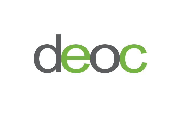
A minimalistic logo designed for Diversity and Equal Opportunity Centre, India, visually depicted the organisation’s ethos of equality and inclusion. With due regard for accessibility, it was also tested for colour blindness.
Background and Creative Brief
Diversity and Equal Opportunity Centre (DEOC), is one of the pioneers of integrated end-to-end services in the domain of disability inclusion in India. It was founded on the fundamental belief that persons with disabilities have equal rights and responsibilities as all other citizens of the country. The organisation strives to promote equal opportunity and inclusion in all spheres of life.
DEOC works in the areas of education, employment, accessibility and technology. It provides consultancy, advocacy, research and training services to corporates, nonprofits, institutions and international agencies.
Design of a logo for DEOC was commissioned in 2010, a few years after the organisation was founded. In the creative brief received from the client, key points mentioned were that the logo should be holistic in nature and depict diversity as well as equality or equal rights. The client was keen to have a clean, professional looking and distinctive logo ideally without the use of an icon / pictorial mark or symbol. Owing to the sensitive nature of their work, they wanted the logo to have a neutral feel.
Design Rationale
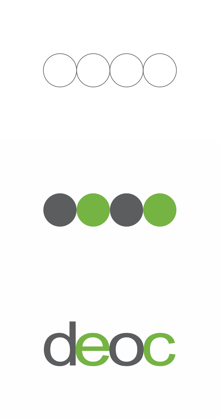
While working on logo concepts, the designer realised that all four first letters or characters in the organisation’s name (d, e, o, c) had similar round shapes when typed in lowercase. A stroke of luck perhaps for as soon as the four were assembled together, they (visually) depicted equality. But as each of the four letters was unique, together they also symbolised diversity.
Of the several logo design options presented to the client, the one finalised was typographical, a minimalistic wordmark. It consisted of the four letters or initials arranged in close proximity to each other, symbolising inclusion. They were set in Helvetica, a sans-serif typeface well regarded for its clarity, legibility and neutral feel.
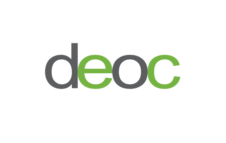
The four letters together, touching each other and dressed in alternating Dim Grey and Lime Green colours, reinforced the proposition of diversity and equality / equal opportunity. The Grey represented strength and neutrality. The Green — a colour often perceived as soothing to the human eye — represented optimism, respect, faith and transparency.
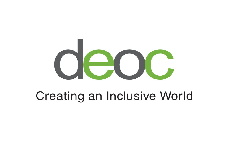
The finalised logo was also clubbed with the organisation’s tagline Creating an Inclusive World.
Logo Contrast, Colour Blindness Tests / Simulations
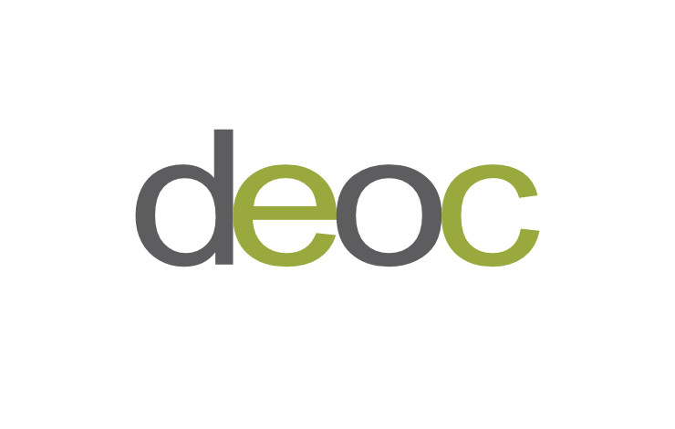
When the logo was designed, it was lighter in appearance. Surfing the web on small screen, handheld or mobile devices was not widespread then. However, the logo was re-looked at in 2020 and darkened to have better contrast — in terms of figure-ground relationship. This was important for it to be legible to viewers with weak eyesight using small mobile devices.
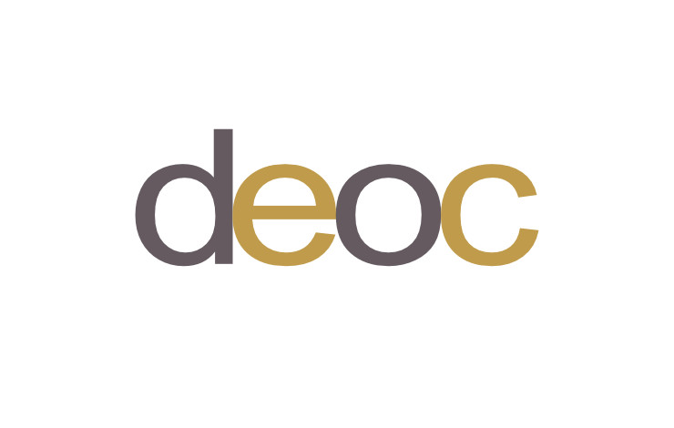
Since vision is an important aspect of accessibility — one of DEOC’s key areas of work — the logo was also tested for colour blindness (how it would appear to colour blind viewers) using Coblis Color Blindness Simulator on the Colblindor website. All available simulations were carried out and shared with the client. Here are some of them:
Technical Notes
Upon finalisation, an artwork — incorporating multiple digital files of the logo for faithful reproduction in print and on the web — was submitted to the client. It included a version in Greyscale for reproduction in single colour or black and white printing jobs. The simplistic logo was also screen printable.
Conclusion
Overall, the logo visually represented the organisation and its ethos in a holistic, simplistic and dignified manner. The client was instructed to use / reproduce the logo on a white background as far as possible, for the best possible visual contrast ratio.
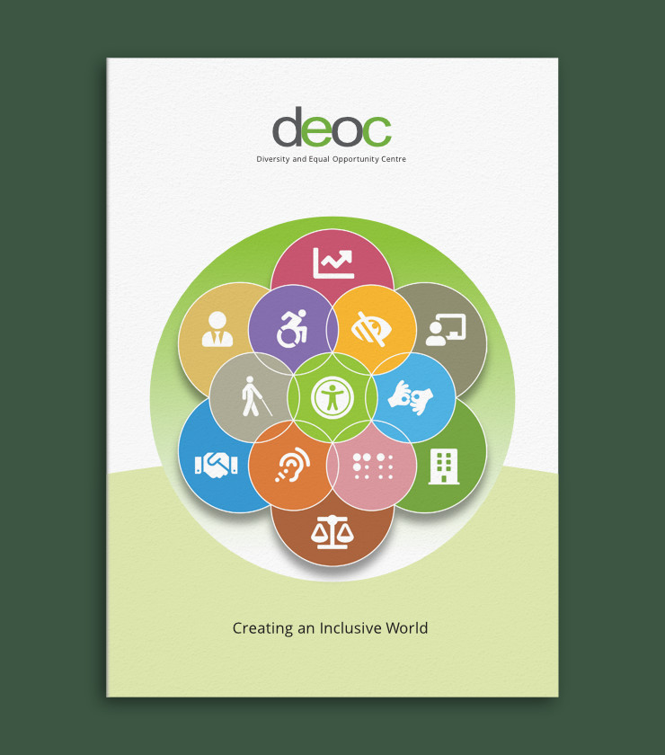
You may also wish to read the related article: Brochure Design for DEOC
Photo Credits
- Photograph of inclusive workplace courtesy Kampus Production / Pexels
- Paper texture on brochure layout courtesy Augustine Wong / Unsplash
