Clean and minimal, slide show like visual design of artist Arunkumar H.G.’s website helped to showcase and catalogue his impressive body of work. It encouraged visitors to explore different site sections and entailed a consistent user experience.
Background and Requirement
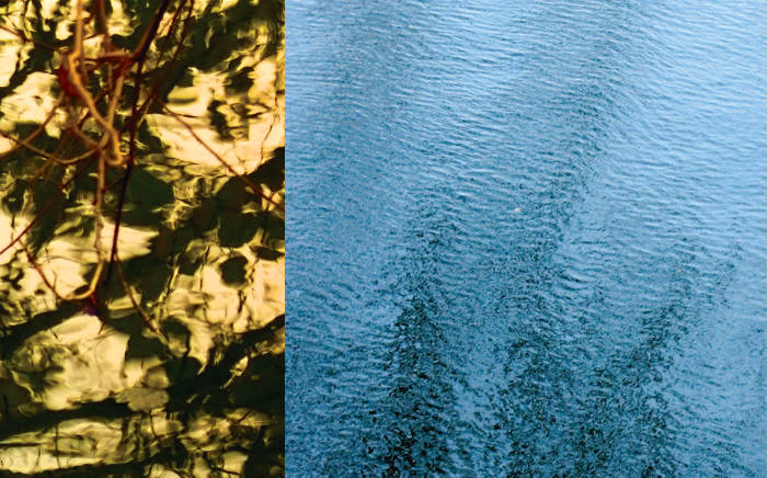
Mr. Arunkumar H.G. is a contemporary artist / sculptor based in the National Capital Region (NCR) and Karnataka, India. He is well-known for his conceptual, environmentally conscious works that often make use of popular elements and are stylistically bold and bright.
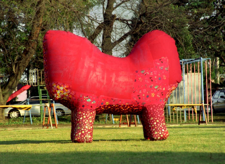
In 2003, the artist felt the need for a website to showcase and catalogue his impressive body of work. He wanted a clean, aesthetically pleasing template or visual design that would allow the artworks to stand out. He was also keen to categorise his works broadly into past, current and upcoming. Mr. Arunkumar H.G. hoped art aficianados, students and gallery curators would get acquainted with his art through the site.
Design Rationale
Design Template and Site Navigation
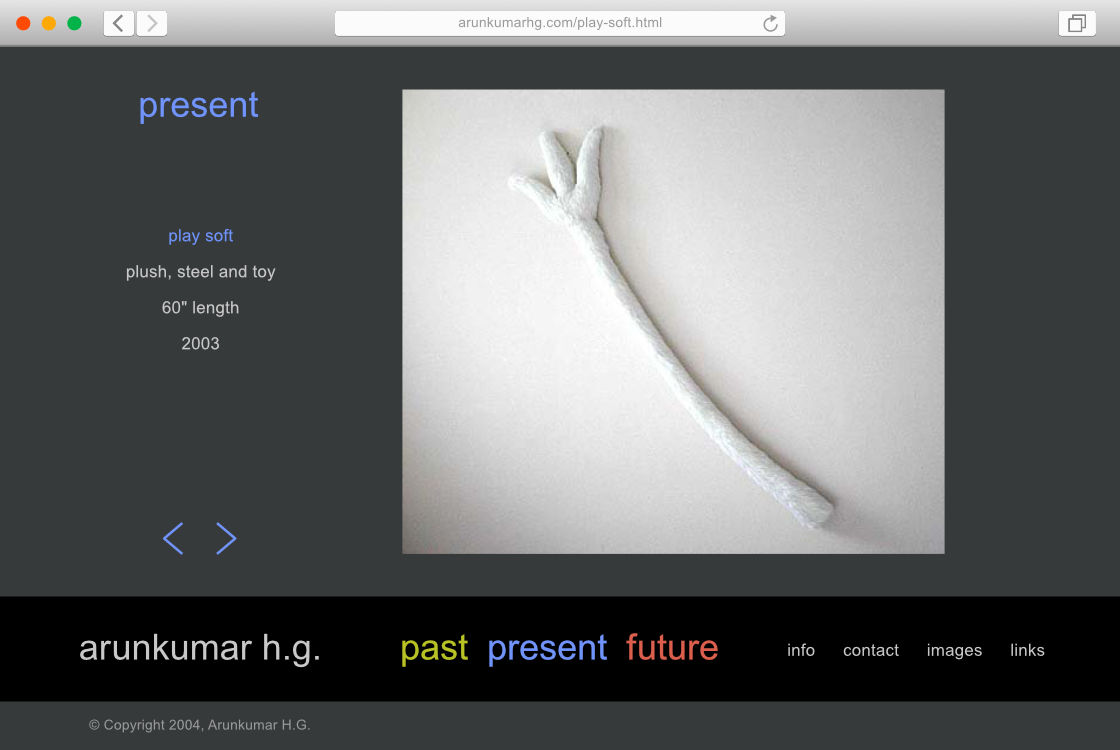
After consultations with the artist and exploration of multiple design options, the design template finalised was minimalistic, like a slide show. It consisted of two main parts. A dominant a top portion (in dark grey colour) contained the artworks, related information and gallery navigation. A darker, black bar at the bottom contained the main site navigation. Copyright information was placed below this bar.
As one browsed through the website, the artworks and related information took center stage and appeared first (or above the fold), followed by the navigation bar — consistently — on every page.
Calls to Action, Typography and Colour Scheme
Along with the artist’s name, Past, Present and Future sections were given prominence in the navigation bar: a Call to Action feature. The large and colourful links aimed to prompt or encourage users to explore the three sections and thus browse through a range of artworks and related information. Bright colours for these links and use of a sans-serif typeface were inspired by the bold and bright characteristics of the artist’s works. The site also had an informal touch with all text typed in lowercase.

Website colour scheme consisted of Dark Grey and Black (used in backgrounds), Light Grey (used for text), and Yellow Green, Dodger Blue and Coral Red — which were used as accent and link colours for the Past, Present and Future sections.
Website Home Page Design
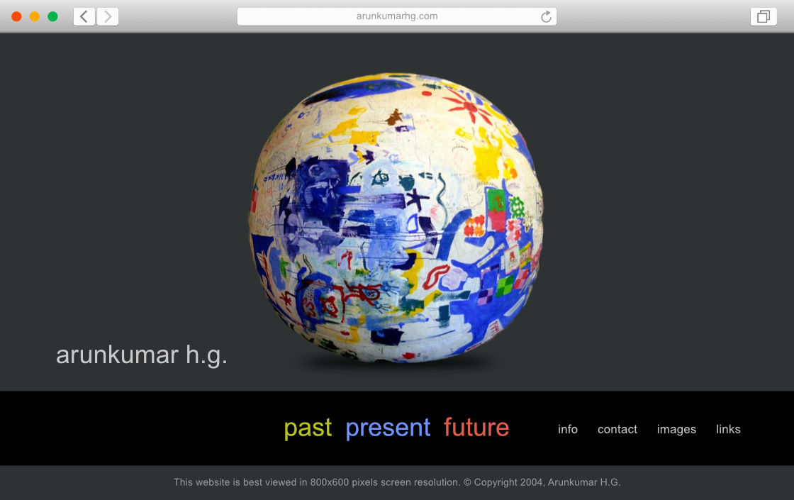
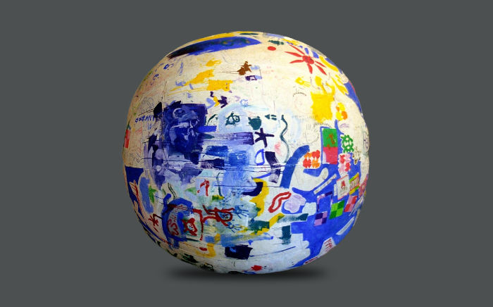
The home page layout aimed to set the tone for the website. It featured a large, cut-out image of Innocent Globe — an inflatable artwork painted upon by school children. The artwork — with its strong and emotive visual language — made it apparent that this was an artist’s website. Its round shape and bright colours were representative of the artist’s ethos.
Design of Gallery / Catalogue Pages
Gallery pages of the website appeared like a slide show with prominent images of artworks left aligned to the Past-Present-Future navigation links. Related information was clearly arranged on the left hand side — centrally aligned to the artist’s name below — followed by back and forward navigational arrows. Each work had a page dedicated to it.
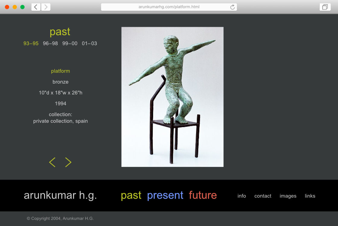
The Past section doubled up as a catalogue of Arunkumar H.G’s art. Here, the works were arranged chronologically, divided into combinations of years — which were also clickable hyperlinks.
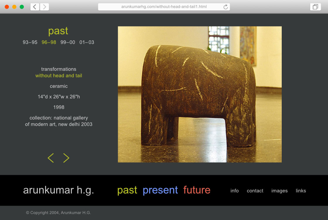
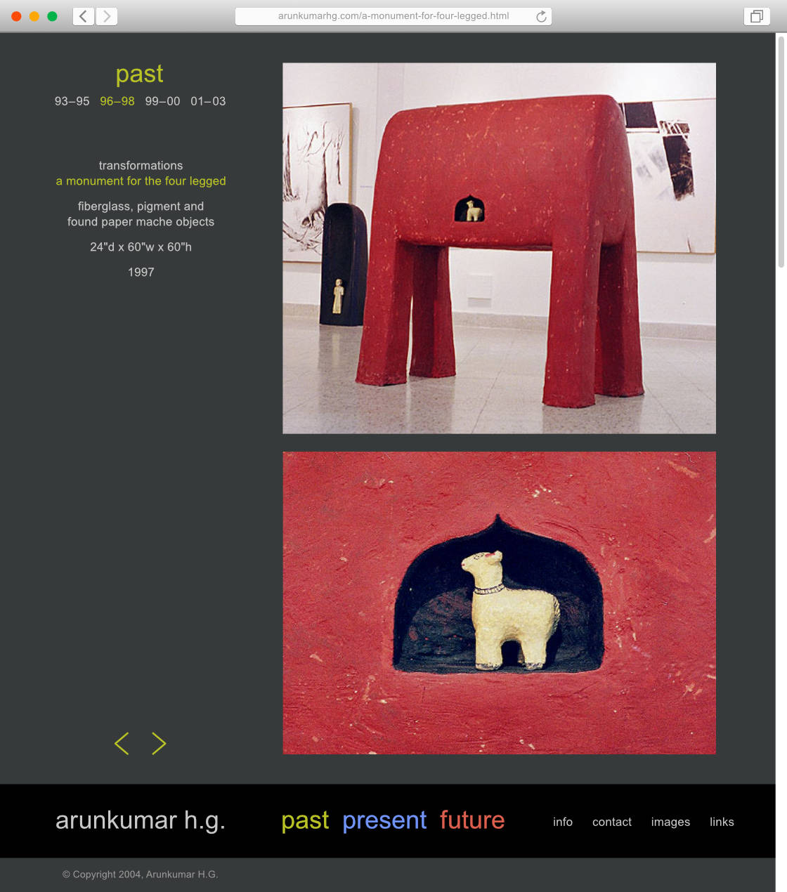
The template was flexible enough to accommodate images in different proportions / orientations. It could also feature multiple photographs of artworks.
Design of Pages With Information
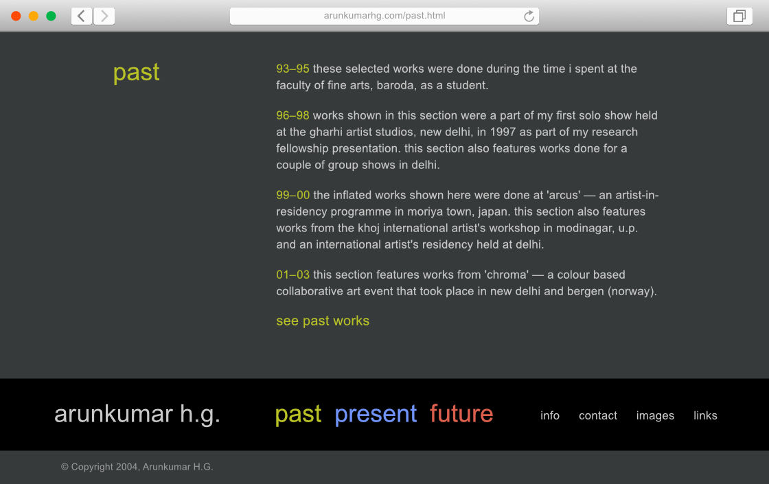
The same template was used to accommodate information about the artworks / artist / shows, which allowed for a consistent user experience across the site.
In Essence
The website helped to catalogue and present Arunkumar H.G.’s works and related information to a global audience, with clarity. The template’s consistency across different sections allowed users to quickly form conceptual models and navigate the site efficiently.
Technical Notes
The static website was designed to be viewed optimally in 800 x 600 pixel screen resolution. At that time (around 2003—2004, well before the prevalence of responsive or mobile friendly sites), browsing the web on computers using CRT monitors was the norm.
Mr. Arunkumar H.G.’s website has since changed to a newer, responsive website.
—
All images of artworks © Copyright Arunkumar H.G.
