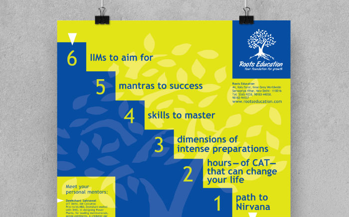
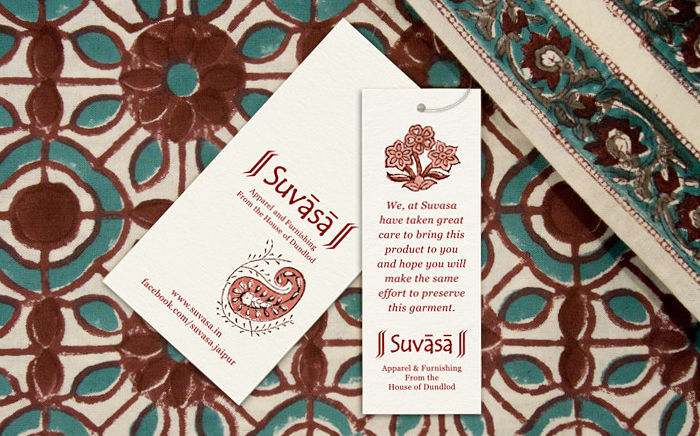
A two colour poster, designed to flag and get students interested in MBAGuru preparatory course, reinforced the parent organisation’s brand identity and was economical to print.
Background and Creative Brief
MBAGuru is one of the leading preparatory courses for the Common Admission Test (CAT) in Delhi / NCR (National Capital Region), India. Design of a poster for the course was commissioned by its parent company Roots Education, in 2003, during its foundational days. It was targeted at university / college students and designed in conjunction with the Roots Education Mini Brochure.
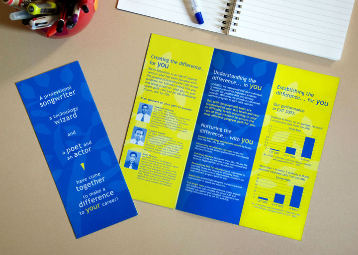
During the initial meeting to discuss the design requirement, the client shared with the designer the text they had written for the poster. They wanted the content to be presented in a striking manner. The poster also needed to have a strong brand look since MBAGuru then was a young entrant in the highly competitive coaching space.
Design Rationale
Headline text for the poster was in a thought-provoking, count down format. It was treated as the hero of the layout. The countdown was depicted as steps leading to the MBAGuru logo. The visual treatment literally took the viewer’s eye to the logo — the large size of which was meant to flag the learning course.
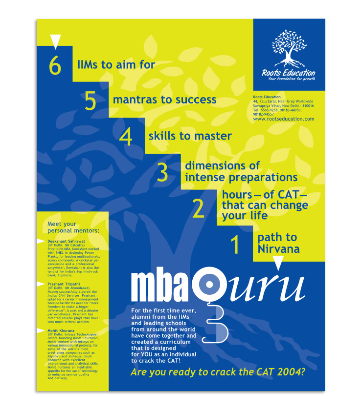
From the MBAGuru logo and related text, the eye went to information about the mentors and then to the Roots Education logo on the top right corner of the poster, where contact details were also placed.
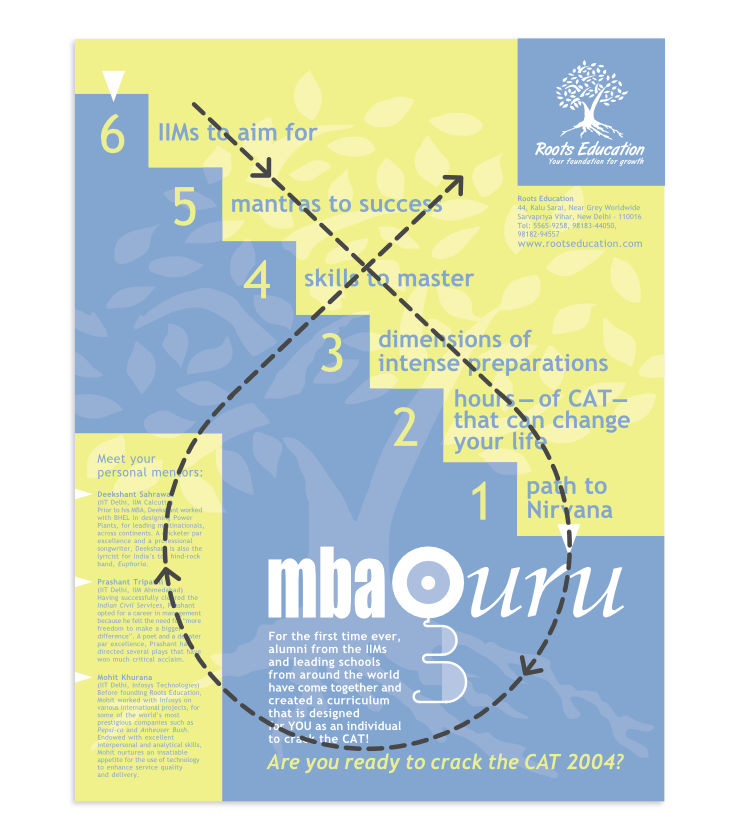
The poster layout essentially showcased the content, it was devoid of any extraneous visual imagery.
Distinctive Brand Look
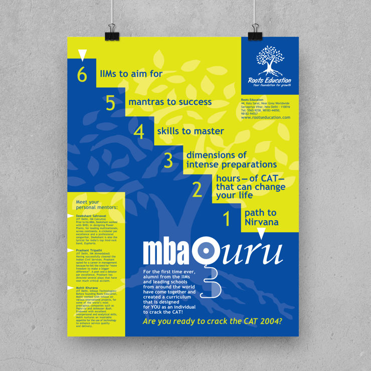
Only one typeface — Trebuchet MS — was used in the poster (apart from the logos), owing to its clarity and intelligent feel. A watermark of the parent company (tree) logo was used in the background to subtly reinforce the brand and to add an extra dimension to the layout. The poster was dressed in only two colours — Blue and Green Yellow, which helped to achieve a strong brand look and lower printing costs.
Technical Notes
The 17 x 22 inch, full bleed poster was printed on 170 gsm matte paper, in two colour offset, using 2 special or spot colours. Use of only two colours (as opposed to four process colours) helped to lessen print production cost.
Conclusion
The poster not only conveyed information and aroused curiosity about the course, together with the Roots Education Mini Brochure, it also helped to establish a striking visual identity for the brand.
—
KINDLY NOTE: Since the poster was designed, MBAGuru’s visual identity has changed.
Poster mockup template courtesy TinyDesignr
