Design of the corporate logo for a glazing technologies firm was inspired by key aspects of glazing. It visually represented core strengths of the company and defined the look of its stationery, website and brand identity.
Background
IGT — International Glazing Technologies, is one of the leading providers of interior and exterior glazing solutions in the National Capital Region (NCR) of India. The company offers its clients some of the best glazing technologies sourced from around the world.
In 2010, a few years after being established, IGT management commissioned the design of a corporate logo to enhance the company’s brand presence and to accurately depict its offerings, including high standards of design and craftsmanship in glazing. The company’s target audience comprised of architects, interior designers, home and business owners as well as institutions.
Design Rationale
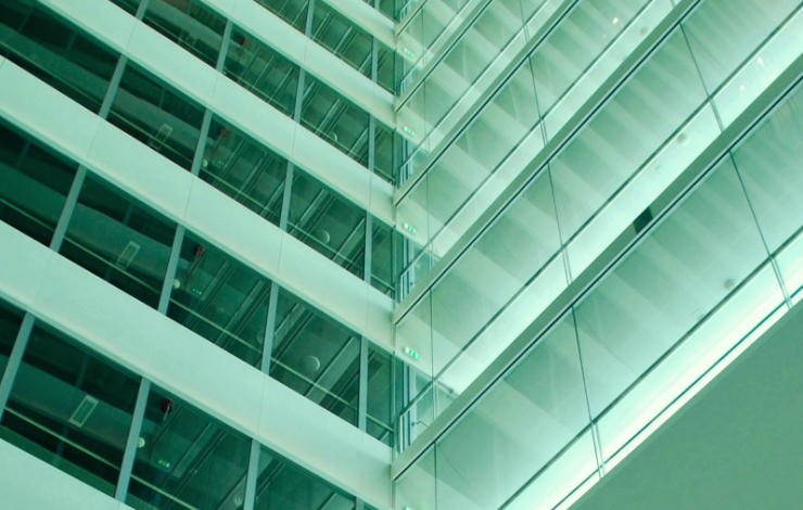
Basis the creative brief received, information about glazing was researched and photographs of projects undertaken by the company studied. Geometric structure and frequent use of pale green colour were identified as two strong visual aspects of glazing. They were used as key ingredients to develop the logo.
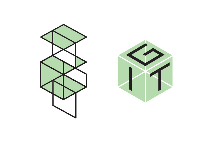
Several logo options were presented to the client most of which included lettermarks. A lettermark is usually an interesting visual depiction of the initials of the company (in this case ‘IGT’). Lettermarks are considered appropriate when the name of the entity is long and it is easier to identify or recall the company with initials.
Logo Concept
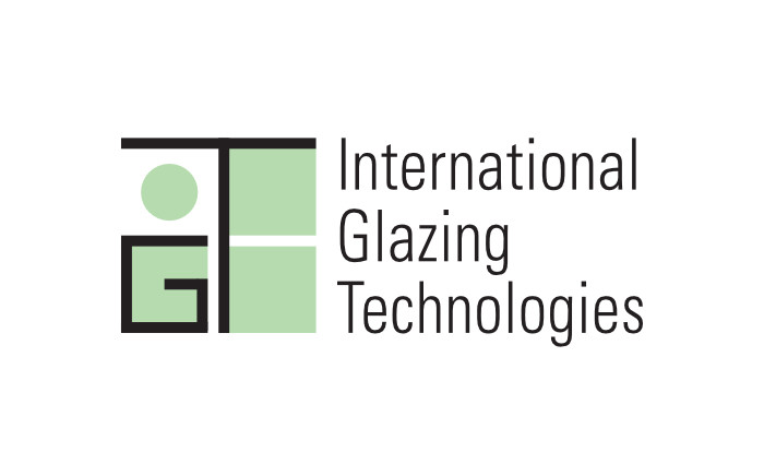
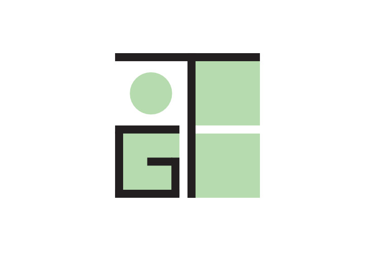
The option finalised by the client looked strong visually and also had a strong feel of glazing. Rectangular pieces of glass held together by linear supports, a characteristic of glazing, was depicted in the logo with letters ‘G’ and ‘T’ playing the role of the supports. Letter ‘I’ was represented by a large dot symbolising the sun and placed within the logo area to convey perhaps the most striking quality of glazing which allows sunlight to enter glazed interiors and yet provides shelter from it.
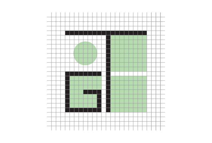
Like in architecture and in case of glazing as well, the finalised IGT lettermark was constructed with precision, using a grid structure.
Colour Scheme and Symbolism
The pale or aquamarine green colour used in the logo represented and symbolised transparency — in relation to the company’s core product offering and also philosophically since fair dealings is one of IGT’s core policies. Black colour — much like the thin metal frames used between glass in glazing — added strength and support to the logo, it symbolised IGT’s competence and confidence in the field of glazing.
A Modern Combination Mark
As ‘IGT’ is a fairly generic acronym, the full name of the company was placed beside the lettermark to constitute a logo unit or a combination mark. Univers Condensed was selected as the typeface (to write ‘International Glazing Technologies’) owing to its sleek-yet-strong, structural, geometric and stylish feel. Glazing has a Modern look which the font matched beautifully. A rendition of the logo with the company’s tagline (Better Technologies. Better Solutions.) was also created.
Overall Look and Feel
Visually, the logo had a strong feel of structural engineering, expertise, finesse, design and craftsmanship to accurately and appropriately represent the company’s offerings.
Technical Notes
A grayscale version of the logo, for reproduction in black and white, was also created and submitted to the client as a part of the logo artwork.
Stationery Design
Upon finalisation of the logo, design of corporate stationery — comprising of business cards, letterhead, continuation sheet and envelope — was commissioned by the company. Overall look of stationery items was based on the visual language (a strong sense of geometric structure, fonts and colours) defined by the logo.
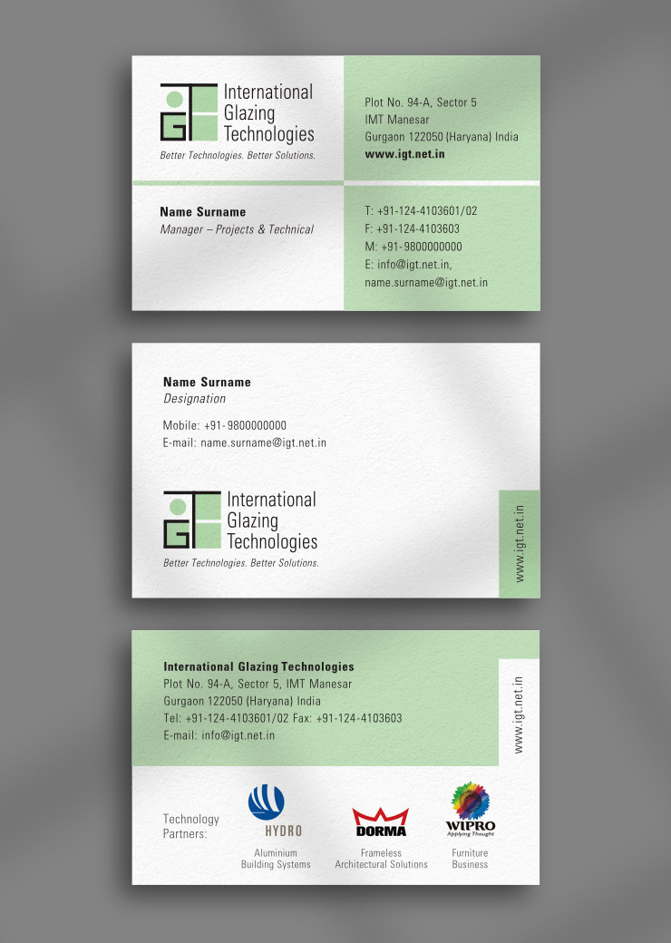
Business Cards were designed for both digital and screen printing. Letterhead, Continuation Sheet and Envelope were designed to be screen printed.
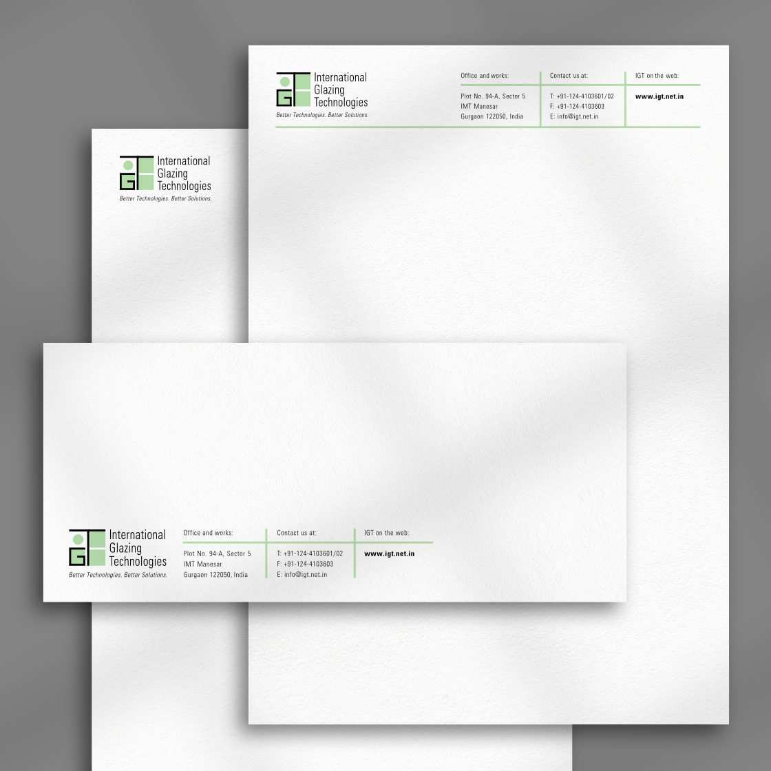
Website Design
Along with stationery, design of a website for the company was also commissioned. Information architecture and development of the site were skillfully handled by Mr. Ravi Pai-Panandiker at Crossover Technologies.
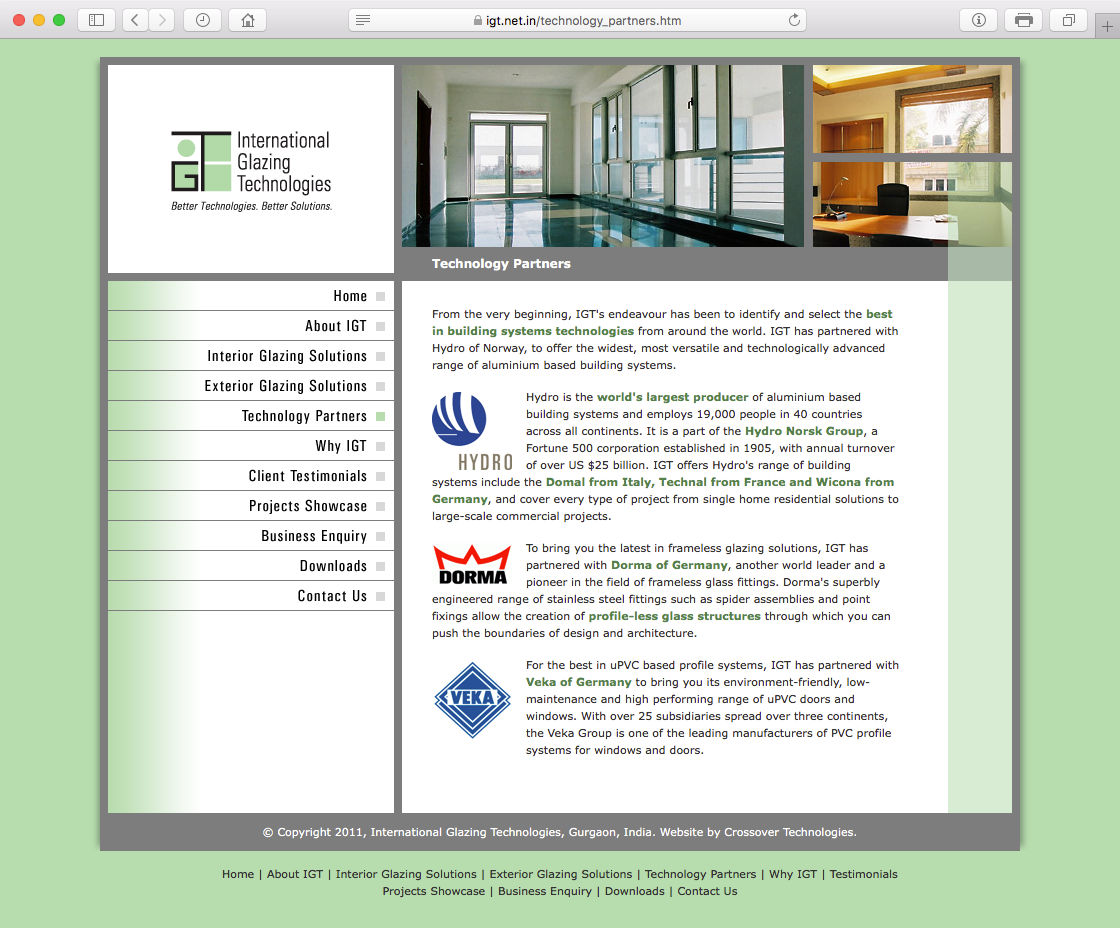
Overall look of the IGT website was again based on the visual language defined by the logo. The template or visual design had a strong sense of structure and was consistent with the logo in terms of colour scheme and fonts / typefaces used. A few additional visual characteristics of glazing like shine (in the left navigation bar) and transparency (over the photographic collage on the top right) were also incorporated in the layout.
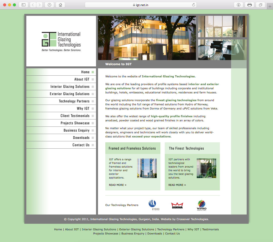
Site elements were neatly organised within a visual structure or frame. The logo was prominently placed on the top left with a collage of project-related images and the page header to its right. The navigation bar was positioned below the logo and the main content area to its right. Width of paragraphs in the content area was set to incorporate 12–15 words per line, for good readability.
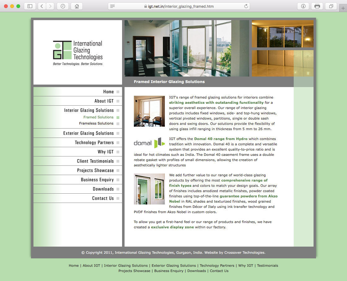
Layout of the pages was remarkably consistent, which allowed users to quickly form conceptual models and navigate the site smoothly and intuitively. The website was optimised for 1024 pixels screen width (it was designed in 2011, before responsive or mobile friendly websites became the norm).
In Essence
The logo, along with the stationery and website designs faithful to its look and feel, helped to establish a distinct, elegant and professional brand or visual identity for International Glazing Technologies.
Photo Credits
- Photograph of glazed exterior courtesy Rita Malçok / Unsplash
- Image of glazed interior for logo mockup courtesy rawpixel.com / Freepik
- Paper texture courtesy Norwood Themes / Unsplash
