A custom website designed for one of India’s leading fine art photographers helped to showcase her works with clarity, consistency and a touch of authenticity, in a modern, global context.
Background
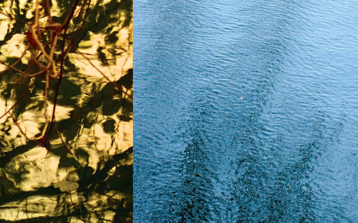
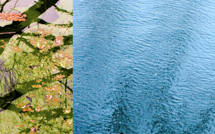
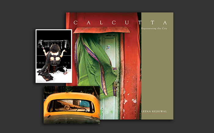
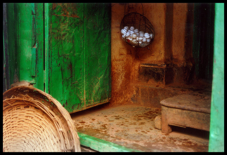
Leena Kejriwal is one of India’s leading fine art photographers and a social artist. Her work is notable for its sensitive depiction of beauty or charm observed in the mundane, and for its social commentary. She has also authored several photographic books.
In 2009, the artist commissioned the design of a new website to showcase her impressive body of work. She wanted the site to look professional and showcase the photographic images with clarity and consistency.
The project was undertaken in collaboration with Crossover Technologies. Mr. Ravi Pai-Panandiker, Crossover’s Chief Technology Officer, meticulously developed the site’s information architecture. He also coded and programmed the front-end and back-end user interfaces.
Design Rationale
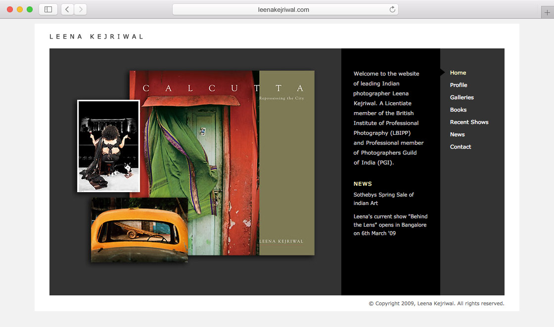
Basis the creative brief and the information architecture document, the designer created several design options or website mockups. The one approved by the artist was — very simply — based on the structure of a mounted photographic slide.
Visual Design
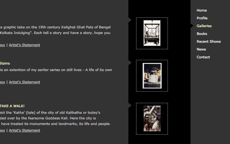
Site layout or visual design essentially consisted of a subtle white frame with the photographer’s name on the top left corner — understated but conspicuous. This treatment was akin to the common practice of photographers printing their name and copyright information on frames of slides, during the heydays of film photography.
Again, just like in a slide, the content area — darker in appearance — was within the white frame. It was divided into three sections or parts: a dominant main content or center stage area, an intermediate vertical bar, followed by the navigation bar on the right hand side.
Small, subtle arrowheads connected the three different sections in the content area, like visual breadcrumbs, giving the viewers a sense of where they are in the site.
Colour Scheme
The main content area was devoid of any strong colour. It consisted of a dark grey background with the intermediate bar in black. Text colour was white. Light yellow accent colour was used to emphasize or highlight important text. Less important text was in grey. This largely neutral colour scheme supported the photographer’s varied imagery, allowing it to stand out. Overall, the site’s visual design gave the impression of a slide show in progress.
Use of One Typeface
Only one typeface — Verdana — was used in the user interface owing to its clarity on screens and modern feel. This added to the site’s consistent look and feel.
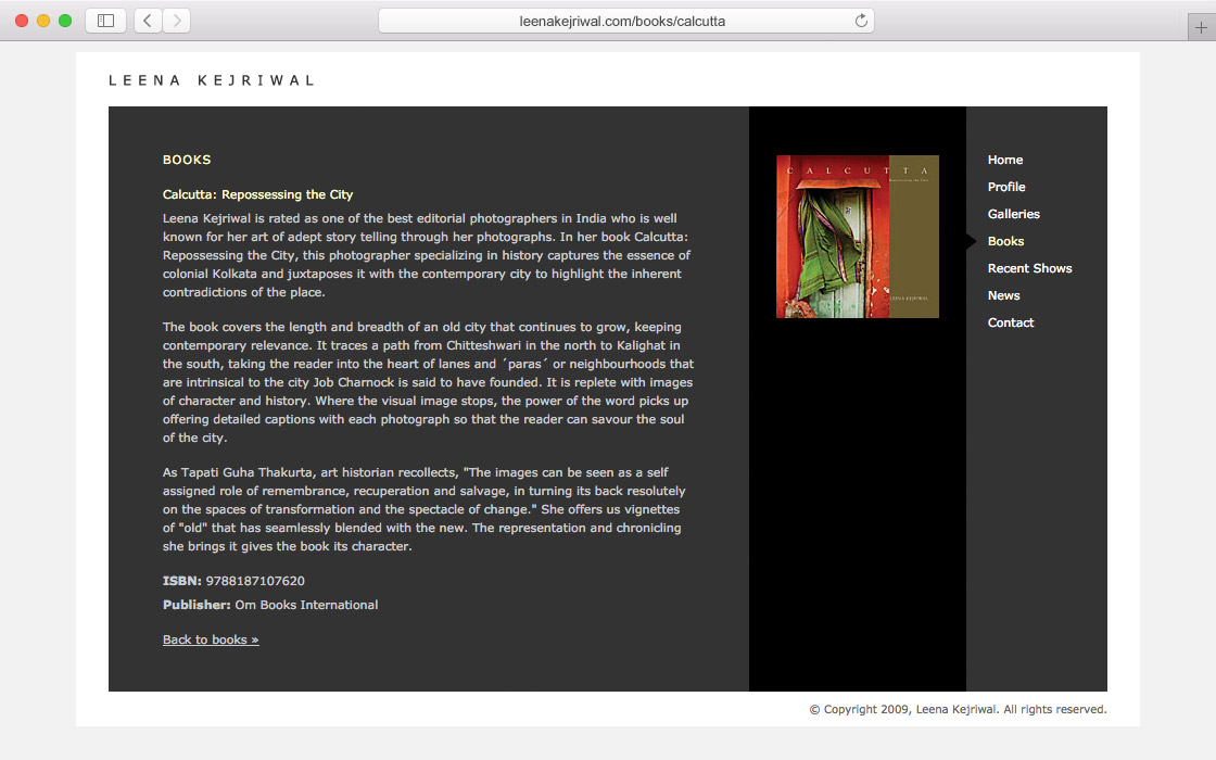
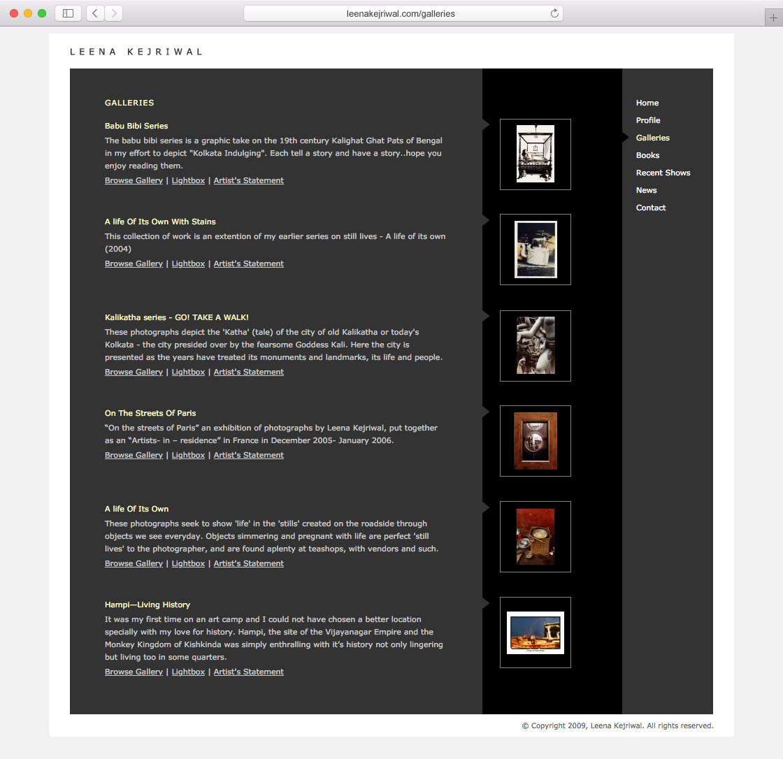
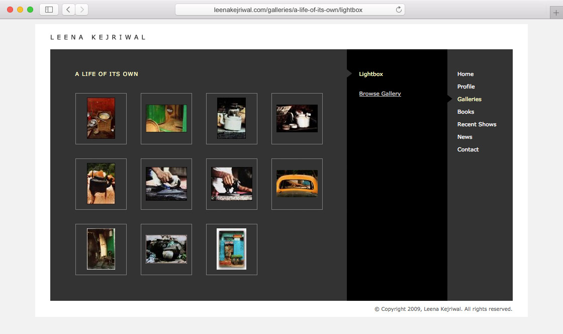
Design of Gallery Pages
Galleries was the most important section of the website, for it showcased the photographer’s stunning work. The main Galleries page listed Leena’s photo series in an understated manner, but with clarity. For each series, there was a short intro, followed by links to view the images or browse thumbnail images or read the artists statement. These three sections for each photo series were also crosslinked.
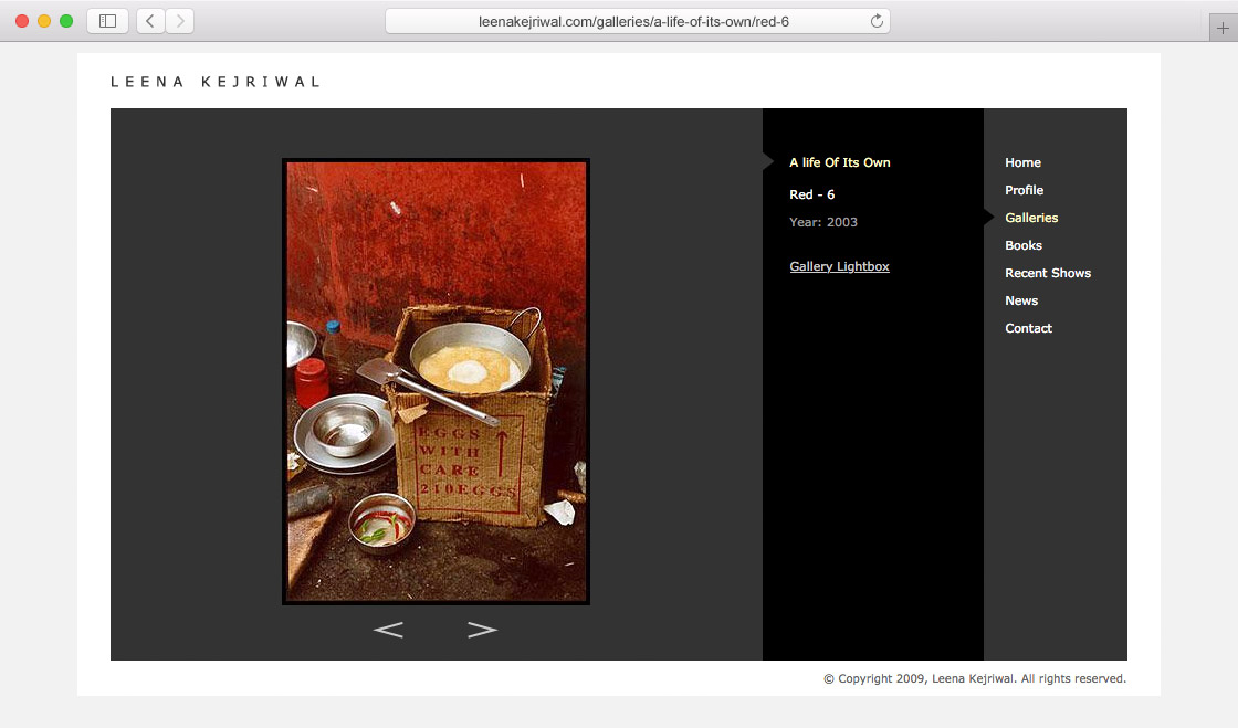
Each work of the photographer had a page dedicated to it. The photograph appeared in the main content area and related information in the intermediate black bar. Arrows below the image helped in navigating to previous or subsequent images.
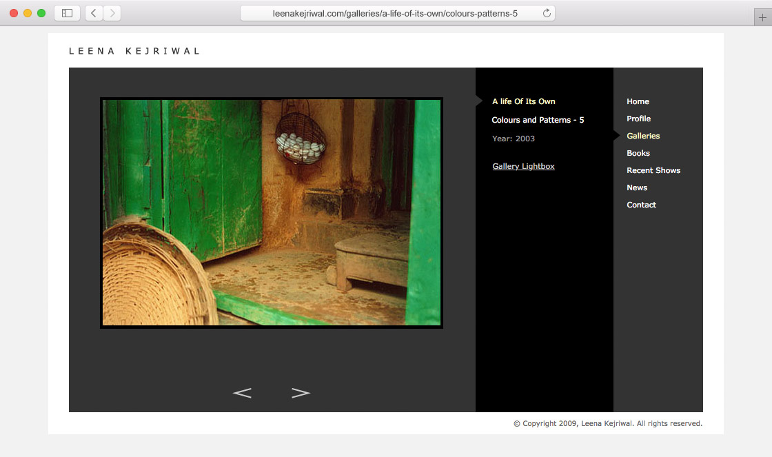
The gallery template was designed to accommodate photographs of any aspect ratio, and any orientation (horizontal or vertical).
Each photo series had a Lightbox section or page dedicated to it. In film photography era, lightboxes were commonly used by photographers and editors to review and select images. The page contained smaller or thumbnail images of each work, allowing viewers to get a feel of the entire series at one glance. By clicking on a thumbnail image, viewers could navigate to the relevant image detail page.
Clean and Consistent User Interface (UI), and User Experience (UX)
The website was developed well before responsive or mobile friendly websites became the norm. It was optimised for a fixed monitor width of 1024 pixels.
The visual design was devoid of any superfluous elements and was remarkably consistent across each and every page. This allowed viewers to quickly familiarise with the user interface / develop conceptual models and navigate the site efficiently. There were no intrusive visual elements, animations or popups specially as the site was dedicated to still photography. Overall, browsing the site resulted in an effective and pleasing user experience.
In Essence
This custom website was designed keeping in mind not only specific requirements of the artist, but nuances of photography as well. Even as the site catered to the web / digital era, its visual references to the film era lent it a touch of authenticity and nostalgia, much like Leena Kejriwal’s work.
Overall, the site helped to catalogue and place the photographer’s work — which had earthy, emotional and nostalgic overtones — in a modern context, to be appreciated by visitors from across the globe.
Copyright Information
All photographs featured in this article are copyrighted. © Copyright, Leena Kejriwal. All Rights Reserved.