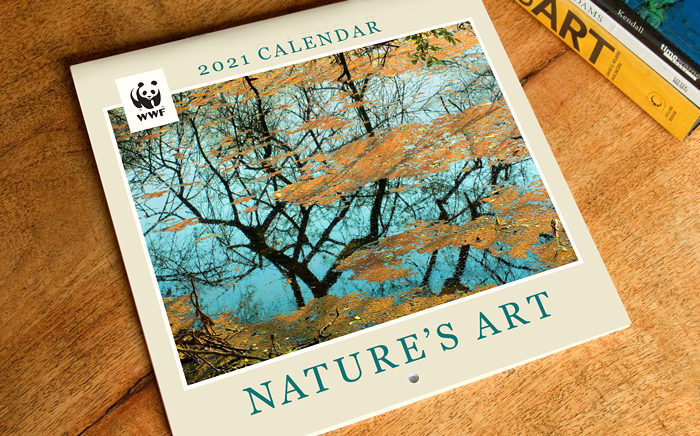
Design of the 2021 Beautiful Birds wall calendar was inspired by the species featured in it. More than a calendar, the product was an informative window into the amazing natural world of birds.
Background and Purpose
WWF (World Wide Fund for Nature) India is one of the foremost organisations working for the conservation of India’s wildlife and natural habitats. The country is home to a mind-boggling array of flora and fauna including over 1,200 species of birds. In 2020, WWF-India commissioned the design of a 2021 wall calendar with focus on this avian wealth.
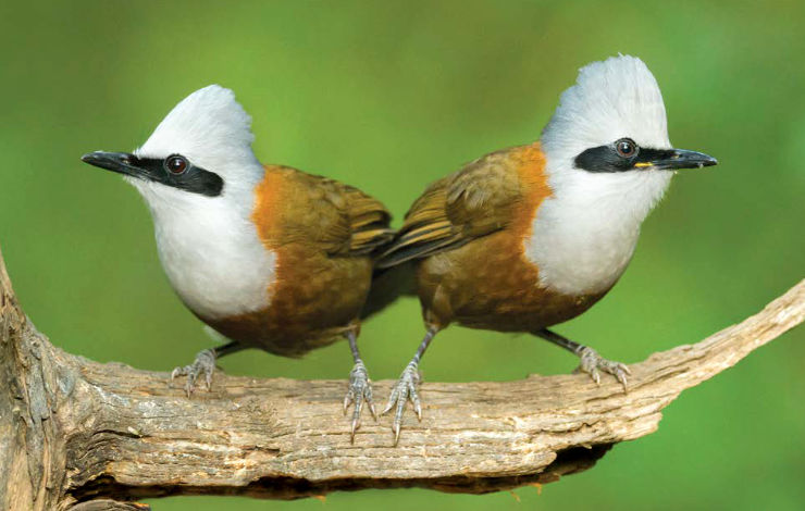
While the calendar showcased 12 stunning bird species (one for every month of the year) found in India, its larger aim was to spread awareness and foster appreciation and knowledge about birds in general. Simply titled Beautiful Birds, the product was meant for mass appeal and targeted an audience as wide as possible. It was designed and developed in co-ordination with the WWF-India team.
Design Rationale
The calendar featured photographs of birds taken by several talented photographers from across India. The beauty, boldness and outstanding colour combinations of the bird species provided inspiration for the design.
Processing of Bird Images
The foremost challenge faced by the designer was to optimize images of birds for faithful reproduction in print. Some of the images received from photographers were in RAW format with muted colours, some others were not exposed perfectly or required white balance correction. For each species therefore, multiple images on the web, in books and field guides were referred to and the image was processed accordingly.
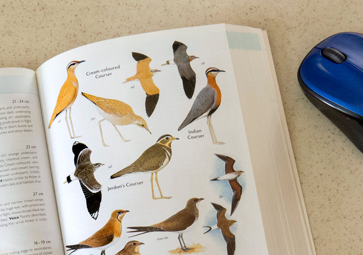
It’s imperative that colours of birds are rendered in their photographs faithfully. A change in hue may make the bird relate to or look like a different species!
Calendar Cover Design
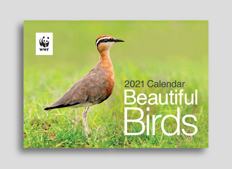
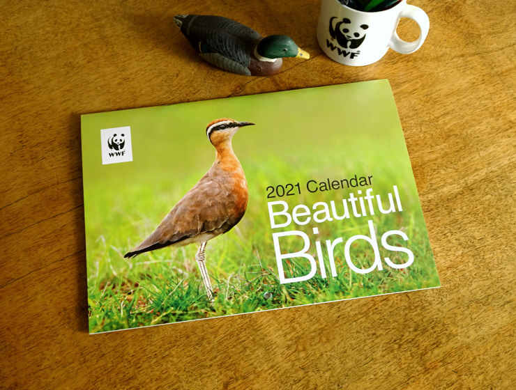
On the cover, one of the most striking images from the selection — of an Indian Courser — was used. Calendar name was set in a large font size to catch the attention of shoppers in stores and on e-commerce websites.
Pages Dedicated to Species
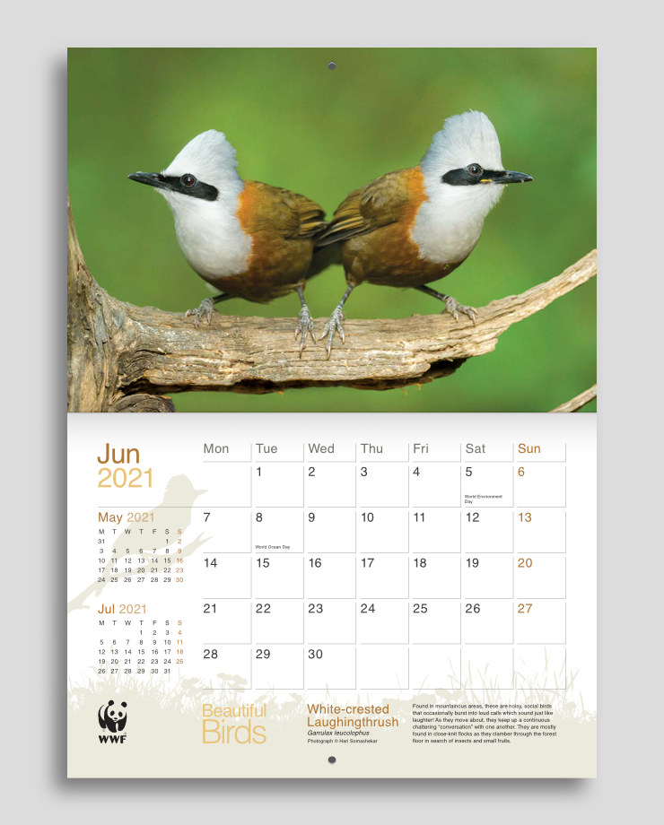
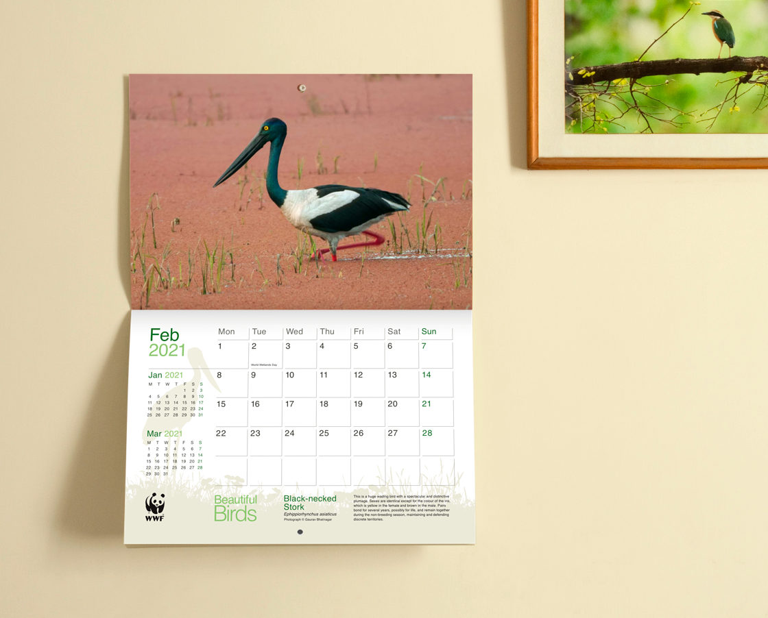
Each calendar page or face was dedicated to one bird species. The top portion for every calendar month showcased a full bleed photograph. Species name, scientific name and a short write-up was provided in the planner section below to enable users to learn a bit more about the bird.
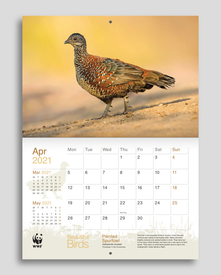
Graphic silhouettes of the species and a generic habitat — in background watermark style — were also given in the bottom planner section. They added a subtle touch of nature to the layout and prevented it from appearing flat.
Colour Scheme
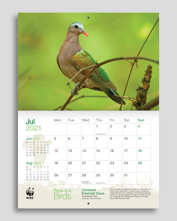
Calendar layout had two colour schemes:
- Neutral colours: Black, dark grey and grey were used for weekday dates and text, and light beige for the watermarks.
- Species inspired colours: Month names, dates falling on Sundays, calendar name and species name were rendered in a colour combination inspired by some of the colours present in or typical to the bird species. They also acted as accent colours and varied on every calendar page. CMYK percentages of the hues were faithful to WWF brand guidelines.
Design of the Planner
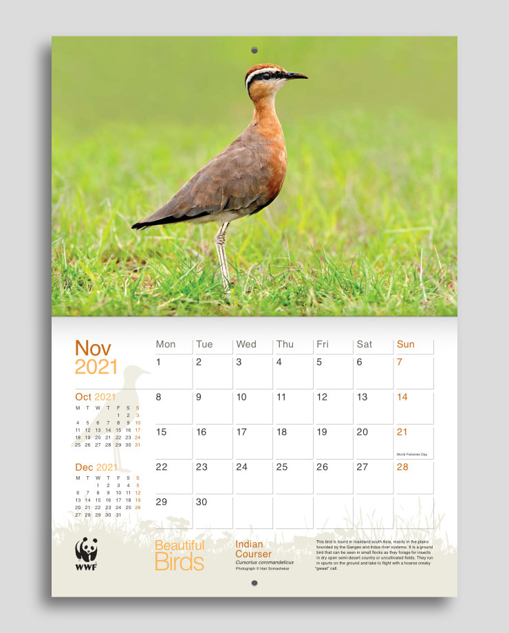
Each calendar month page featured a planner subtle in overall appearance to allow the bird photograph to dominate the layout. But it was also functional. Type sizes of dates were large enough to be seen from a distance of a few feet (an important aspect in wall calendar design), they left room to jot down plans within each grid. Previous and following months — in smaller size — were also present alongside the main month. Important days relating to the environment were flagged in the planner.
Grid Based Layout
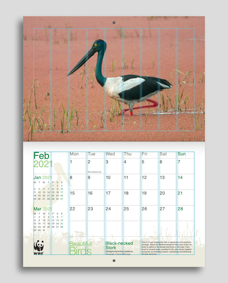
Visual elements and content were arranged with the aid of a nine column grid. Use of the grid helped to bring order and consistency across different pages and sections of the calendar.
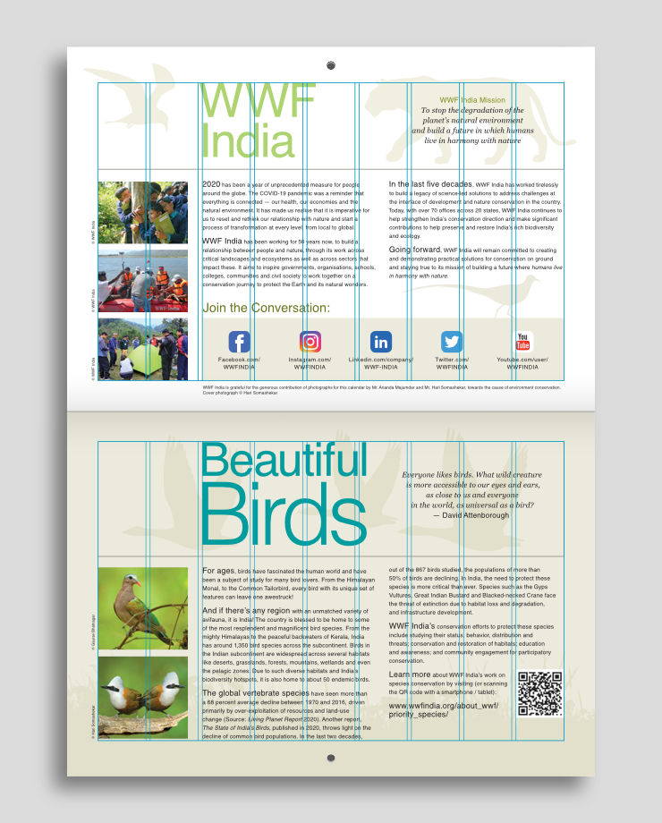
Typography and Product Branding
Most of the calendar content was set in Helvetica. The bold, robust yet delicate nature of the bird species showcased inspired the use of this sans-serif typeface. Helvetica added a modern touch to the calendar, contrasted with its nature-related visual elements and helped to present the content with clarity. For text in italics, the serif typeface Georgia was used, as per WWF brand guidelines.
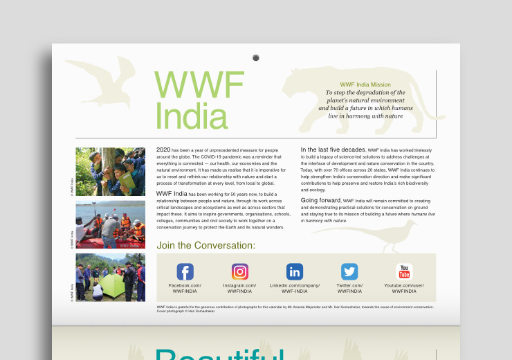
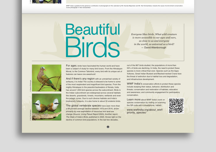
Subtle product branding was introduced in the calendar. The name Beautiful Birds (an alliteration) appeared in the same style — like a product logo — on most pages. It was dressed in different colours inspired by colours of the featured birds.

As calendars are used over many months, it was important to flag the theme on every spread.
Technical Notes
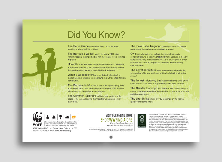
The 13.75 x 9.5 inch (folded size), 13.75 x 19 inch (open size) wall calendar was printed in four colour offset on FSC (Forest Stewardship Council®) Certified paper. Its pages were center-stapled.
Conclusion
Beautiful Birds was more than a calendar. It was akin to a window into the amazing world of nature in which different birds appeared as the months unfolded. The design helped to showcase some stunning bird species, disseminate related information / knowledge — including about WWF-India and its initiatives — and assisted users to plan their days.
WWF-India Nature Products
WWF-India calendars have a decades old legacy. Nature / wildlife enthusiasts, supporters and many others adorn their homes and office spaces with them every year. Apart from calendars, a wide range of nature related and eco-friendly products are available at the WWF-India Online Nature Store. Please do visit, proceeds from sales go towards the organisation’s conservation initiatives.
Copyright Information
- All text, designs and images in this article are copyrighted and may not be reproduced.
- WWF® and ©1986 Panda Symbol are owned by WWF. All rights reserved.
- © 1986 Panda Symbol WWF – World Wide Fund For Nature (Formerly World Wildlife Fund). ® “WWF” is a WWF Registered Trademark.
Photo Credits
- Photographs of Indian Courser, Painted Spurfowl and White-crested Laughingthrush by Hari Somashekar
- Photographs of Black-necked Stork and Common Emerald Dove by Gaurav Bhatnagar
Related Article
Also read the case study: Stone Mural Design for WWF-India


