Step-by-step, disciplined graphic design approach helped to shape a unique book on Indian folk art and realise the author’s vision. This case study reveals all the steps we took — from concept to book promotion.
Background and Introduction
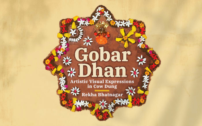
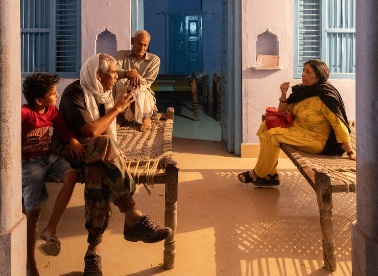
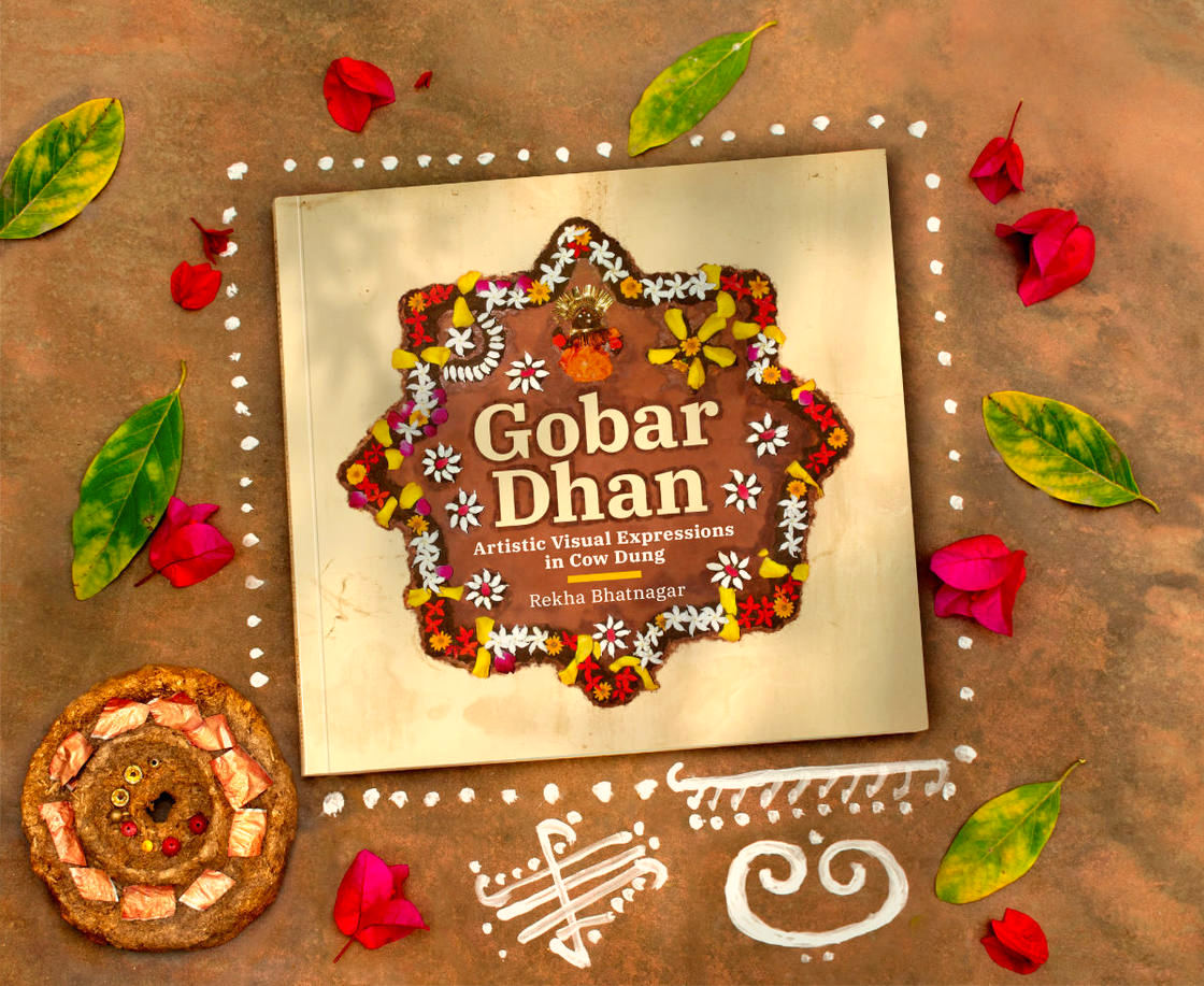
Gobar Dhan — Artistic Visual Expressions in Cow Dung is a truly unique book written by Jaipur (India) based contemporary artist Dr. Rekha Bhatnagar, my mother. It is a culmination of research into four folk art forms — Bitawada, Badkula, Sanjhi and Govardhan — that are made using Gobar or cow dung in and around our home state of Rajasthan.
The book takes its readers on a journey into villages, towns and cities of Rajasthan, where people — mostly women — still practice these age-old, eco-friendly but fading traditions. It is visually rich and replete with facts and mythological anecdotes about the art forms. Published in July 2025, Gobar Dhan was featured in sessions at the prestigious Jaipur Literature Festival (2026) and Hyderabad Literary Festival (2026).
The author spent about three years doing research for the book, which included travelling to rural Rajasthan, interviewing rural and urban folk, photographing and commissioning photographs of cow dung creations, sketching and writing.
The manuscript written by the author was subsequently edited by two editors. Chapter-wise text files were then given to me, along with a whole lot of photographs, many in raw format. We went through the chapters one-by-one and sourced / purchased additional photographs relevant to the editorial. Sketches made by the author were scanned in high resolution. ‘Gobar Dhan’ — meaning treasure of Gobar in Hindi — was decided as the name of the book.
The Design Brief
The author had a concise design brief: the book should have a square / squarish format, easily readable text, lots of photographs (while browsing, it should feel like a coffee table book or a magazine) and a contemporary design / layout. But of course, the unsaid brief was to present the stories of these remarkable art forms in an easy-to-understand and visually interesting manner — in the form of a book.
Step-by-step Book Design Rationale
1. Print Production Research and Consultations
To kick start the book design process, we spoke to several printers and visited a recommended printing press. Upon discussions with a print production consultant there, decided to get the book printed digitally — using the Digital Offset process. This printing technology allowed for smaller print runs and for cost to be less (as compared to conventional Offset), at least initially. An economical (closed) size of 23.5 cms (w) x 23 cms (h) with a soft cover (paperback format) and costs were finalised.
2. Choice of Graphic Design Software
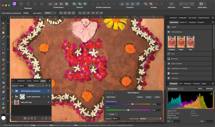
Affinity Publisher (v2) and Affinity Photo (v2) — for page layout and image editing — (now Affinity) were chosen as the applications to design the book. They worked flawlessly (on an Apple Mac Mini M2) throughout the book design process. We did not use any AI tools.
3. Mood Board, Colour Scheme and ‘Look and Feel’
To start the visualization process, I created a mood board. Our most obvious visual reference point was the hundreds of photographs sourced for the book. They were grouped them into two broad categories: a) images of cow dung creations that had an earthy feel, and b) images of rituals, decorations and traditional dresses that had brighter and diverse colours.
Based on the two categories of images, I derived a colour scheme for the book — browns, earthy yellow ochre and beige, and several bright / other colours picked up from different images.
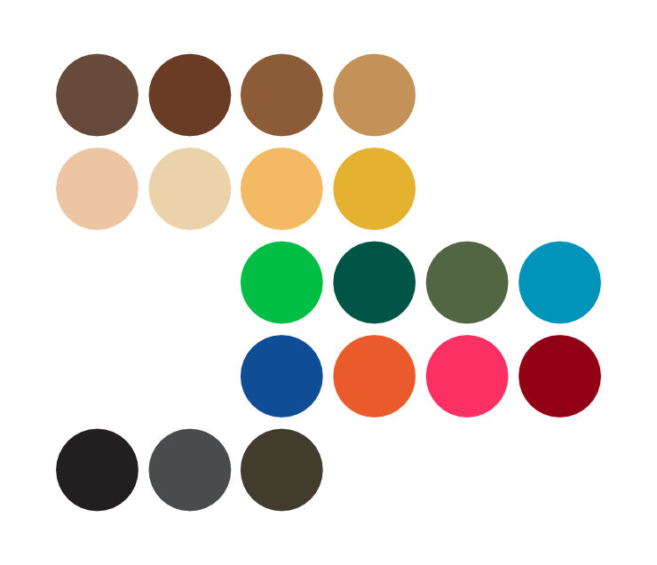
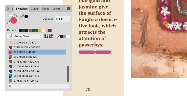
Dark Brown and Beige (representative of cow dung and earth, respectively) were selected as the dominant colours for layouts. CMYK percentages for each colour swatch were manually fine-tuned and set as global colours in Affinity Publisher’s Colour Swatches palette.
I also collected publication design layouts from several magazines and studied them as we wanted the book to have a magazine-like feel.
The subject of the book — art forms made with cow dung — is actually a bit abstract. Many people, even in India, are not aware of the existence of such practices. Moreover, cow dung is often considered as waste and unpleasant. In terms of subject character, it is earthy / organic, crude and traditional. We were, however, keen to present it in a modern context.
We wanted to do a coffee table book or magazine like layout which would support a large amount of text, a wide range and sizes of photographs as well as drawings. I made a lot of thumbnail sketches and initially tried layouts with textures, heavy use of browns, and even geometric sans serif fonts to contrast with the subject matter. After some experimentation and discussions, we settled for a clean layout with earthy undertones and touches of bright colours. One that appeared modern, disciplined and intellectual in overall feel — like a study or a commentary on the subject.
4. Book Typography and Typographic Hierarchies
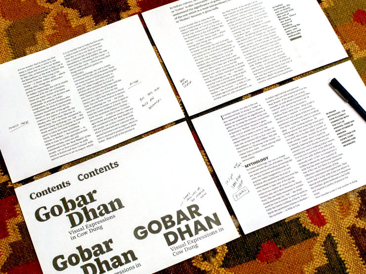
Typography is one of the most important aspects of book design. It is also instrumental in determining how easy the book is to read. I formatted several pages of the book in the finalised size, experimenting with different typefaces and type sizes. Then, I printed them out, read the content, viewed exported PDF layouts on different screens (since we also wanted to do an eBook) and discussed them with the author. Text sizes were gradually fine-tuned and tracking and kerning adjusted to entail good legibility and readability.
We eventually selected the IBM Plex family — specifically IBM Plex Serif and IBM Plex Sans typefaces. Their modern, engineered look contrasted as well as complimented with the earthy and traditional nature of the imagery and content. We loved the family’s intellectual feel. And of course, the typeface has excellent legibility in print and on screens, which was very important for us.
A five step typographic hierarchy system was worked out for the book. It was quite straightforward and comprised of chapter header, sub-header, intro text, paragraph text, image caption and pull quote. By and large, the serif fonts were used. IBM Plex sans serif (in dark grey colour) was reserved for captions to easily distinguish them from paragraph text. These styles were defined in Affinity Publisher’s text styles panel, which allowed for consistent implementation across the book.
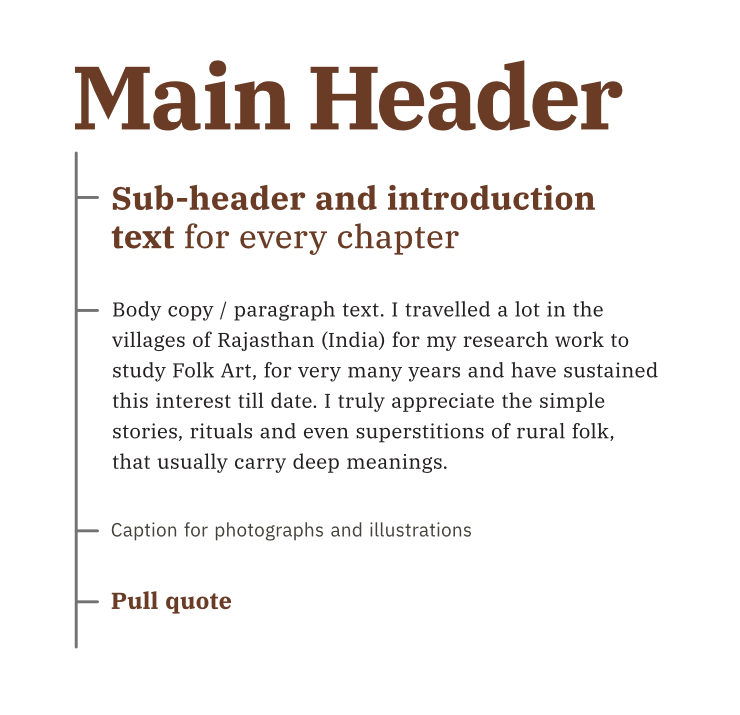
At places in the book, standalone text / paragraphs and typographic design patterns were also required. As far as possible, their sizes and styles were matched with the corresponding sizes from the hierarchy (above). Thus font sizes and styles in the book were kept at minimum.
5. Master Page Spread Setup
Out of the several page designs we explored, one was approved by the author. I then set out to create the skeletal structure of the book in the form of a master page spread. In it, within the left and right (verso and recto) book pages, an outer margin was left on all sides (including gutter space on either side of the spine in the middle). A five column grid structure was selected for each page as it allowed for more flexibility (as opposed to two or four column) in the layout to aid arrangement of text and images.
On each spread, inner 2+2 = 4 columns were designated for page text and outer columns for image captions, pull quotes, etc. A baseline grid was used for consistent alignment of paragraph text and headers. Bleed area (as specified by the print production consultant) was provided on all sides.
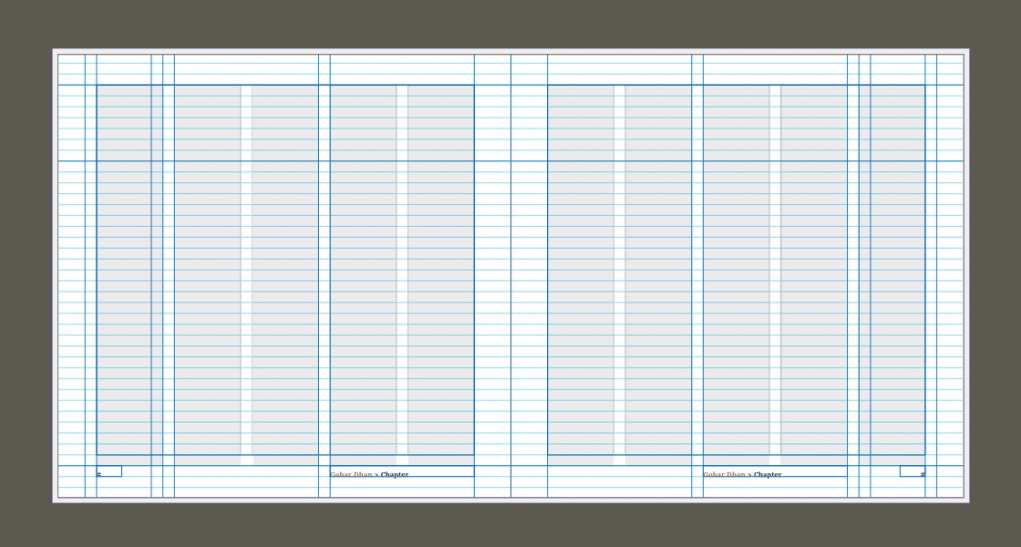
Guidelines were additionally used to reinforce the page structure. Placeholders for chapter names were provided at the bottom, left aligned to the third column on each page. Placeholders for page numbers were also included (on either side, bottom aligned with chapter names) and automatic page numbering was triggered in the software.
6. Initial Proofs and Paper Types
Once initial pages of the book were formatted, we shared the print file with the printer and got them digitally proofed on two different paper types.
Upon receiving the proofs, we selected an earthy, natural shade, uncoated paper, 100 gsm in weight (the other option was a white, matte, coated paper). The proofs, which were done on the actual digital printing press (also known as machine proofs) acted as a validation of the design effort we had thus far put into the assignment. Further fine-tuning was done to the typography and colour swatches and we then set out to format remaining pages of the book.
7. Selection and Processing of Images for Offset Printing
The photographs we received and collected for the book were of a wide variety, even technically. They ranged from low-res web images to 26 megapixel raw files. The images also varied in dimensions and many were shot in far-from-ideal or dim light conditions.
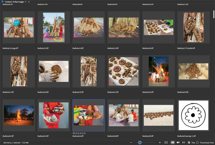
For every chapter, I sat down with the author and shortlisted the appropriate images. We also discussed where the images will have to be placed, as per the editorial. Adobe Bridge software was invaluable in helping us organise images for the book.
Raw / original images were optimised for offset printing in Affinity Photo, using a range of image processing techniques. Different images required different editing approaches / techniques. They were all, eventually, saved as CMYK Tiff files.
8. Layouts of Book Pages and Spreads
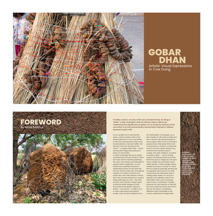
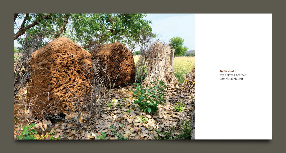
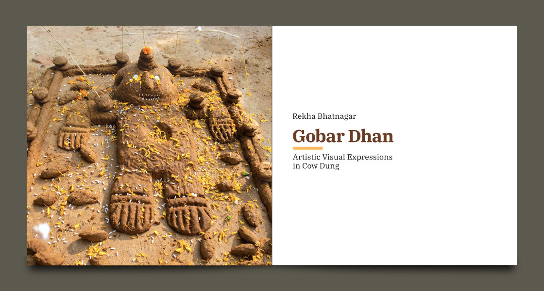
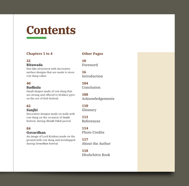
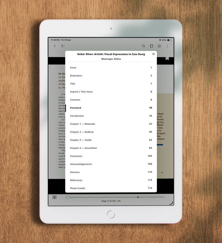
The book started with a dedication message and large / full page photographs of each of the four folk art forms. The front matter also consisted of two Title pages, Imprint / Colophon, Table of Contents, Foreword and Introduction.
On the Contents page, main chapters were listed and described in the first column and remaining pages in the second column. Font sizes conformed to the ones defined in the typographic hierarchy system.
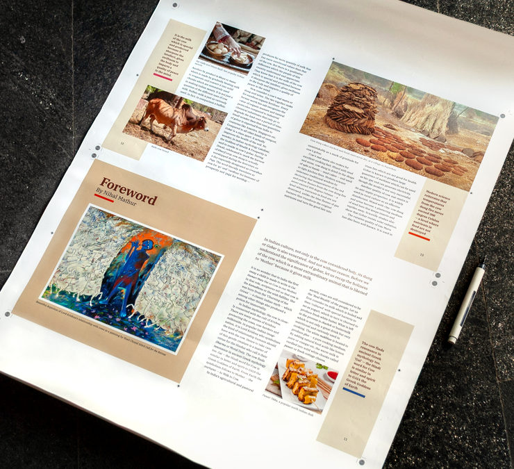
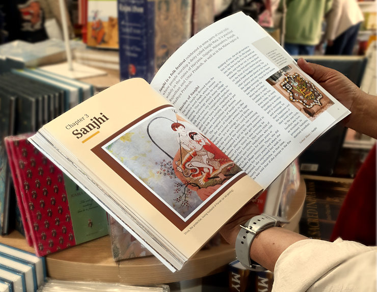
Each main chapter page of the book started on the left (verso) side with a large image indicative or symbolic of the content or story in it. On its facing right (recto) page, the first / introduction paragraph was set in a larger font size to attract the eye of the reader and draw it into the prose. Chapter names and pull quotes had coloured rectangular blocks right below, for emphasis. They used the book’s colour palette and matched a colour from one of the images on the spread.
Formatting of the book was a tedious process, to say the least. On each page, images relevant to the text had to be placed, along with captions. Then, on each spread, left and right pages had to be visually balanced — which is an important aspect of good book design. The fact that the photographs came in different sizes and proportions / aspect ratios did not make the task easier!
The system of margins, grids and guides — as defined in the master spread setup — was used to arrange elements on each and every page of the book.
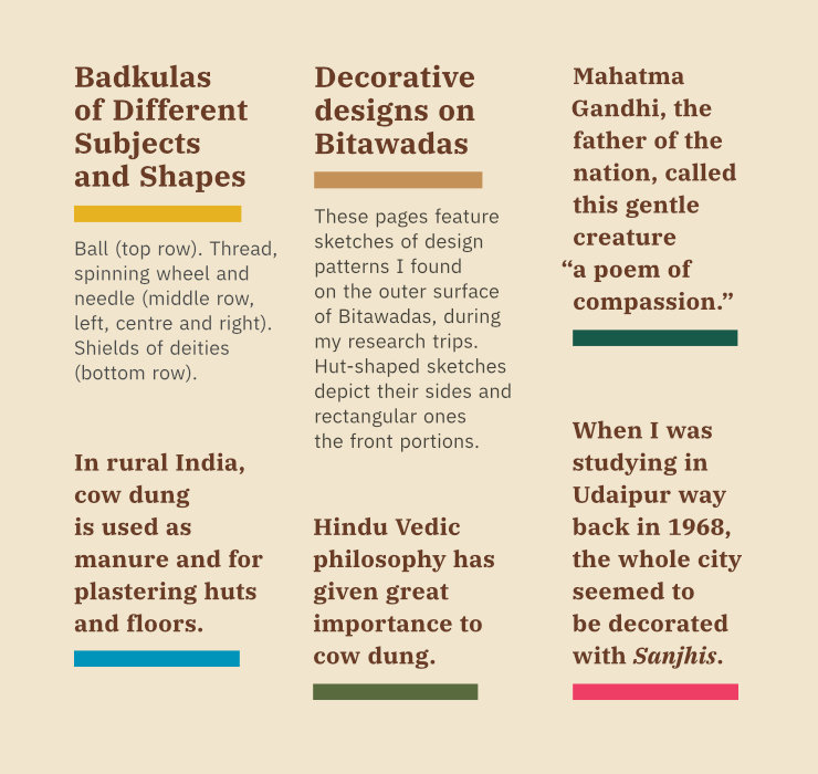
Periodically, throughout the book design process, I sat down with the author to discuss and fine-tune placement of images along with the relevant paragraph text. We also discussed photo captions, which were written as we went along. In the captions, each photograph was described, specially for readers unfamiliar with the topic. In page spreads, most captions were placed in the outer (first and tenth) columns, over beige colour blocks or sidebars.
Paragraph text was set flushed left / left aligned and ragged right, in two columns on each page, with liberal leading or line spacing. We used selective hyphenation. The elegance and clarity of IBM Plex typeface came across — in a subliminal manner — on every page. No superfluous visual elements were used in layouts.
While the effort to put the content and images together could be technically termed as layout or page design, it was actually the coming together of the author’s experiences, research and the stories she wanted to narrate and therefore her vision — systematically, in the form of a book.
A major appeal of Gobar Dhan book is in the visual story it narrates. It is replete with over 250 photographs and drawings. Some pages featured mainly photographs with photo captions, that were arranged (again) in a balanced manner, using the system of grids and guides.
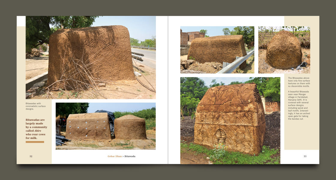
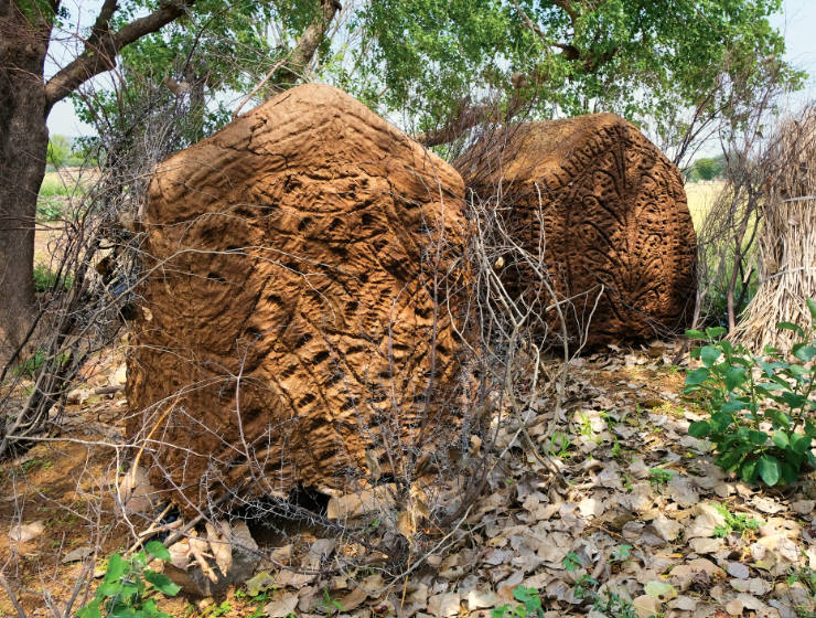
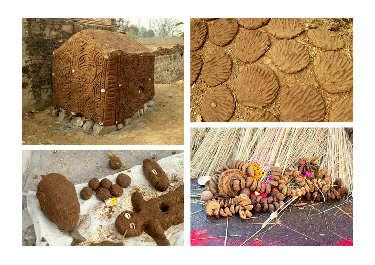
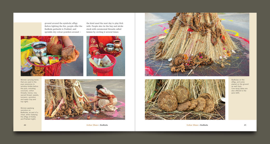
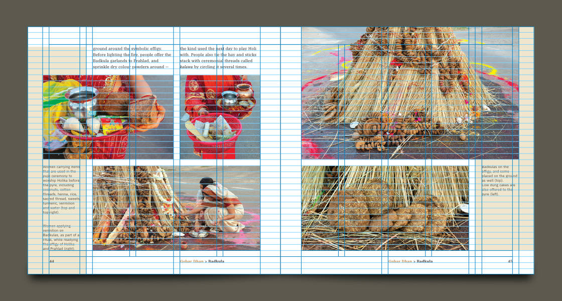
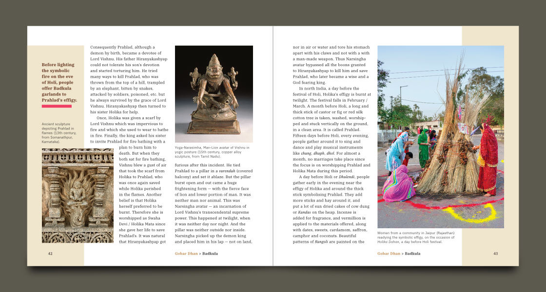
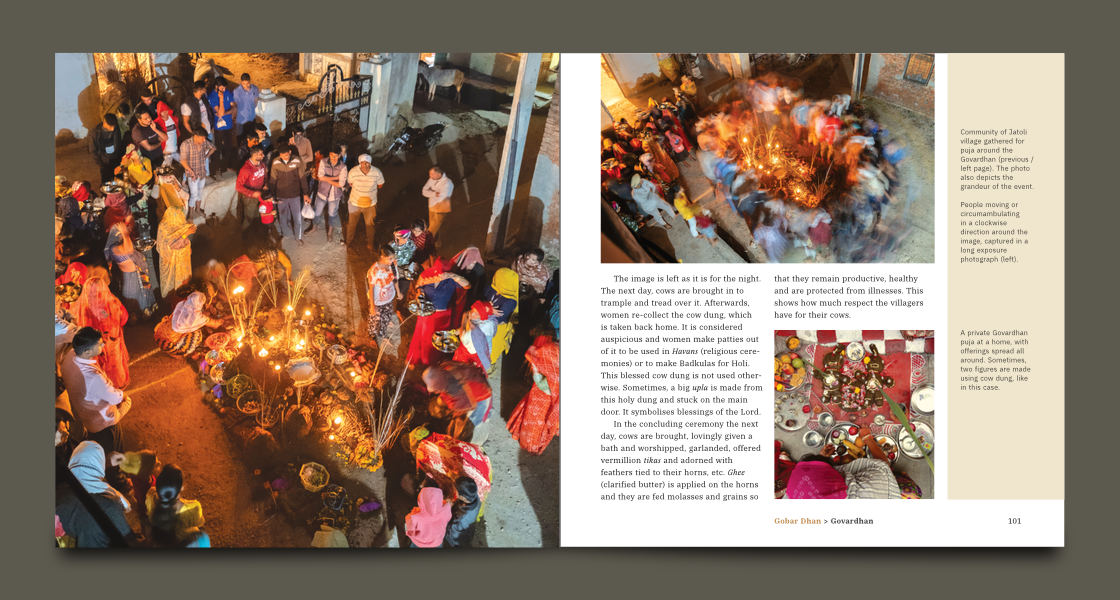
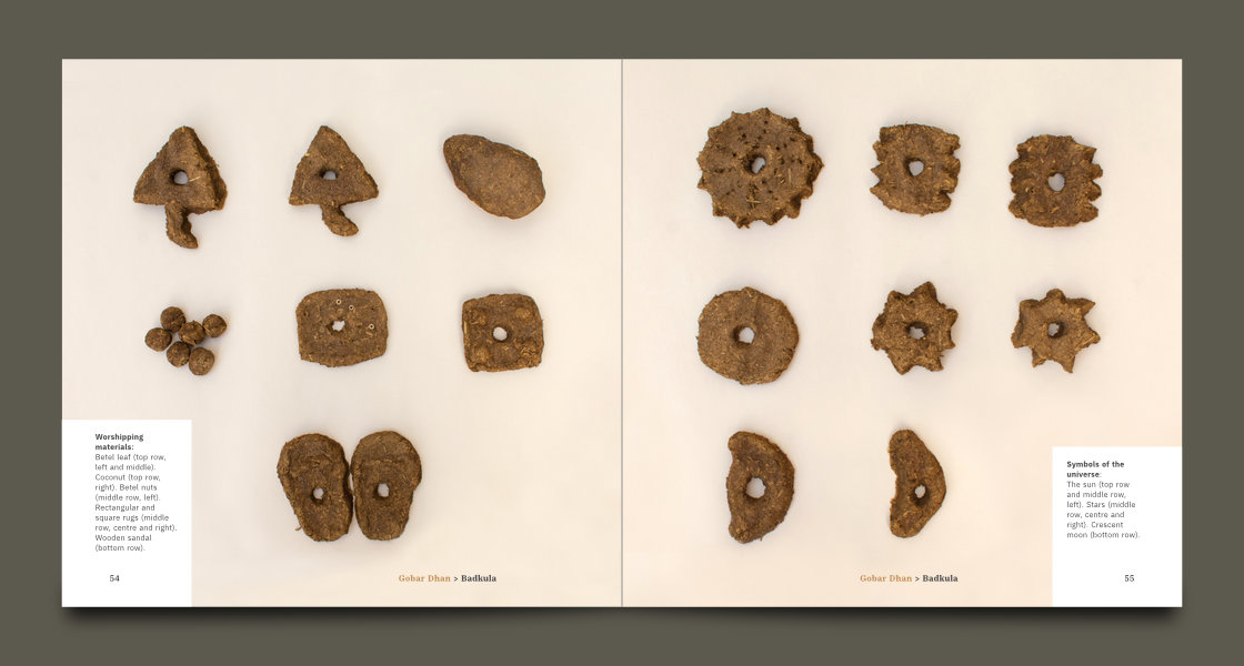
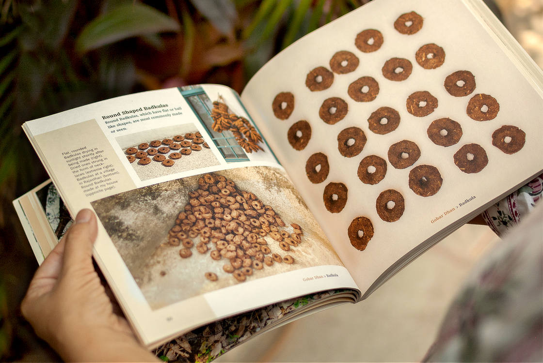
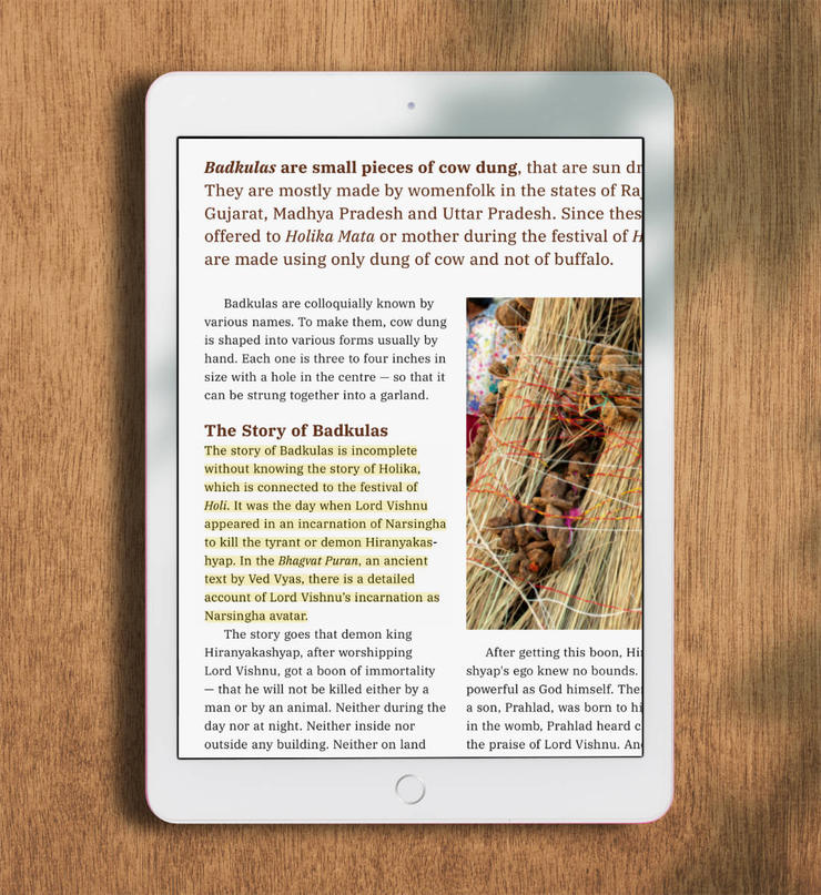
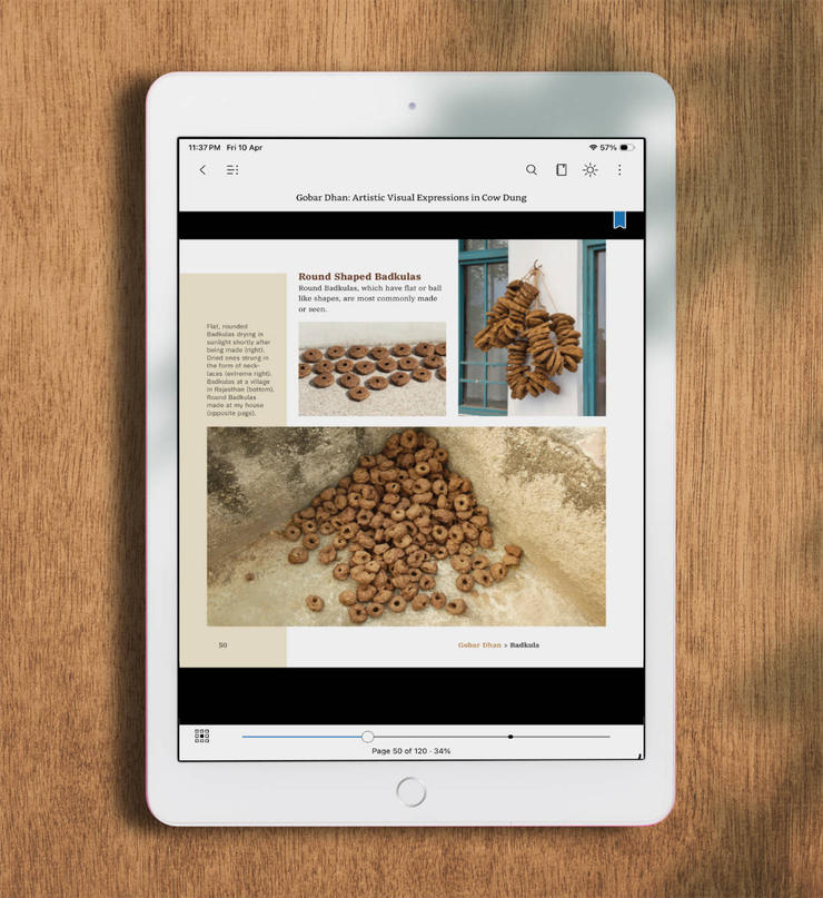
Photography for the book was done over the course of many months, by four photographers. Shoots and research trips were timed with religious festivals during which these art forms are made. Photographs were also sourced from several people, stock photo libraries, art galleries and museums. In specific cases, like for Badkulas (below), the photo shoot was done keeping the (squarish) format of the book in mind.
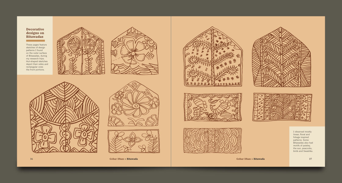
During research trips to villages and towns, Dr. Rekha Bhatnagar had also made linear sketches of the folk art forms she came across. They were featured at the end of every main chapter. Scanned drawings were carefully cleaned in Affinity Photo, converted to Grayscale and represented in dark brown colour over beige or light brown background to preserve their earthy feel.
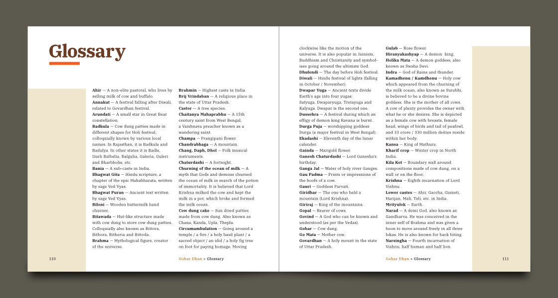
Back matter of the book consisted of Conclusion, Acknowledgements, Glossary, References, Photo Credits, Author’s page and three pages about her first book — Dhulichitra. Page layouts here were largely text-heavy.
Throughout the book, a disciplined design approach was followed. Page layouts stuck to the master page skeletal system and yet, arrangement of elements on most pages of the book (barring back matter) was unique. The earthy beige colour bands placed on the outer (left and right) columns of pages — like sidebars in a website — helped to balance the pages visually. Touches of bright colours (in the form of thin rectangular blocks used like underlines) emphasised key text elements, drawing the reader’s eye to them.
We worked judiciously to set and distribute the entire content across 120 individual pages. The total number of pages in a book should be divisible by 4. The overall number of pages also depends on the number of printed sections that are sewn and bound together to constitute the (physical) book. 120 pages, in this regard, worked perfectly.
9. Book Cover and Back Cover Design
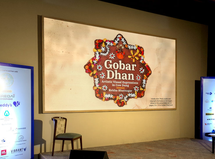
We had a lot of discussions about the cover design. The most obvious thought was to put one representative image of each of the four folk art forms on it. After working on a few cover design options, we settled for a concept based on Sanjhi — the most visually attractive art form of the four.
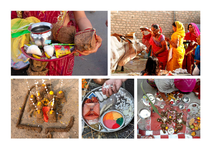
Sanjhis designs made on walls using cow dung, during the Shradh Paksh period (August–September) every year. They are decorated with natural materials like flowers and remnants of fabrics. Usually geometric in overall shape, they embody religious symbols including representations of deities and elements of the universe like the sun, stars and crescent moon.
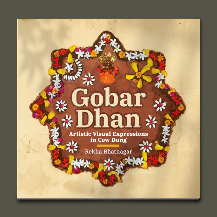
One of the most attractive Sanjhi design from the book was adapted onto the book cover. In Affinity Photo, it was extracted from the original photo and fused over the image of an old wall. Then, it was cleaned up from the middle and the book title, sub-title and author’s name were incorporated in it, faithful to the Sanjhi’s central alignment. Some of the flowers were carefully re-arranged around the typography and light shadows incorporated adjacent to the design (on the background wall).
The resulting design looked visually strong and attractive, replete with natural materials and mythological symbolism. It was thus representative of the contents of the book. With dominant dark browns and beige and touches of bright colours, the cover was also faithful to the book’s overall colour scheme.
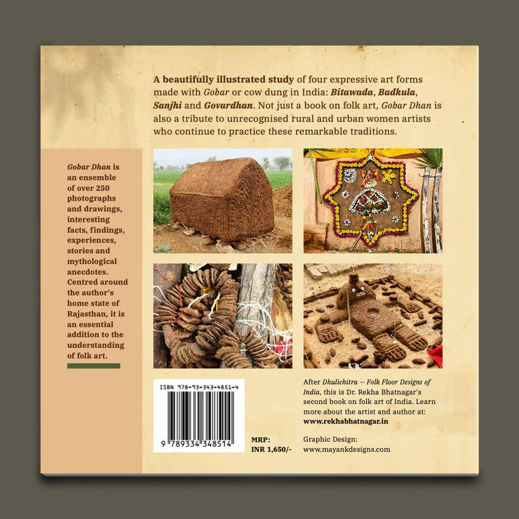
The book’s back cover layout comprised of four photographs — one of each art form — a short summary and highlights, arranged and conforming to the book’s typographic styles. Mandatory information: about the author, pricing and bar codes were present as well. All of this was placed over the beige background of an old wall (extending from the cover), in a manner that adhered to the system of grids, guides and colours.
10. Print Ready Artwork, Digital Dummy and Production
Once all page layouts had been approved, print ready artworks (one for the cover and another for inside pages) were exported from Affinity Publisher. The composite cover and back cover artwork also included a spine. After a few days, the printing press gave us a digital dummy for review. We checked it thoroughly, made some more edits and submitted the final print files for production.
After about week or so, we were (of course) thrilled to receive the printed copies!
eBook Version and Accessibility
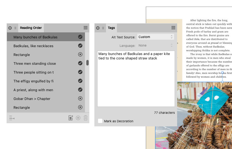
The main purpose of Gobar Dhan book is to document these age-old but diminishing Indian folk art traditions. We wanted the book to reach as many readers as possible, across the globe. Along with the print version, we also worked on an eBook for Amazon Kindle. One major advantage of an eBook is that via computing devices including tablets and smartphones, it also becomes accessible for readers with visual impairments.
While designing the book, we used accessibility features in Affinity Publisher 2 including reading order and alt tags to describe images in words. On every page, the logical order of each element was marked, so that it is picked up in the correct sequence by screen reading software. For all images, we wrote alt tags or attributes keeping the prose in mind (for minimal repetition of words). We also marked all superfluous elements like rectangles / boxes as ‘decorative’ so that screen readers ignore them. This was a lot of work!
After exporting the book in PDF format, I worked on the file in Kindle Create software and made an interactive menu for it. The Kindle file was then uploaded to Amazon.
Book Launch, Literature Festivals, Presentations and Social Media
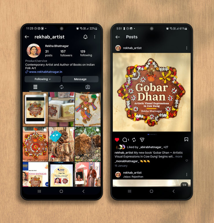
Even after the book was published, our work was not over! Invites, poster and a presentation were designed for the book launch function in Jaipur. Subsequently, Gobar Dhan got selected for the prestigious Jaipur Literature Festival (2026) and Hyderabad Literary Festival (2026), two of the top literary events in India. We designed more presentations to support the author’s talks in festival sessions. Gobar Dhan’s strong and all inclusive cover design / Sanjhi graphic, well defined colour scheme, typography and repertoire of images helped a great deal in this regard. We used several of the images and page layouts to promote the book on social media.
Conclusion
Gobar Dhan book is a labour of love. After three years of research, it took us seven months to design it or put it together. During the process, we had to deal with several issues, but we persisted. Dr. Rekha Bhatnagar funded and self-published the book, with the hope that these remarkable, unique but diminishing folk art forms made with cow dung are documented, shared with readers / art lovers the world over and appreciated.
Self-funded, designed at home and printed in our home city of Jaipur (Rajasthan, India), Gobar Dhan is truly a local product. Since the book was published (in July 2025), we have received overwhelming positive feedback about it, with modest sales as well — for which we are grateful indeed.
How to Buy Gobar Dhan Book
Printed Book
In case you are interested in purchasing the printed book, kindly message me using the contact form on this website or get in touch with Dr. Rekha Bhatnagar via her website. You can also connect with the author on Instagram. For now, the book can be purchased and shipped in India only.
Kindle eBook
eBook version of Gobar Dhan, suitable for reading on laptop, desktop and tablet computers, is available on Amazon online stores globally. Here is the link to the eBook on Amazon India store. If you live in a different country, search for ‘Gobar Dhan Book’ in your country’s or suitable Amazon website.
Photo Credits
- Photographs featured in Gobar Dhan book Copyright © Gaurav Bhatnagar, © Mayank Bhatnagar, © Sunil Nimawat, © Rekha Bhatnagar and several other photographers / artists / art galleries / museums. All rights reserved.
- Original Sanjhi design on book cover by Mitali Soni, Rupal Soni and Gehna Soni.
- Affinity Publisher and Affinity Photo UI screen shots courtesy and © Copyright Affinity, used under fair use guidelines.
- Adobe Bridge UI screen shot courtesy and © Adobe, used under fair use guidelines.
- Amazon Kindle UI screen shots courtesy and © Amazon.com Inc, used under fair use guidelines.
- iPad mock-ups courtesy magnific.com
- Wooden background in iPad and mobile phone mock-ups and easel mockup courtesy Image by rawpixel.com on Magnific
- Photograph of old wall in poster mock-up courtesy Image by freepik on Magnific