Design of a Mini Brochure for an MBA preparatory institute helped to convey a large amount of information in a compact size — with consistency, focus and visual variation. It reinforced the startup’s brand identity and was economical to print.
Background and Requirement
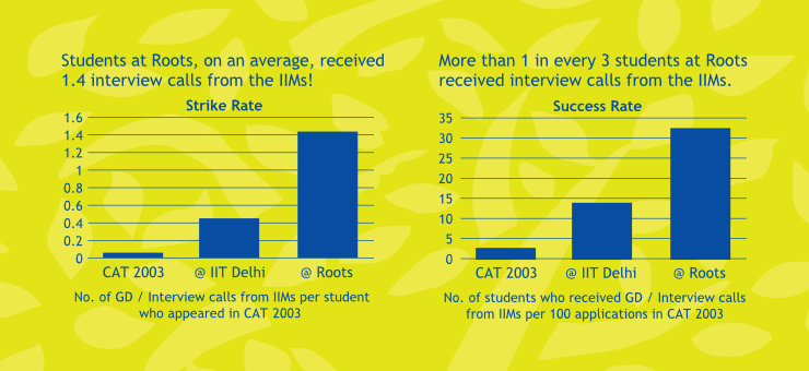
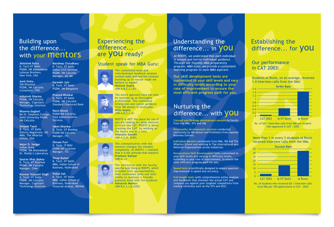
Roots Education — now MBAGuru — is one of the leading educational institutes in New Delhi / NCR (National Capital Region) of India offering preparatory courses for the Common Admission Test (CAT). In its early years, students coached by the startup demonstrated an outstanding success rate of cracking the CAT exam.
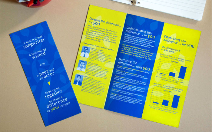
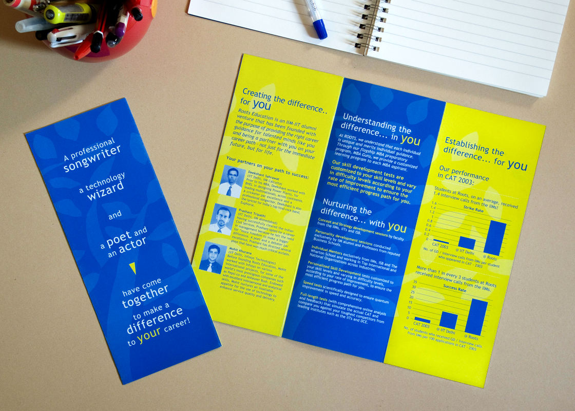
In 2003, to expand their operations and reach out to more students, the founders envisaged the design of a detailed handout containing information about the institute, its faculty and performance of their students in the past year. Owing to the large amount of information it carried in a compact size, it was termed as a ‘Mini Brochure’.
In the first meeting with the designer, the client shared a rough dummy of the brochure that they had prepared using laser printouts. They wanted it to be printed as economically as possible.
Challenges before the designer were to arrange all the information in a cohesive manner and to bring out a strong visual identity for the brand — an important aspect as Roots Education had just started stepping into the highly competitive coaching space. The brochure was designed in conjunction with the MBAGuru poster.
Design Rationale
Based on the brief, a print production professional was first consulted who worked out an economical size for the brochure. In the 4 sided brochure layout, content was organised by referring to the dummy provided by the client.
A strong and distinctive brand look was achieved by:
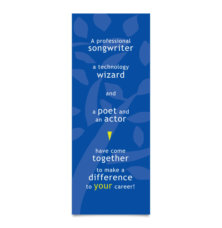
- Liberal use of the brand colours: Blue and Green Yellow. In fact, they were the only two colours used.
- Use of the Roots Education tree logo as a watermark — which subtly reinforced the branding and prevented the backgrounds from looking flat.
- Use of only one typeface: Trebuchet MS, which brought a feeling of cohesion or consistency into the layout.
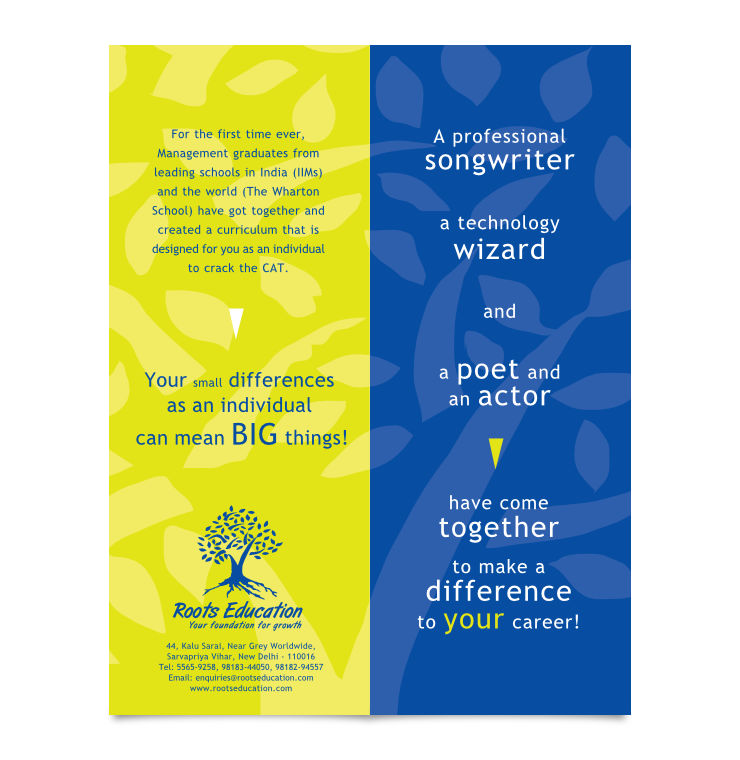
From its compact folded size, the Mini Brochure opened up in a double gate fold, to reveal a range of information for prospective students.
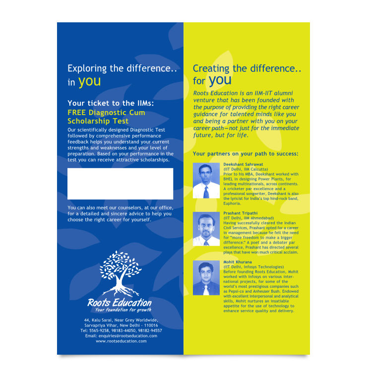
Each page of the brochure was rendered in an alternate or complimentary brand colour — which helped to retain its distinctiveness or individuality and aided the eye to focus on one section at a time.
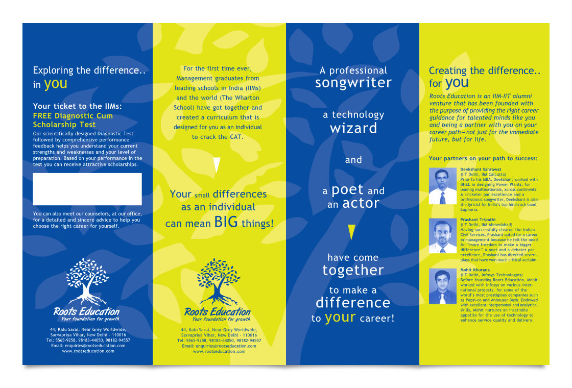
Even as the minimal colour scheme and use of one typeface helped to achieve a cohesive look, variety of information in each section along with typographical variations prevented the layout from looking monotonous. There was enough ‘play’ in each page of the brochure.
In Essence
The design treatment helped to convey a large amount of information on just one sheet of paper (printed on both sides) with consistency, focus, visual variation and in a manner that reinforced Roots Education’s brand identity.
Technical Notes
The 14 x 9 inch (open size), eight page Mini Brochure was printed on 135 gsm matte paper in two colour offset, using two special or spot colours (Blue and Green Yellow). Its economical size (which minimised paper wastage) and use of only two printing inks helped to lower print production costs.
—
KINDLY NOTE: Since the brochure was designed, Roots Education’s visual identity has changed. The brand is now known as MBAGuru.